1

I have a template like this:

enter image description here

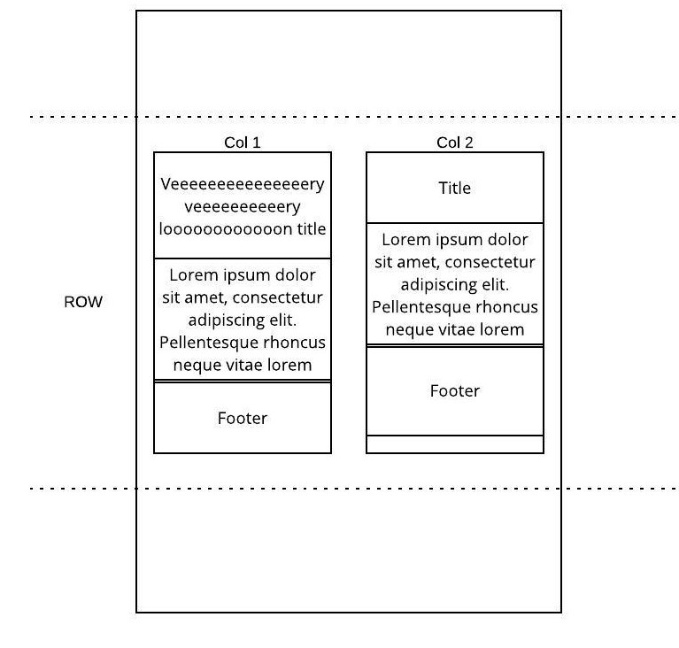
I want to maintain the same height between each item of both columns, depending on the one that has the biggest height, but only when they are side by side. In smaller screens, when they have width: 100%, each div has its own height depending of its own content height.

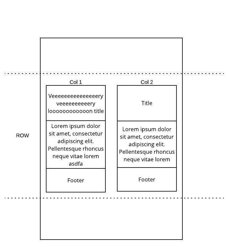
It should look like this:

enter image description here

I think that what I want is something like display: table, but I need both columns to be responsive.

All the questions I´have found are about maintaining the same height in both columns, but I´m already using flexbox to achieve this.

Is it possible to achieve what I vant with css only?

EDIT: Added code snippet. I forgot to mention that it needs to be supported by Chrome 36 (Android L WebView).

This question´s first answer shows what I wanted to achieve, but display:subgrid is not supported by any version Chrome at present: Align child elements of different blocks

.title {
  background: #b6fac0;
}

.content {
  background: #b6b6fa;
}

.footer {
  background: #f7f5b5;
}

.col-50 {
  border: 1px solid red;
}
<link href="http://code.ionicframework.com/1.3.3/css/ionic.min.css" rel="stylesheet" />
<ion-content>
<div class="row responsive-sm">
  <div class="col-50">
    <div class="padding title">
      Veeeeeeeeeeeeeeery veeeeeeeeeery veeeeeeeeeeeeeeery veeeeeeeeeery veeeeeeeeeeeeeeery veeeeeeeeeery veeeeeeeeeeeeeeery veeeeeeeeeery loooooooooooong title </div>
    <div class="padding content">
      Lorem ipsum dolor sit amet, consectetur adipiscing elit. Pellentesque rhoncus neque vitae lorem varius placerat. Donec blandit mi non mauris ornare faucibus. Quisque mollis nunc in tortor dapibus, et ornare lacus pharetra
    </div>
    <div class="padding footer">
      Footer
    </div>
  </div>
  <div class="col-50">
    <div class="padding title">
      Title </div>
    <div class="padding content">
      Lorem ipsum dolor sit amet, consectetur adipiscing elit. Pellentesque rhoncus neque vitae lorem varius placerat. Donec blandit mi non mauris ornare faucibus. Quisque mollis nunc in tortor dapibus, et ornare lacus pharetra. Phasellus tortor tortor, luctus
      in dapibus sed, ultrices eget lorem. Morbi vehicula fermentum arcu, nec egestas augue. Fusce orci ex, sodales ut tellus sit amet, pretium pulvinar odio. Suspendisse potenti. Phasellus convallis metus sed erat rhoncus, eu tristique lacus fermentum.
    </div>
    <div class="padding footer">
      Footer
    </div>
  </div>
</div>
</ion-content>
  • where is your HTML / CSS? what have you tried ? you need 2col but also 3 rows , it seems that display:table or grid could be usefull here. – G-Cyrillus Apr 06 '20 at 08:23
  • @G-Cyrillus updated with html and css – Eneko de la Torre Apr 06 '20 at 09:43
  • would this work for you ? https://codepen.io/gc-nomade/pen/gOpVwGr , you can also filter subgrids with @supports,(ff only so far i believe) – G-Cyrillus Apr 06 '20 at 18:19
  • 1
    Thank you very much @G-Cyrillus. Even if `display: contents` is not supported until Chrome 58 I think that this, in combination with @supports, is the best approach I can find and I can assume some little differences in older versions if they are still readable. Please, if you want, post it as an answer and I´ll mark it as the correct one. – Eneko de la Torre Apr 07 '20 at 10:22

1 Answers1

1

you may take a look at @supports to filter possible display:option or subgrid .

example with display:contents

.title {
  background: #b6fac0;
}

.content {
  background: #b6b6fa;
}

.footer {
  background: #f7f5b5;
}

.col-50 {
  border: 1px solid red;
}

@supports (display: contents) {
  .row.responsive-sm {
    display: grid;
    grid-template-columns: repeat(2, 1fr);
    grid-column-gap: 1em;
  }
  .col-50 {
    display: contents
  }
  .title {
    grid-row: 1
  }
  .content {
    grid-row: 2;
  }
  @media screen and (max-width:500px) {
    /* set the break point to the right value */
    .row.responsive-sm,
    .col-50 {
      display: block;
    }
  }
}
<link href="http://code.ionicframework.com/1.3.3/css/ionic.min.css" rel="stylesheet" />
<ion-content>
  <div class="row responsive-sm">
    <div class="col-50">
      <div class="padding title">
        Veeeeeeeeeeeeeeery veeeeeeeeeery veeeeeeeeeeeeeeery veeeeeeeeeery veeeeeeeeeeeeeeery veeeeeeeeeery veeeeeeeeeeeeeeery veeeeeeeeeery loooooooooooong title </div>
      <div class="padding content">
        Lorem ipsum dolor sit amet, consectetur adipiscing elit. Pellentesque rhoncus neque vitae lorem varius placerat. Donec blandit mi non mauris ornare faucibus. Quisque mollis nunc in tortor dapibus, et ornare lacus pharetra
      </div>
      <div class="padding footer">
        Footer a
      </div>
    </div>
    <div class="col-50">
      <div class="padding title">
        Title </div>
      <div class="padding content">
        Lorem ipsum dolor sit amet, consectetur adipiscing elit. Pellentesque rhoncus neque vitae lorem varius placerat. Donec blandit mi non mauris ornare faucibus. Quisque mollis nunc in tortor dapibus, et ornare lacus pharetra. Phasellus tortor tortor, luctus
        in dapibus sed, ultrices eget lorem. Morbi vehicula fermentum arcu, nec egestas augue. Fusce orci ex, sodales ut tellus sit amet, pretium pulvinar odio. Suspendisse potenti. Phasellus convallis metus sed erat rhoncus, eu tristique lacus fermentum.
      </div>
      <div class="padding footer">
        Footer
      </div>
    </div>
  </div>

</ion-content>

usefull for a fast check on supports on properties: https://caniuse.com/

Community
  • 1
  • 1
G-Cyrillus
  • 101,410
  • 14
  • 105
  • 129