13

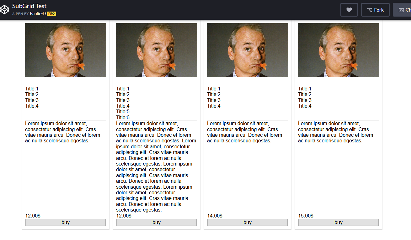
I have a list of wares. I need to show them in a 2-dimensional list. Every ware has daughter elements: photo, title, description, price and buy button, which must be sized and positioned in this way: all titles, description, price and photo in a wares row must be at the same y-coordinate position and have height which is maximum of corresponding height element in a row.

Ive tried this: "grid-template-rows: 1fr 1fr 1fr 1fr 30px;" to make all daughter elements in a row be at the same y-position, but I need their height to fit the content and be not higher then maximum element in a row. P.S. You may provide code using flex or whatever you want.

CODE

.Grid {
  display: grid;
  grid-gap: 10px;
  grid-template-columns: repeat( auto-fill, 280px);
}

.loon-card {
  grid-template-rows: 1fr 1fr 1fr 1fr 30px;
  display: grid;
  grid-gap: 10px;
  border: 1px solid #ddd;
  padding: 10px;
}

.long-description {
  border-top: 1px solid #ddd;
}
<div class="Grid">

  <div class="loon-card">
    <img src="">
    <div class="short-description">
      Title:1
      <br/>Title:2
      <br/>Title:3
      <br/>Title:4
    </div>
    <div class="long-description">
      Lorem ipsum dolor sit amet, consectetur adipiscing elit. Cras vitae mauris arcu. Donec et lorem ac nulla scelerisque egestas.
    </div>
    <div class='price'>12.00$</div>
    <button>buy</button>
  </div>

  <div class="loon-card">
    <img src="">
    <div class="short-description">
      Title:1
      <br/>Title:2
      <br/>Title:3
      <br/>Title:4
      <br/>Title:5
      <br/>Title:6
      <br/>Title:7
      <br/>Title:8
      <br/>Title:9
      <br/>Title:10
      <br/>Title:2
      <br/>Title:3
      <br/>Title:4
      <br/>Title:5
      <br/>Title:6
      <br/>Title:7
      <br/>Title:8
      <br/>Title:9
      <br/>Title:10

    </div>
    <div class="long-description">
      Lorem ipsum dolor sit amet, consectetur adipiscing elit. Cras vitae mauris arcu. Donec et lorem ac nulla scelerisque egestas. Lorem ipsum dolor sit amet, consectetur adipiscing elit. Cras vitae mauris arcu. Donec et lorem ac nulla scelerisque egestas.
      Lorem ipsum dolor sit amet, consectetur adipiscing elit. Cras vitae mauris arcu. Donec et lorem ac nulla scelerisque egestas. Lorem ipsum dolor sit amet, consectetur adipiscing elit. Cras vitae mauris arcu. Donec et lorem ac nulla scelerisque egestas.
    </div>
    <div class='price'>12.00$</div>
    <button>buy</button>
  </div>

  <div class="loon-card">
    <img src="">
    <div class="short-description">
      Title:1
      <br/>Title:2
      <br/>Title:3
      <br/>Title:4
    </div>
    <div class="long-description">
      Lorem ipsum dolor sit amet, consectetur adipiscing elit. Cras vitae mauris arcu. Donec et lorem ac nulla scelerisque egestas.
    </div>
    <div class='price'>14.00$</div>
    <button>buy</button>
  </div>

  <div class="loon-card">
    <img src="">
    <div class="short-description">
      Title:1
      <br/>Title:2
      <br/>Title:3
      <br/>Title:4
    </div>
    <div class="long-description">
      Lorem ipsum dolor sit amet, consectetur adipiscing elit. Cras vitae mauris arcu. Donec et lorem ac nulla scelerisque egestas.
    </div>
    <div class='price'>15.00$</div>
    <button>buy</button>
  </div>

</div>
Awais
  • 4,752
  • 4
  • 17
  • 40
user3240998
  • 181
  • 3
  • 9

3 Answers3

7

This is not possible at present (2019/06)* with any CSS layout method.

display:subgrid solves the issue but it has limited non-experimental adoption by browsers as yet.*

*[2019/12 Update] - Subgrid is now shipped in Firefox 71

Support @ CanIuse.com

--

It is enabled, by default, in Firefox 71+ so it is possible to test. Until this is fully adopted Javacript is needed to equalise element heights.

A couple of resources links from Rachel Andrew (a CSS-Grid envangalist)

  1. https://rachelandrew.co.uk/archives/2019/04/16/css-subgrid-news-and-demos/

and

  1. YouTube video on subgrid

  2. And Another

* {   margin: 0;   padding: 0;   box-sizing: border-box; }  ::before, ::after {   box-sizing:inherit; }

.Grid {
  display: grid;
  width:90%;
  margin:auto;
  grid-gap: 10px;
  grid-template-columns: repeat( auto-fill, 280px);
}

.loon-card {
  display:grid;
  grid-row: span 5; /* as we have 5 card components in each card */
  grid-template-rows:subgrid;
  border: 1px solid #ddd;
  padding: 10px;
}

.long-description {
  border-top: 1px solid #ddd;
}

.price {
padding:.5em;
text-align:center;
}

img {
  max-width:100%;
  display: block;
}
<div class="Grid">

  <div class="loon-card">
    <img src="http://www.fillmurray.com/300/200">
    <div class="short-description">
      Title:1
      <br/>Title:2
      <br/>Title:3
      <br/>Title:4
    </div>
    <div class="long-description">
      Lorem ipsum dolor sit amet, consectetur adipiscing elit. Cras vitae mauris arcu. Donec et lorem ac nulla scelerisque egestas.
    </div>
    <div class='price'>12.00$</div>
    <button>buy</button>
  </div>

  <div class="loon-card">
    <img src="http://www.fillmurray.com/300/200">
    <div class="short-description">
      Title:1
      <br/>Title:2
      <br/>Title:3
      <br/>Title:4
      <br/>Title:5
      <br/>Title:6

    </div>
    <div class="long-description">
      Lorem ipsum dolor sit amet, consectetur adipiscing elit. Cras vitae mauris arcu. Donec et lorem ac nulla scelerisque egestas. Lorem ipsum dolor sit amet, consectetur adipiscing elit. Cras vitae mauris arcu. Donec et lorem ac nulla scelerisque egestas.
      Lorem ipsum dolor sit amet, consectetur adipiscing elit. Cras vitae mauris arcu. Donec et lorem ac nulla scelerisque egestas. Lorem ipsum dolor sit amet, consectetur adipiscing elit. Cras vitae mauris arcu. Donec et lorem ac nulla scelerisque egestas.
    </div>
    <div class='price'>12.00$</div>
    <button>buy</button>
  </div>

  <div class="loon-card">
    <img src="http://www.fillmurray.com/300/200">
    <div class="short-description">
      Title:1
      <br/>Title:2
      <br/>Title:3
      <br/>Title:4
    </div>
    <div class="long-description">
      Lorem ipsum dolor sit amet, consectetur adipiscing elit. Cras vitae mauris arcu. Donec et lorem ac nulla scelerisque egestas.
    </div>
    <div class='price'>14.00$</div>
    <button>buy</button>
  </div>

  <div class="loon-card">
    <img src="http://www.fillmurray.com/300/200">
    <div class="short-description">
      Title:1
      <br/>Title:2
      <br/>Title:3
      <br/>Title:4
    </div>
    <div class="long-description">
      Lorem ipsum dolor sit amet, consectetur adipiscing elit. Cras vitae mauris arcu. Donec et lorem ac nulla scelerisque egestas.
    </div>
    <div class='price'>15.00$</div>
    <button>buy</button>
  </div>

</div>

Resulting output (FF Nightly)

enter image description here

Paulie_D
  • 107,962
  • 13
  • 142
  • 161
5

Arguably, you could achieve the same thing without subgrid though it's a bit more of a pain.

In my example, I didn't change the HTML so I use display: contents to sort of bring the children up one level of the DOM tree. But if you can change your markup and don't mind the resulting mess, you could also achieve this without display: contents.

.Grid {
    display: grid;
    grid-gap: 10px;
}
.loon-card {
    display: contents;
}
img {
    width: 100%;
    grid-row-start: 1;
}
.short-description {
    grid-row-start: 2;
}
.long-description {
    grid-row-start: 3;
}
.price {
    grid-row-start: 4;
}
button {
    grid-row-start: 5;
}
<div class="Grid">

 <div class="loon-card">
  <img src="http://www.fillmurray.com/300/200">
  <div class="short-description">
   Title:1
   <br />Title:2
   <br />Title:3
   <br />Title:4
  </div>
  <div class="long-description">
   Lorem ipsum dolor sit amet, consectetur adipiscing elit. Cras vitae mauris arcu. Donec et lorem ac nulla
   scelerisque egestas.
  </div>
  <div class='price'>12.00$</div>
  <button>buy</button>
 </div>

 <div class="loon-card">
  <img src="http://www.fillmurray.com/300/200">
  <div class="short-description">
   Title:1
   <br />Title:2
   <br />Title:3
   <br />Title:4
   <br />Title:5
   <br />Title:6

  </div>
  <div class="long-description">
   Lorem ipsum dolor sit amet, consectetur adipiscing elit. Cras vitae mauris arcu. Donec et lorem ac nulla
   scelerisque egestas. Lorem ipsum dolor sit amet, consectetur adipiscing elit. Cras vitae mauris arcu. Donec
   et lorem ac nulla scelerisque egestas.
   Lorem ipsum dolor sit amet, consectetur adipiscing elit. Cras vitae mauris arcu. Donec et lorem ac nulla
   scelerisque egestas. Lorem ipsum dolor sit amet, consectetur adipiscing elit. Cras vitae mauris arcu. Donec
   et lorem ac nulla scelerisque egestas.
  </div>
  <div class='price'>12.00$</div>
  <button>buy</button>
 </div>

 <div class="loon-card">
  <img src="http://www.fillmurray.com/300/200">
  <div class="short-description">
   Title:1
   <br />Title:2
   <br />Title:3
   <br />Title:4
  </div>
  <div class="long-description">
   Lorem ipsum dolor sit amet, consectetur adipiscing elit. Cras vitae mauris arcu. Donec et lorem ac nulla
   scelerisque egestas.
  </div>
  <div class='price'>14.00$</div>
  <button>buy</button>
 </div>

 <div class="loon-card">
  <img src="http://www.fillmurray.com/300/200">
  <div class="short-description">
   Title:1
   <br />Title:2
   <br />Title:3
   <br />Title:4
  </div>
  <div class="long-description">
   Lorem ipsum dolor sit amet, consectetur adipiscing elit. Cras vitae mauris arcu. Donec et lorem ac nulla
   scelerisque egestas.
  </div>
  <div class='price'>15.00$</div>
  <button>buy</button>
 </div>
</div>
Temani Afif
  • 245,468
  • 26
  • 309
  • 415
Sheraff
  • 5,730
  • 3
  • 28
  • 53
  • display: contents; doesnt support IE and EDGE – mat Mar 02 '20 at 14:06
  • 1
    @mat only IE isn't supported – Sheraff Mar 02 '20 at 14:53
  • 1
    as of today, `display:subgrid` is not fully supported on all browsers. This is not a solution at this time. https://caniuse.com/#feat=css-subgrid – Wreeecks May 19 '20 at 23:52
  • 5
    @Wreeecks which is why I'm proposing a solution without subgrid. – Sheraff Jul 17 '20 at 21:03
  • @RazvanZamfir it depends on the exact requirements. `display: contents` is useful for flexbox too, but flexbox isn't always the best for 2D layouts like this one, so you usually end up having one parent flex with many flex children, and sometimes you still can't do the exact thing you're trying to do. depends on the requirements. – Sheraff Sep 04 '21 at 18:38
  • @Sheraff This is the closest Ive ben able to get to my solution on this qusetionLhttps://stackoverflow.com/questions/75523590/equal-height-columns-height-css-flexbox - Issue is using this now my container grid completely ignores my columns. Any idea why? It just displays every signel child in the container in it's own column – Mike Feb 22 '23 at 08:07
2

A little bit of JavaScript can help out . By getting the maximum height , you can define that to all classes

function textHeight() {
  var reed = document.getElementsByClassName("titles")

  let lengths = Array.from(reed).map(e => e.offsetHeight);
  let max = Math.max(...lengths);

  for (let i = 0; i < reed.length; i++) {
    reed[i].style.minHeight = max + "px"
  }
}
textHeight();
.kind-words {
  margin-top: 3%;
  margin-left: 10%;
  margin-right: 10%;
  display: flex;
}

.word {
  background-color: #F5F5F5;
  float: left;
  width: 50%;
  margin-left: 1%;
  margin-right: 1%;
  padding-left: 5%;
  padding-right: 5%;
  padding-top: 3%;
  padding-bottom: 3%;
  border: solid 1px #B1976B;
  display: flex;
  flex-flow: column;
}
<div class="kind-words" style="margin-bottom: 4%;">
  <div class="word">
    <h1 style="text-align: center; font-family: avenirNext; font-size: 30px; color: #B1976B;">Mark D. Griffith</h1>
    <h1 style="text-align: center; font-family: avenirNext; font-size: 20px; color: #B1976B;" class="titles">Griffith & Associates</h1>
    <h1 style="text-align: center; text-align:justify;  font-family: avenirnext; font-size: 20px; line-height: 1.5em; color: #54595F;">I would not try any level criminal allegation regarding sexual assault without the help of Dr. Pierce. I have tried many of these cases and the most valuable asset when I do is Dr. Pierce. He has testified in many of my cases with the outcome being
      the two word verdict my client so badly needs. The most clear and concise witness I have ever used. I have come to the point where I feel the only way to be truly effective is to have him on our team when we go to trial. He is approachable, understanding,
      and infinitely knowledgeable.
    </h1>
  </div>
  <div class="word">
    <h1 style="text-align: center; font-family: avenirNext; font-size: 30px; color: #B1976B;">Katheryn H. Haywood
    </h1>
    <h1 style="text-align: center;  font-family: avenirNext; font-size: 20px; color: #B1976B;" class="titles">The Law Office of<br> Katheryn H. Haywood, PLLC </h1>
    <h1 style="text-align: center;  text-align:justify; font-family: avenirnext; font-size: 20px; line-height: 1.5em; color: #54595F;">Dr. Pierce is my ONLY expert for child abuse cases. He is a national leader in understanding false accusations based on fear of the boogey man/family dynamics/hyper-sensitivity to touching based on past trauma. I have been doing sex defense work for
      20 years. Dr. Pierce is the expert I rely on to help me understand the intricacies of my cases. He is a straight shooter. And perhaps more importantly, he speaks very well to juries in common language which is clear, concise, and not elitist. I
      have 5 cases pending with Dr. Pierce and have yet to lose one where he has consulted/testified.
    </h1>
  </div>
</div>
Rana
  • 2,500
  • 2
  • 7
  • 28