5

I have a scatter plot where the y-axis scaling changes at a certain point to plot data with some extreme values. I'm trying to add some sort of visual cue on the y-axis that indicates that the scaling changes at the point.

Here's an example of a plot

library(scales)
library(ggplot2)

set.seed(104)

ggdata <- data.frame('x' = rep('a',100),
                     'y' = c(runif(90, 0, 20), runif(10, 90, 100)))

transformation <- trans_new(
  "my_transformation", 
  transform = function(x) ifelse(x <= 30, x / 5, (x - 30) / 20 + 30 / 5),
  inverse = function(x) ifelse(x <= 30 / 5, x * 5, (x - 30 / 5) * 20 + 30)
)

ggplot(data = ggdata) + 
  geom_jitter(aes(x = x, y = y)) +
  scale_y_continuous(trans = transformation, breaks = c(0, 10, 20, 30, 50, 70, 90, 110))  
scatter plot

I want to add some marker to "tick 30" on y axis for scale change.

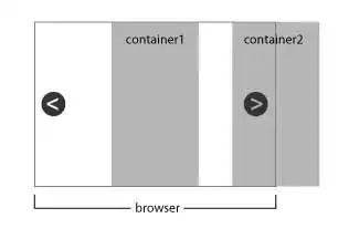
I was thinking of adding a double tick on the axis, but there is no linetype that looks like a double line. The product should look something like this. I'm aware of transforms like scale_y_log10, but I'd rather work with custom scaling that dynamically changes with the data.

EDIT: per @Tjebo's suggestion, I used annotate to add a "=" to the y axis breakpoint:

library(scales)
library(ggplot2)

set.seed(104)

ggdata <- data.frame('x' = rep('a',100),
                     'y' = c(runif(90, 0, 20), runif(10, 90, 100)))

transformation <- trans_new(
  "my_transformation", 
  transform = function(x) ifelse(x <= 30, x / 5, (x - 30) / 20 + 30 / 5),
  inverse = function(x) ifelse(x <= 30 / 5, x * 5, (x - 30 / 5) * 20 + 30)
)

mybreaks <- c(0, 10, 20, 30, 50, 70, 90, 110)
tick_linetype <- rep("solid", length(mybreaks))
tick_linetype[4] <- "blank"

ggplot(data = ggdata) + 
  geom_jitter(aes(x = x, y = y)) +
  annotate(geom = "point", shape = "=", x = -Inf, y = 30, size = 3) +
  scale_y_continuous(trans = transformation, breaks = mybreaks) +
  theme(axis.ticks.y = element_line(linetype = tick_linetype)) + 
  coord_cartesian(clip = 'off')
solution

J. Lee
  • 53
  • 5
  • Here are some related topics: https://stackoverflow.com/questions/7194688/using-ggplot2-can-i-insert-a-break-in-the-axis – bs93 Apr 21 '20 at 16:38
  • @bs93 Thank you for the link. I guess producing two plots with & without the extreme values could be a solution. I'd like to see a way incorporate all information in one plot though. I'm working with genetic data so I would have tens of thousands of data, so the table wouldn't be an effective method. To be precise, the "scatterplot" I'm working wtih is a manhattan plot, and I'd like to see the distribution of lower -log10(pval) as well as the extreme values – J. Lee Apr 21 '20 at 17:24

3 Answers3

3

I was thinking of adding a double tick on the axis, but there is no linetype that looks like a double line.

You can use any character as point shape. Also an equal sign, or back slash, etc.

For example:

library(scales)
library(ggplot2)

set.seed(104)

ggdata <- data.frame('x' = rep('a',100),
                     'y' = c(runif(90, 0, 20), runif(10, 90, 100)))

transformation <- trans_new(
  "my_transformation", 
  transform = function(x) ifelse(x <= 30, x / 5, (x - 30) / 20 + 30 / 5),
  inverse = function(x) ifelse(x <= 30 / 5, x * 5, (x - 30 / 5) * 20 + 30)
)

ggplot(data = ggdata) + 
  geom_jitter(aes(x = x, y = y)) +
  annotate(geom = "point", shape = "=", x = -Inf, y = 30, size = 8, color = 'red') +
  scale_y_continuous(trans = transformation, breaks = c(0, 10, 20, 30, 50, 70, 90, 110))+
  coord_cartesian(clip = 'off')

I removed the clipping, but you can also leave it. The color was just chosen for highlighting.

Or, even better, use text annotation. You can then also change the angle - kind of nice.

ggplot(data = ggdata) +
  geom_jitter(aes(x = x, y = y)) +
  annotate(geom = "text", label = "=", x = -Inf, y = 30, size = 8, color = "red", angle = 45) +
  scale_y_continuous(trans = transformation, breaks = c(0, 10, 20, 30, 50, 70, 90, 110)) +
  coord_cartesian(clip = "off")

Created on 2020-04-21 by the reprex package (v0.3.0)

tjebo
  • 21,977
  • 7
  • 58
  • 94
  • 2
    Yes thank you! This is the closest to what I've been looking for. I had no idea that I could set `x` in `annotate()` to `-Inf`, let alone including it does not change the overall x scale. – J. Lee Apr 21 '20 at 20:36
2

I cannot get the exact look that you linked to, but perhaps some of these ideas are useful to you.

You can make your specified value a minor break, and add a line only to minor breaks (here I was unable to pick the exact value of 20, since that was already a major break, but perhaps you can play around with the numbers to get something you like):

ggplot(data = ggdata) + 
  geom_jitter(aes(x = x, y = y)) +
  scale_y_continuous(trans = transformation, minor_breaks=20.05,breaks = c(0, 10,20, 30, 50, 70, 90, 110))+
  theme(
    panel.grid.minor.y = element_line(1)
  )

enter image description here

Another option is to change the labels themselves. Here I have bolded and wrapped in () the 20 value, but you can add other symbols as well:

ggplot(data = ggdata) + 
  geom_jitter(aes(x = x, y = y)) +
  scale_y_continuous(trans = transformation, minor_breaks = c(0, 10, 20, 30, 50, 70, 90, 110),
                       breaks  = c(0, 10, 20, 30, 50, 70, 90, 110), labels=c(0, 10, expression(bold(("20"))), 30, 50, 70, 90, 110))

enter image description here

You can add a segment to the plot, which here isn't the prettiest option since the x axis isn't continuous, but perhaps it will spur ideas:

ggplot(data = ggdata) + 
  geom_jitter(aes(x = x, y = y)) +
  scale_y_continuous(trans = transformation, breaks = c(0, 10, 20, 30, 50, 70, 90, 110))+
  geom_segment(aes(x=-.01,y=19.5,xend=.01,yend=20.5),size=1.5)

enter image description here

Perhaps you could also just shade the bottom (or top) portion of your plot:

ggplot(data = ggdata,aes(x = x, y = y)) + 
  geom_jitter() +
  scale_y_continuous(trans = transformation,breaks = c(0, 10,20, 30, 50, 70, 90, 110))+
  annotate("rect", xmin = .4, xmax = 1.6, ymin = 0, ymax = 21,
           alpha = .2)

enter image description here

Dylan_Gomes
  • 2,066
  • 14
  • 29
  • Thank you for your thoughts Dylan. In fact, we've had similar ideas :) ! Adding a horizontal line could cause some confusion just because I already have dashed lines indicating the p-values. For now, I've colored the axis red at the "break point". Although it doesn't intuitively say that the scale changes at that point, but it still stands out. I still think having a "/" or "X" mark on the axis would be more visually alarming. – J. Lee Apr 21 '20 at 18:44
  • @J.Lee, I just had an additional thought, where you could shade one area. This may not be too ugly with other lines, etc. in the plot. See the revised answer. – Dylan_Gomes Apr 21 '20 at 19:03
0

This solution should help with how you want your axis to look like. FWIW I would like to caution against breaking axes unless you explicitly tell your audience about them. In the code below I created two plots, one is for the data below 30 and the other data is for the extreme points (and remove its x axis and labels). Then I use plot.margin to set the plots margins so that they overlap a bit when I put them in a grid.arrange. You might have to mess with the margins to get the labels to line up.

library(scales)
library(ggplot2)
library(gridExtra)
set.seed(104)

ggdata <- data.frame('x' = rep('a',100),
                     'y' = c(runif(90, 0, 20), runif(10, 90, 100)))

p1 <- ggplot(data = ggdata) + 
  geom_jitter(aes(x = x, y = y)) +
  scale_y_continuous(breaks = seq(0,30,5), limits = c(0,30))+
  theme(plot.margin=unit(c(0,.83,0,1), "cm")) 


p2 <- ggplot(data = ggdata) + 
  geom_jitter(aes(x = x, y = y)) +
  scale_y_continuous( breaks = seq(60,100,10), limits = c(60,100)) +
  scale_x_discrete()+
  theme(axis.title.x=element_blank(),
        axis.text.x=element_blank(),
        axis.ticks.x=element_blank(),
        plot.margin=unit(c(0,1,-0.1,1), "cm"))


grid.arrange(p2,p1)
Mike
  • 3,797
  • 1
  • 11
  • 30