I don't know how this thing is called, or even how to describe it, so the title may be a little bit misleading.
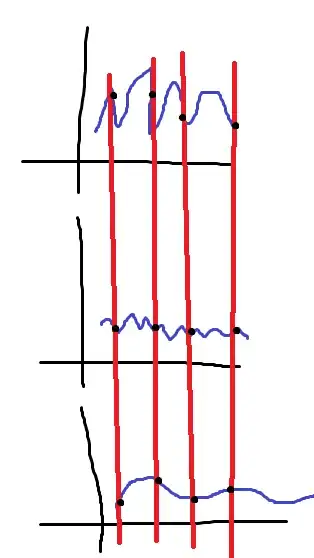
The first attached graph was created with pyplot. I would like to draw a straight line that goes through all graphs instead of the three red dot I currently use. Is it possible in pyplot? Second image is what I am looking for.

Asked
Active
Viewed 2.0k times
28
-
How do you determine where to take red points? – Sword22 May 26 '11 at 23:40
-
@Sword22 All graphs have the same x-axis. Red points are basically a list of x-axis values. – Artium May 26 '11 at 23:47
4 Answers
38
You can pull this off by turning clipping off for the relevant lines. There's probably a cleaner way to do this -- you might be able to draw lines on the main frame directly -- but the following worked for me:
from matplotlib import pyplot as plt
from numpy import arange, sin, cos

xx = arange(100)
cut = (xx > 0) & (xx % 17 == 0)
y1 = sin(xx)
y2 = (xx**2) % 2.0+cos(xx+0.5)

fig = plt.figure()
ax1 = fig.add_subplot(211)
ax1.plot(xx, y1, c="blue",zorder=1)
ax1.scatter(xx[cut], y1[cut], c="red",zorder=2)
ax2 = fig.add_subplot(212)
ax2.plot(xx, y2, c="green",zorder=1)
ax2.scatter(xx[cut], y2[cut], c="red",zorder=2)

for x in xx[cut]:
    ax1.axvline(x=x,ymin=-1.2,ymax=1,c="red",linewidth=2,zorder=0, clip_on=False)
    ax2.axvline(x=x,ymin=0,ymax=1.2,c="red",linewidth=2, zorder=0,clip_on=False)

plt.draw()
fig.savefig('pic.png')
With a bit more work you could modify the line drawing to handle the general case of multiple subplot windows, but I'm profoundly lazy. :^)

DSM
- 342,061
- 65
- 592
- 494
12
[Update 03/2013] In newer revisions of matplotlib, there's ConnectionPatch that greatly simplifies this task. It's particularly useful whenever there are more than two subplots that need to be covered.
from matplotlib import pyplot as plt
from matplotlib.patches import ConnectionPatch
from numpy import arange, sin, cos

xx = arange(100)
cut = (xx > 0) & (xx % 17 == 0)
y1 = sin(xx)
y2 = (xx**2) % 2.0+cos(xx+0.5)

fig = plt.figure()
ax1 = fig.add_subplot(211)
ax1.plot(xx, y1, c="blue")
ax1.scatter(xx[cut], y1[cut], c="red")
ax2 = fig.add_subplot(212)
ax2.plot(xx, y2, c="green")
ax2.scatter(xx[cut], y2[cut], c="red")

for x in xx[cut]:
    con = ConnectionPatch(xyA=(x, -1.5), xyB=(x, 1.5),
        coordsA="data", coordsB="data", axesA=ax2, axesB=ax1,
        arrowstyle="-", linewidth=2, color="red")
    ax2.add_artist(con)

plt.draw()
fig.savefig('pic.png')
clesenne
- 153
- 1
- 6
12
Relevant documentation:
http://matplotlib.sourceforge.net/api/pyplot_api.html#matplotlib.pyplot.axvline
Edit: since @DSM's answer was so much better than mine I have shamefully incorporated some of that answer in an attempt to make my answer less poor.
I've tried to handle the somewhat-general case of multiple subplots in a column (i.e. not the even-more-general case of multiple subplots, e.g. in a grid).
Thanks, @DSM, for your answer and @Artium for the question.
import matplotlib.pyplot as plt
import numpy as np

def main():
    fig = plt.figure()

    x = np.arange(20)
    y1 = np.cos(x)
    y2 = (x**2)
    y3 = (x**3)
    yn = (y1,y2,y3)
    cut = (x > 0) & (x % 2 == 0)
    COLORS = ('b','g','k')

    for i,y in enumerate(yn):
        ax = fig.add_subplot(len(yn),1,i+1)

        ax.plot(x, y,ls='solid', color=COLORS[i], zorder=1)
        ax.scatter(x[cut], y[cut], c='r', zorder=2)

        if i != len(yn) - 1:
            ax.set_xticklabels( () )

        for j in x[cut]:
            if i != len(yn) - 1:
                ax.axvline(x=j, ymin=-1.2, ymax=1,
                           c='r', lw=2, zorder=0, clip_on=False)
            else:
                ax.axvline(x=j, ymin=0, ymax=1,
                           c='r', lw=2, zorder=0, clip_on=False)

    fig.suptitle('Matplotlib Vertical Line Example')
    plt.show()

if __name__ == '__main__':
    main()
Community
- 1
- 1
mechanical_meat
- 163,903
- 24
- 228
- 223
-
I really like your answer. However, in my case horizontal and vertical margins are present if I run your code. Any idea how to remove them? – Rickson Dec 23 '16 at 12:26
-
To be more precise. In my case, the range of the xaxis is [-5,20] instead of [0,20] and f. e. for the last plot, the yaxis range is [-1000,8000] instead of [0,7000]. Tried almost anything (autoscale, tight axis, relim etc.) without success. – Rickson Dec 23 '16 at 13:33
-
If someone else is interested: It is caused by the generation of the scatter points. – Rickson Dec 23 '16 at 23:51
-
0
I would try axvline(x, y1, y2) (link), but I don't think any of the options in pyplot will draw something that spans across several subplots/graphs.
If that's the case, I would just try drawing the same vertical line at each point in the graph, hoping that the same intent is conveyed to the viewer.
matt b
- 138,234
- 66
- 282
- 345
-
Apologies. My answer doesn't present any new information that yours doesn't have. I had already put together an example so I thought that I would post anyway. +1 to you for being much faster. – mechanical_meat May 27 '11 at 00:39
-
agreed with Jonathan, an answer with source code and examples is much better than one without, speed doesn't count! – matt b May 27 '11 at 13:14
-
If I try your way, the line is hidden behind the inset axis set. What am I doing wrong? – Jun 30 '14 at 16:49