14

I have been trying to do something that seemed easy, but I have been trying for a few hours and I can't find the solution.

I have an SVG that needs to be on top of a screen. It came from the designer with these dimensions:

<Svg width="354px" height="190px" viewBox="0 0 354 190">...</Svg>

In React Native, that would go inside of a container, and the SVG needs to take the full width of the screen, which I am taking from:

Dimensions.get("window").width

My problem is, I haven't found a way to scale the SVG to take 100% of the screen width, finding out the correct height (or a way for it to be set automatically), and preserve the aspect ratio. I've tried like a million things, including playing around with the container's aspectRatio style and its height (or not setting the height at all). Whenever I've found some "proportions" that worked, I tried in a different device with different screen width and it didn't look good at all (cropped, smaller than the screen's width, etc).

I feel like the preserveAspectRatio property in the SVG (react-native-svg) is somehow conflicting with the aspectRatio style. And I am totally lost with the preserveAspectRatio, I haven't found a way to make it scale without being cropped.

Does anyone have any idea how to achieve this?

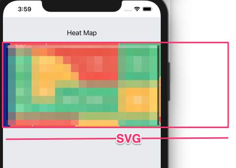
This is my final code, which returns a HeatMap component showing an SVG, but although it has the correct height, part of the SVG is out of the screen from the right (looks cropped because it's too wide):

const windowWidth = Dimensions.get("window").width;

const getSVGRootProps = ({ width, height }) => ({
  width: "100%",
  height: "100%",
  viewBox: `0 0 ${width} ${height}`,
  preserveAspectRatio: "xMinYMin meet",
});

const FieldShape = () => {
  const width = 354; // Original width
  const height = 190; // Original height
  const aspectRatio = width / height;
  // adjusted height = <screen width> * original height / original width
  const calculatedHeight = (windowWidth * height) / width;
  const fieldStyles = {
    width: windowWidth,
    height: calculatedHeight,
    aspectRatio,
  };

  return (
    <View style={fieldStyles}>
      <Svg {...getSVGRootProps({ windowWidth, calculatedHeight })}>
      ...
      </Svg>
    </View>
  );
};

const HeatMap = () => {
  return <FieldShape />;
};

This is the result:

Result picture (pixelation intended)

Luis Serrano
  • 1,174
  • 1
  • 8
  • 17
  • Use the getBBox() method. Read more here: https://stackoverflow.com/questions/44748197/calculating-svg-bounding-boxes-with-react – enxaneta May 07 '20 at 12:31
  • I am not sure I can use that in react-native-svg, I haven't seen that method implemented here... – Luis Serrano May 07 '20 at 12:58

3 Answers3

57

I've found the solution, and I am posting it here in case anyone runs into the same problem with react native and SVG. Basically, if you're trying to get an SVG file and turn it into a component with "dynamic" parts (like programmatically set colors to path based on data, or display SVG text), you'll probably run into this issue.

What I did was to use SVGR to convert the original SVG into a react native component (with react-native-svg). Then I just replaced hardcoded data with variables (from props) as needed. It looked good, but I had a problem with the component's size. I couldn't find a consistent way to display it across different device sizes and resolutions. It seemed easy, but I tried for hours and the results were different on each screen size. After asking here and opening an issue on react-native-svg repo, I got no answers and no clues (not blaming anyone, just saying it was maybe not something a lot of people runs into). So I digged and digged and I finally found this post by Lea Verou, where she talked about absolute and relative SVG paths. That made me think that maybe I was having so many issues trying to find the perfect resizing formula because my paths weren't relative, but absolute. So I tried this jsfiddle by heyzeuss, pasting my (original) SVG code, and then copying the results. I pasted the results into this handy SVGR playground (SVG to JS) tool, and then I changed some bits to achieve my goal:

  • I want my SVG to take the full screen's width, width its height scaled accordingly.

So this is what I changed:

// SVG's original size is 519 width, 260 height
// <Svg width="519" height="260" viewBox="0 0 519 260">...</Svg>
// I also added a container, which enforces the aspect ratio
const originalWidth = 519;
const originalHeight = 260;
const aspectRatio = originalWidth / originalHeight;
const windowWidth = Dimensions.get("window").width;
return (
    <View style={{ width: windowWidth, aspectRatio }}>
        <Svg 
            width="100%" 
            height="100%" 
            viewBox={`0 0 ${originalWidth} ${originalHeight}`}>
        ...
        </Svg>
    </View>
)

I learned some things while doing this, for example, that there's a @svgr/cli included in create-react-app and also available in my react-native project without installing anything extra, so it must be bundled with the original dependencies too. You can run this command and it'll turn a single file or all files in a folder from .svg to React components:

npx @svgr/cli [-d out-dir] [--ignore-existing] [src-dir]

The script used to transform absolute paths to relatives is part of this library called Snap.svg, but you'll only need like a 1% of it (Snap.path.toRelative). I am thinking of having a small tool that would take all the paths in an svg file, and apply this transformation. To be totally honest, I have been dealing with SVG files for years but I never really had a proper look at how it works internally, the format of the paths, coordinates, and so on, so this has been highly instructive :)

I hope this helps you if you find yourself in the same situation!

Luis Serrano
  • 1,174
  • 1
  • 8
  • 17
5

Expanding on Luis Serrano answer, you can leave out windowWidth and use 100%.

Example:

import * as React from 'react';
import Svg, { Circle, Path } from 'react-native-svg';
import { View } from 'react-native';

export default function SvgExample() {

  const originalWidth = 500;
  const originalHeight = 500;
  const aspectRatio = originalWidth / originalHeight;

  return (
    <View style={{ width: "100%", aspectRatio, backgroundColor: "salmon" }}>
      <Svg width="100%" height="100%" viewBox={`0 0 ${originalWidth} ${originalHeight}`}>
        <Circle cx="250" cy="250" r="40" fill="yellow" />
        <Circle cx="240" cy="240" r="4" fill="black" />
        <Circle cx="260" cy="240" r="4" fill="black" />
        <Path d="M 240 265 A 20 20 0 0 0 260 260" strokeWidth={2} stroke="black" />
      </Svg>
    </View>
  )
}

This has the advantage that it respects the padding of the enclosing View.

import { StyleSheet, View } from 'react-native';
import SvgExample from './SvgExample';

export default function TabOneScreen() {
  return (
    <View style={styles.container}>
      <SvgExample/>
    </View>
  );
}

const styles = StyleSheet.create({
  container: {
    flex: 1,
    alignItems: 'center',
    padding: 20,
  },
});
Phierru
  • 219
  • 2
  • 5
3

Thanks to you both guys Luis Serrano & Phierru!

I put this whole thing into an example Snack.

SNACK: https://snack.expo.dev/@changnoi69/fbf937

When you change the marginLeft and marginRight of that view that is wrapped around the SVG-Component the SVG resizes according to it.

 <View style={{marginLeft:"20%", marginRight:"20%", backgroundColor: "pink"}}> 
    <NoInternetConnectionSVG />
    </View>
ChangNoi
  • 83
  • 8