0

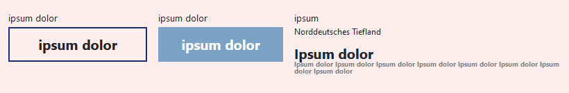
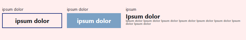
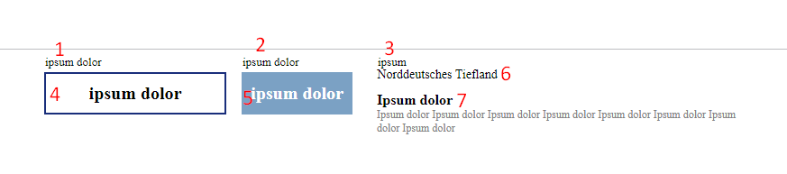
I am struggling to place div under third td (7 under 6 on the screen). The div(7) should also change its Y position depending on td(6) height.

1, 2, 4, 5, 7 change its content dynamically (it can containt <sub> & <sup> tags) and text(6) should be aligned with the top of the 4 and 5 boxes.

If 6 is empty, then 7 should be on 6 place aligned top of 4 and 5 boxes. Boxes should be the same exact width and height as on the screen (4 - ~width: 200px;, 5 - ~width: 120px;).

  • I tried to put that div inside the table, but it makes boxes ugly big.
  • Also i tried to make table inside tr of the 6 element, it is also made boxes ugly.
  • When you give the table position absolute, then the div does not change its position.

This is some complicated task i can't complete for a week already. I also tried to make rowspan and third tr, to put 7 under 6, but rowspan makes boxes big as well (like it shown here).

It is allowed to change html code. It is important to make it through CSS, because it needed for printing. And one of the biggest problem when you try to solve it with JS, is when you zoom out a window, items can change it position.

enter image description here

.detailName {
    margin-top: 10px;
}

.table-sources {
    width: 400px;
    margin-left: 40px;
    margin-top: 3px;
}

.table-wrap:first-child {
    margin-top: -10px;
}

.table-wrap {
    display: flex;
}

.table-vals {
    margin-bottom: 5px;
}

.table-vals th {
    max-width: 200px;
    text-align: left;
    font-size: 13px !important;
    font-weight: normal;
    vertical-align: top;
}

.table-vals .first-th {
    min-width: 200px;
}

.table-vals td {
    text-align: center;
    padding: 10px;
    font-size: 20px;
    font-weight: bold;
}

.table-vals .second-th {
    float: left;
    position: relative;
    left: 15px;
    width: 98px;
}

.table-vals .first-td {
    border: 2px solid #192E7B;
}

.table-vals .second-td {
    position: relative;
    left: 15px;
    background: wheat;
}

.table-vals .third-th {
    position: relative;
    left: 40px;
}

.table-vals .third-td {
    font-size: 14px;
    font-weight: normal;
    position: relative;
    left: 30px;
    top: -20px;
    text-align: left;
}

.source-link {
    word-break: break-word;
    font-size: 12px;
    color: grey;
    position: absolute;
    width: 400px;
}

.detailName {
    display: block;
}

.detailName {
    font-weight: bold;
}
<div class="tables-wrap">
  <div class="table-wrap">
    <table class="table-vals">
      <tbody>
        <tr class="first-tr">
            <th class="first-th">ipsum dolor</th>
            <th class="second-th">ipsum dolor</th>
            <th class="third-th">ipsum</th>
        </tr>
        <tr class="second-tr">
          <td class="first-td">ipsum dolor</td>
          <td class="second-td" style="background:rgb(123, 161, 196);color:white;">ipsum dolor</td>
          <td class="third-td" style="/* top:-23px; */">Norddeutsches Tiefland</td>
        </tr>
      </tbody>
    </table>
  <div class="table-sources" style="position: relative; left: -120px; top: 31px;">
    <span class="detailName">Ipsum dolor</span><span class="source-link">Ipsum dolor Ipsum dolor Ipsum dolor Ipsum dolor Ipsum dolor Ipsum dolor Ipsum dolor Ipsum dolor</span>
    </div>
  </div>
</div>
beerwin
  • 9,813
  • 6
  • 42
  • 57
Nar Jovan
  • 85
  • 10

1 Answers1

2

I've taken a stab at your requirements as I understand them, but moved out of tables (which are primarily for tabular data, which this doesn't appear to be).

The requirements: item 6 in your diagram may or may not be present. Item 7 should move up in the absence of item 6. Item 6's top (or item 7's top if 6 is absent) should align with top of items 4 and 5.

Here it is with the subTitle in place: .subTitle in place

I added a background color overall for contrast in my browser window.

If you remove the .subTitle div, item 6 in your diagram (currently containing 'Norddeutsches Tiefland') you'll see that the longer section below it (item 7 in your diagram) moves up to the top and is even with the tops of the two boxes to the left (items 4 and 5).

Here it is with the .subTitle removed: enter image description here

  * {
   box-sizing: border-box;
  }

  .table-vals {
   padding: 1rem;
   width: 900px;
   background: #FEE;
   display: flex;
   flex-direction: column;
   align-items: center;
   justify-content: center;
   margin: 2rem 0 2rem 2rem;
   font-size: 14px;
  }


  .first-row, .second-row {
   width: 100%;
   display: flex;
   flex-direction: row;
   align-items: flex-start;
   justify-content: center;
   margin-bottom: 0.2rem;
  }

  .second-row {
   height: 200px;
  }

  .table-vals .ath {
   text-align: left;
   font-size: 13px;
   font-weight: normal;
  }

  .first-column {
   display: flex;
   align-items: center;
   justify-content: flex-start;
   width: 200px;
   margin: 0 1rem 0 0;
  }

  .second-column {
   width: 180px;
   /*border: 1px solid black;*/
   display: flex;
   align-items: center;
   justify-content: flex-start;
   margin: 0 1rem 0 0;
  }

  .table-vals .atd {
   font-size: 20px;
   font-weight: bold;
   height: 50px;
  }

  .second-row .first-column {
   border: 2px solid #192E7B;
   justify-content: center;
  }

  .second-row .second-column {
   background: rgb(123, 161, 196);
   color: white;
   justify-content: center;
  }

  .third-column {
   width: 400px;
   font-size: 14px;
   font-weight: normal;
   display: flex;
   flex-direction: column;
   align-items: flex-start;
   justify-content: flex-start;
  }

  .source-link {
   word-break: break-word;
   font-size: 10px;
   line-height: 1;
   color: grey;
   position: absolute;
   width: 400px;
  }

  .detailName {
   display: block;
   font-weight: bold;
   line-height: 1;
  }

  .sources {
   width: 400px;
   line-height: 1;
  }

  .second-row .third-column .subTitle {
   font-size: 12px;
   font-weight: normal;
   line-height: 1;
   margin-bottom: 1rem;
  }
<div class="table-vals">
 <div class="first-row">
  <div class="ath first-column">ipsum dolor</div>
  <div class="ath second-column">ipsum dolor</div>
  <div class="ath third-column">ipsum</div>
 </div>
 <div class="second-row">
  <div class="atd first-column">ipsum dolor</div>
  <div class="atd second-column" style="">ipsum dolor</div>
  <div class="atd third-column"><div class="subTitle">Norddeutsches Tiefland</div>
   <div class="sources">
    <div class="detailName">Ipsum dolor</div>
    <div class="source-link">Ipsum dolor Ipsum dolor Ipsum dolor Ipsum dolor Ipsum dolor Ipsum dolor Ipsum dolor Ipsum dolor</div>
   </div>
  </div>
 </div>
</div>
  • I tried your code, when i have multiple results, boxes not aligned vertically, and second boxes not centered with first box. – Nar Jovan May 08 '20 at 12:46
  • @Nar Jovan - You did not say any of this before in your question. I am handling the data you gave, and the description you gave. If you want to change your question, or otherwise describe things that somehow allow for multiple results, great. I can answer. For example: how many of these multiple results can there be? Is there a max? Where would they go? How _should_ they look? You didn't give me any of that before. –  May 08 '20 at 21:12
  • In addition, most of the css, especially the sizing limits, should be changed to adapt to your particular case. I picked reasonable ones for the cases you described (item 6 present, or item 6 absent). They would not be reasonable if, say, item 6 could in fact be 3, or 10 items, or if item 7 is longer. –  May 08 '20 at 21:31