Clipped path render with ugly border
I want to make a web page where i picture and detail will be shown like this. But i am getting this small border in the rendered result. Please help me remove this. Thanks in advance.
This is my CSS:
.mainphoto{
border:0;
outline: none;
height:100vh;
width:100vw;
max-width: 100%;
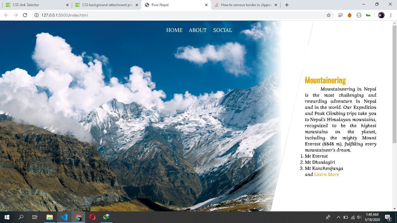
background-image:linear-gradient(to right, transparent 10%,transparent 65%,rgba(255, 255, 255, 0.568) 68%,white 72% ),url("./photos/photo-of-mountains-under-clouds-2902939.jpg");
background-repeat: no-repeat;
background-position: center;
background-size:cover;
-webkit-clip-path: polygon(0 0, 80% 0, 69% 100%, 0% 100%);
clip-path: polygon(0 0, 80% 0, 69% 100%, 0% 100%);
overflow:none;
}
This is my HTML:
<!--for image processing-->
    <div class="mainphoto">
        <div class="intro">
            <p>Namaste</p>
            <h3>PURE NEPAL WELCOMES YOU</h3>
            <p>Click on the photo for
            the caption</p>

        </div>

    </div>
    <div class="info">
        <!--box here-->
        <h3 class="infohead">Mountainering</h3>
        <div class="infobody">
            <p class="infobody">Mountaineering in Nepal is the most challenging and rewarding adventure in Nepal and in the world.
                Our Expedition and Peak Climbing trips take you to Nepal's Himalayan mountains,
                 recognized to be the highest mountains on the planet,
                including the mighty Mount Everest (8848 m), fulfilling every mountaineer's dream.
           </p>
           <ol type="1">
               <li>Mt Everest</li>
               <li>Mt Dhaulagiri</li>
               <li>Mt Kanchenjunga</li>

           </ol>
           and <a href="https://www.ruggedtrailsnepal.com/mountaineering-in-nepal">Learn More</a>
        </div>