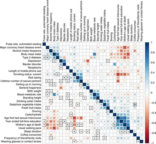
This figure seems to be generated using python seaborn. But how exactly is each box customized with different shape (star or dot) and background color (size)?
Thanks!
This figure seems to be generated using python seaborn. But how exactly is each box customized with different shape (star or dot) and background color (size)?
Thanks!
I believe the graph in question was created in the R language 'ggplot2'. stackoverflow,Correlation Heatmaps in R The Python seaborn provides the following customization examples.Better Heatmaps and Correlation Matrix Plots in Python
The process I found this answer is to search for the posted image in Google (by right-clicking on it) I'm checking out each of these sites, and I encourage you to take a look at them as well. If you've already searched and posted on our site, you're good to go.