I have a data set like this one: Names of mutations and two numerical variables representing values in two conditions (CIP and TIG):

I was able to plot one variable (e.g. CIP) in these mutation using the following code:
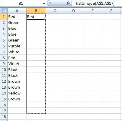
Data names as "Dotchart2)
dotchart(Dotchart2$`CIP resistance`,
   labels = rownames((Dotchart2)), pch = 16, cex = 1, pt.cex = 2)
This appeared as follows:
Since I am comparing CIP vs TIG, I would like to have the same figure but showing another dots for the TIG for the same mutation (i.e. on each horizontal mutation line, there will be two dots of different color, one for CIP value and the other for TIG value). It should appear like this figure for instance

Could any of you provide a simplified code for this ?