137

How exactly can you add Margin in Jetpack Compose?

I can see that there is a Modifier for padding with Modifier.padding(...) but I can't seem to find one for margins or am I blind?

Someone guide me please.

Thank you very much.

Archie G. Quiñones
  • 11,638
  • 18
  • 65
  • 107

9 Answers9

151

You can consider padding and margin as the same thing (imagine it as "spacing"). A padding can be applied twice (or more) in the same composable and achieve the similar behavior you would get with margin+padding. For example:

val shape = CircleShape
Text(
    text = "Text 1",
    style = TextStyle(
        color = Color.White,
        fontWeight = FontWeight.Bold,
        textAlign = TextAlign.Center),
    modifier = Modifier.fillMaxWidth()
        .padding(16.dp)
        .border(2.dp, MaterialTheme.colors.secondary, shape)
        .background(MaterialTheme.colors.primary, shape)
        .padding(16.dp)
)

Will result on this:

enter image description here

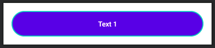
As you can see, the first padding is adding a space between the component and its border. Then the background and border are defined. Finally, a new padding is set to add space between the border and the text.

nglauber
  • 18,674
  • 6
  • 70
  • 75
  • 2
    You cannot consider margin and padding as being the same. – Marcin Orlowski Jul 17 '20 at 00:17
  • 12
    I had a long discussion with Adam Powell and Leland Richardson from UI toolkit, and quoting Leland: _"realistically, “padding” is actually just “spacing”_... So if the guy responsible to the Compose compiler/runtime is saying that, I can say so ;) – nglauber Jul 17 '20 at 00:31
  • 101
    This silly argument, because a margin is the space around an element and padding refers to the space between an element and the content inside it. One can contribute to i.e. widget clickable are, the other will not. So yes, visually it can be considered just spacing but different type of hence not **functionally** equivalent. – Marcin Orlowski Jul 17 '20 at 01:29
  • 8
    As you can see in my answer above, the first padding/spacing is acting like a margin. Then, I'm adding a border and a background. Then I'm adding another padding which acting like a padding that we're familiar with on the current UI framework. If you add a clickable modifier in this same sample, you'll notice that the area outside of the background/border is not clickable. That's why I'm saying that padding and margin are the same thing, depending where you're using it. – nglauber Jul 17 '20 at 01:38
  • 9
    @MarcinOrlowski: "because a margin is the space around an element and padding refers to the space between an element and the content inside it" -- in Compose, effectively there is no "element" in the way that you are thinking. FWIW, [this post](https://jetc.dev/slack/2020-07-05-space-by-any-other-name.html) summarizes the Slack thread that nglauber refers to and has a link to that thread, if you are interested in reading the original discussion. – CommonsWare Jul 17 '20 at 11:13
  • 3
    I still don't get it though. So If I have a button, where I wanted to add margin to. do i just add padding to it? or do I do something like `Container(modifier = Modifier.padding(16.dp) ) { Button() }`?? – Archie G. Quiñones Jul 17 '20 at 12:44
  • 1
    Just add a padding to the Button's modifier. That's why I'm saying that you think about "padding" as "spacing". And if you want the "old padding" effect on a Button, you can add a padding to the Text's modifier (the Text assigned to the "text" Button parameter). – nglauber Jul 17 '20 at 12:54
  • 1
    I see... so in other words, if I want to add padding ("old padding") to my button, I cant simply do `Button(text = "Click Me")`.. rather i have to do `Button(children = Text("Click Me, modifier = Modifier.padding(16.dp)))`. correct? – Archie G. Quiñones Jul 18 '20 at 08:28
  • 2
    Kinda... To add a padding to the "content of your button"(which means, the text), you can use `Button(text= { Text("OK", modifier=Modifier.padding(16.dp)) }, onClick={})`. Notice the `text` property is a composable. – nglauber Jul 19 '20 at 02:33
  • 2
    Ok that make sense but how about Widgets that doesn't accept a single Widget like `TopAppBar`, doing `TopAppbar(modifier = Modifier.padding(16.dp)) { ... }` add white space around the `AppBar` instead of adding it to its width and height. `TopAppBar`can have children from `title`, `navigationIcon`, `action`, etc. Who would the have the padding? – Archie G. Quiñones Jul 20 '20 at 11:56
  • 1
    Can you reference a dimens value for the padding value? – Jono Oct 13 '20 at 11:16
  • 11
    This is insane! – ericn Nov 28 '20 at 15:33
  • 2
    What about textField? Its text is not a composable, so cannot add a padding there. At the same time its background is defined not as a modifier but as a parameter "shape" which is applied before modifiers no matter what. Old padding would include the background shape, whereas margin would not. Now I only got margin, and cannot move the text around (I need for the text to sit Xdp to the right of the CircleShape start). – Nicolò Parolini Sep 16 '21 at 03:35
  • Although there are no visual differences, the bounding boxes for each view won't reflect the visible situation, as padding is contained within the view. The way I see it, this was a poor choice made by the Compose team – reavcn Sep 17 '21 at 13:41
  • I know I got here late, but for the button widget, there's a contentPadding property that works like padding in css. – Eaweb Nov 30 '21 at 15:27
  • Padding and margins aren't the same thing. The main difference is that padding is inside the View, while the margin is outside. Thus, padding will always have the same background color as the View. – Marty Miller Jul 20 '22 at 07:57
  • Your concept is correct for the View based UI, but for Compose it is wrong. Compose does not have margins, just padding, because they are the same thing depending of the order they are declared. – nglauber Jul 20 '22 at 12:06
  • **So if the guy responsible to the Compose compiler/runtime is saying that, I can say so ;)** those 2 have different meanings. One will pad a view towards inside the other will add spacing towards outside. So you basically repeat whatever "experts" say without even testing what really happens behind scenes? – Farid Feb 04 '23 at 12:38
  • @CommonsWare "I feel that it’s easier to think about either just spacing or margins + padding" they say they have considered this thoroughly yet they mentioned that the decision they came up with was a total failure with this sentence. I mean imagine you have Image with static size, once you add padding to it your image gets fucked up. I know there are workarounds but it would have been better if they thought about making development easier than hurrying to finish the cumbersome library – Farid Feb 04 '23 at 12:46
69

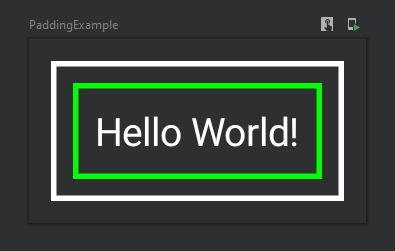
Thinking in terms of padding and margin you refer to the so-called box model that we are used to. There's no a box model in Compose but a sequence of modifiers which is applied to a given composable. The trick is that you can apply the same modifier like padding or border multiple times and the order of these matters, for example:

@Composable
fun PaddingExample() {
    Text(
        text = "Hello World!",
        color = Color.White,
        modifier = Modifier
            .padding(8.dp) // margin
            .border(2.dp, Color.White) // outer border
            .padding(8.dp) // space between the borders
            .border(2.dp, Color.Green) // inner border
            .padding(8.dp) // padding
    )
}

As the result you'll get this composable:

enter image description here

This design is well explained in the Modifiers documentation:

Note: The explicit order helps you to reason about how different modifiers will interact. Compare this to the view-based system where you had to learn the box model, that margins applied "outside" the element but padding "inside" it, and a background element would be sized accordingly. The modifier design makes this kind of behavior explicit and predictable, and gives you more control to achieve the exact behavior you want.

Valeriy Katkov
  • 33,616
  • 20
  • 100
  • 123
  • So basically it's like a Photoshop layer and modifiers are blending options! – YaMiN Mar 19 '21 at 17:47
  • I am still a little confused about Modifiers and thanks for this interesting example. I had no idea about this. – Booger Sep 10 '21 at 15:59
  • Box exists: https://developer.android.com/reference/kotlin/androidx/compose/foundation/layout/package-summary#Box(androidx.compose.ui.Modifier) – MathiasTCK Jun 20 '23 at 22:53
42

You can also use Spacer:

Spacer(modifier = Modifier.width(10.dp))

It represents an empty space layout, whose size can be defined using Modifier.width, Modifier.height and Modifier.size modifiers.

Suppose you want to add margin between 2 composables, then you can achieve it as

Text(
    text = stringResource(id = R.string.share_your_posters),
    fontSize = 16.sp,
    color = Color.Black
)

Spacer(modifier = Modifier.width(10.dp))

Image(painter = painterResource(id = R.drawable.ic_starts), contentDescription = null)
ankuranurag2
  • 2,300
  • 15
  • 30
17

The margin is different than padding, margin is the space outside the widget, where padding is the distance inside the widget, in old XML you could have decided explicitly which one to use, however the new compose way is different.

How compose treat paddings and margins?

There is an object which can be set as Parameter to the composable called Modifier, you can use this to do both margins and paddings.

Example of Padding:

    Text(
    text = "Test",
    modifier = Modifier
        .padding(16.dp)
        .clickable { }
)

Example of Margin

    Text(
    text = "Test",
    modifier = Modifier
        .clickable { }
        .padding(16.dp)
)

As you can see the order makes a difference here in compose, all the modifiers are implemented by order.

هيثم
  • 791
  • 8
  • 11
  • Hi, do you mean the first snippet is for showing Margin behavior and the latest for showing Padding behavior? – Izzuddiin May 08 '22 at 10:30
  • 1
    No the opposite, the first is for showing padding, and the second is for showing margin – هيثم May 15 '22 at 07:33
  • 2
    The first example is demonstrating margin, not padding. If you apply 'padding' first in the modifiers it affects the outside of the composable, not the inside – alfietap May 30 '22 at 13:57
  • No, the first one is for padding, because jetpack compose modifiers work in order. Padding Explanation: 1. padding modifier --> adds a padding to the widget 2. Clickable --> adds padding to the widget area which in this case includes the padding Margin Explanation: 1. Clickable --> Makes the widget clickable, here padding is not included which makes this a margin 2. Padding --> Adds padding to the widget. I hope that things are clear and well explained. – هيثم Aug 02 '22 at 06:55
6

So from what I can understand after reading the documentation there is no margin modifier as such as the API designer felt it is redundant to give something different name which essentially does the same thing.

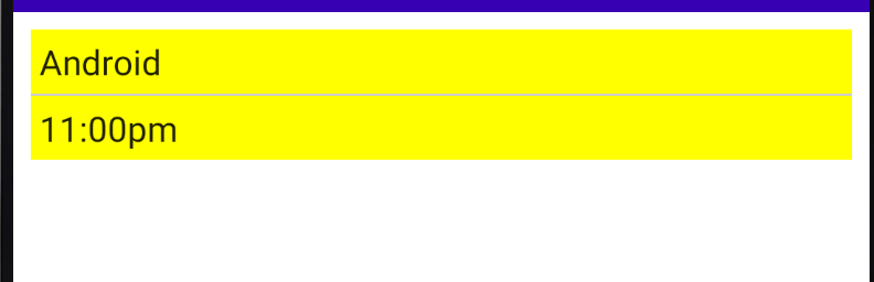
So let's say you want to apply a margin of 8dp before colouring your container with yellow background and you want the container with a padding of 4dp for the content.

Column(modifier = Modifier.padding(all = 8.dp)
                          .background(color = Color.Yellow)
                          .padding(all=4.dp)) {
        Text(text = "Android")
        ...
    }

Here in the above example you can see that I have applied the padding first and after that I have added background colour to the container and finally the last padding. And here's how it looks. Just like we intended. enter image description here

pratham kesarkar
  • 3,770
  • 3
  • 19
  • 29
4

I was also looking for something which should give me a direct option to set margin on a View like TextView. But unfortunately we don't have margin support in Jetpack compose. But the good news is we can still achieve it by using layout container like Box, which allows us to add views like TextView, ImageView etc. So you can add margin to any of the child(TextView) by using padding modifier to the parent(Box). Here is the code:

Box(Modifier.padding(10.dp)) {
    Surface(color = Color.LightGray) {
        Text(text = "Hello $text!", color = Color.Blue,
            modifier = Modifier.padding(16.dp))
    }
}

And the result is:

enter image description here

Here I have given 10.dp padding to the box. Hope it is useful.

Parmesh
  • 480
  • 4
  • 11
3

You can achieve the same effect as margin with putting your content, that has padding, inside a different composable like Box and make outer composable clickable. With this approach, inner padded areas will be included in clickable content.

Sinan Kozak
  • 3,236
  • 2
  • 26
  • 32
1

In Compose, sequence of modifiers matter.

So if you use padding before everything else, it behaves as padding. If you use padding after everything else, it behaves as margin.

enter image description here

enter image description here

anandbibek
  • 1,659
  • 16
  • 20
0

You can achieve a margin effect by using nested Surface elements with padding e.g.

@Composable
fun MainScreen() {
    Surface(color=Color.Yellow, modifier=Modifier.padding(10.dp)){
        Surface(color=Color.Magenta, modifier=Modifier.padding(30.dp)) {
            Surface(
               color = Color.Green, 
               modifier = Modifier.padding(10.dp).wrapContentSize()) {
               Text(text = "My Dummy Text", color = Color.Black)
            }
        }
    }
}
Javlon
  • 1,108
  • 2
  • 15
  • 29
Oke Uwechue
  • 314
  • 4
  • 14
  • although my solution works, it's probably simpler to just declare the _".padding()"_ instructions in the correct *order* to achieve a margin effect (see other answers above) – Oke Uwechue Jun 26 '23 at 18:02