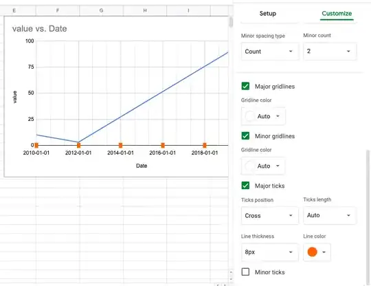
This picture can help to understand my problem. Need an orange tick.
How can draw tick related style like major tick, tick-length, position, color in react-google-charts
Asked
Active
Viewed 299 times
3
WhiteHat
- 59,912
- 7
- 51
- 133
ParagDineshGupta
- 210
- 2
- 10
-
there are no options that will do this for you, it will require some manipulation, both in the data and how the ticks are generated. both of which can be done dynamically. please share a sample of the code and data, currently used to draw the chart... – WhiteHat Sep 15 '20 at 12:53
-
https://codesandbox.io/s/fervent-montalcini-mh3hp?file=/index.js – ParagDineshGupta Sep 15 '20 at 13:10
-
If squares are close enough to your rectangular ticks, perhaps you could add a series to draw squares at the points you want. See https://developers.google.com/chart/interactive/docs/points – dlaliberte Sep 15 '20 at 14:59
-
maybe you should elaborate on what you actually need. I've already shown you how to draw the ticks, and the suggestion made by @dlaliberte will work as well. – WhiteHat Sep 17 '20 at 11:29
1 Answers
1
in the data table used to draw the chart,
we can use a hidden series with an annotation role.
data.addColumn('string', 'x');
data.addColumn('number', 'y');
data.addColumn('number', 'hidden series');
data.addColumn({type:'string', role:'annotation'});
we use a value of zero for the hidden series.
this will place the annotation on the x-axis.
and we give the annotation a value, such as 'A', so the annotation is drawn.
to draw the orange tick, and hide the annotation value,
we use the following annotation options...
annotations: {
  boxStyle: {
    fill: '#f57c00',
    stroke: '#f57c00',
    strokeWidth: 1
  },
  stem: {
    length: 0
  },
  textStyle: {
    color: 'transparent',
    fontSize: 16
  },
},
you can use fontSize to change the size of the annotation.
to prevent the hidden series from being drawn,
we use the following options...
series: {
  1: {
    color: 'transparent',
    visibleInLegend: false,
    enableInteractivity: false
  }
},
see following working snippet...
google.charts.load('current', {
  packages: ['corechart']
}).then(function () {
  var data = new google.visualization.DataTable();
  data.addColumn('string', 'x');
  data.addColumn('number', 'y');
  data.addColumn('number', 'hidden series');
  data.addColumn({type:'string', role:'annotation'});
  data.addRows([
    ['2010-01-01', 10, 0, 'A'],
    ['2012-01-01', 4, 0, 'A'],
    ['2014-01-01', 26, 0, 'A'],
    ['2016-01-01', 50, 0, 'A'],
    ['2018-01-01', 75, 0, 'A']
  ]);

  var options = {
    annotations: {
      boxStyle: {
        fill: '#f57c00',
        stroke: '#f57c00',
        strokeWidth: 1
      },
      stem: {
        length: 0
      },
      textStyle: {
        color: 'transparent',
        fontSize: 12
      },
    },
    chartArea: {
      left: 80,
      top: 56,
      right: 32,
      bottom: 80,
      height: '100%',
      width: '100%'
    },
    hAxis: {
      title: 'Date'
    },
    height: '100%',
    legend: {
      position: 'none'
    },
    series: {
      1: {
        color: 'transparent',
        visibleInLegend: false,
        enableInteractivity: false
      }
    },
    title: 'value vs. Date',
    vAxis: {
      title: 'value'
    },
    width: '100%'
  };

  var chart = new google.visualization.LineChart(document.getElementById('chart'));

  window.addEventListener('resize', function () {
    chart.draw(data, options);
  });
  chart.draw(data, options);
});
html, body {
height: 100%;
margin: 0px 0px 0px 0px;
padding: 0px 0px 0px 0px;
}
#chart {
height: 100%;
min-height: 400px;
}<script src="https://www.gstatic.com/charts/loader.js"></script>
<div id="chart"></div>EDIT
another option is to draw square points at each tick location,
as suggested by @dlaliberte
see following working snippet...
google.charts.load('current', {
  packages: ['corechart']
}).then(function () {
  var data = new google.visualization.DataTable();
  data.addColumn('string', 'x');
  data.addColumn('number', 'y');
  data.addColumn('number', 'tick series');
  data.addRows([
    ['2010-01-01', 10, 0],
    ['2012-01-01', 4, 0],
    ['2014-01-01', 26, 0],
    ['2016-01-01', 50, 0],
    ['2018-01-01', 75, 0]
  ]);

  var options = {
    chartArea: {
      left: 80,
      top: 56,
      right: 32,
      bottom: 80,
      height: '100%',
      width: '100%'
    },
    hAxis: {
      title: 'Date'
    },
    height: '100%',
    legend: {
      position: 'none'
    },
    series: {
      1: {
        color: '#f57c00',
        lineWidth: 0,
        pointSize: 12,
        pointShape: 'square',
        visibleInLegend: false,
        enableInteractivity: false
      }
    },
    title: 'value vs. Date',
    vAxis: {
      title: 'value'
    },
    width: '100%'
  };

  var chart = new google.visualization.LineChart(document.getElementById('chart'));

  window.addEventListener('resize', function () {
    chart.draw(data, options);
  });
  chart.draw(data, options);
});
html, body {
height: 100%;
margin: 0px 0px 0px 0px;
overflow: hidden;
padding: 0px 0px 0px 0px;
}
#chart {
height: 100%;
min-height: 400px;
}<script src="https://www.gstatic.com/charts/loader.js"></script>
<div id="chart"></div>
WhiteHat
- 59,912
- 7
- 51
- 133
-
In the case when chart ticks are auto-generated (not taken from other series) then the position of the orange tick will be wrong. – ParagDineshGupta Sep 15 '20 at 12:12
-
you can add rows specific for the ticks, while leaving the values for the other series `null` – WhiteHat Sep 15 '20 at 12:37
-
-
