I need to use display: inline-flex; AND flex-wrap: wrap;. These two values of flexbox I think are blocking each other. Each sentence is wrapped in span inside flexbox. If the sentence is short enough, it will be displayed next to another sentence like I want, but still following sentence won't fill the remaining space.
What I want to achieve:
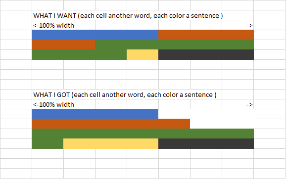
My current code:
.aligment {
    align-items: flex-start;
    display: inline-flex;
    flex-wrap: wrap;
    white-space: normal !important;
}
<html>
<head>
<meta charset="utf-8" />
<title>test</title>
</head>
<body>
<div class="aligment">
<span>1.Wihu kw jw kwjew we wekjwe w.</span>
<span>2.Wewewe jwe k ew k.</span>
<span>3.Wew w ew wl we/ wewe we we we we we we w we we.</span>
<span>4.We we we wew ewe.</span>
<span>5.Weeeeeeeeeeeeeeeeeeeeeee w ew ewe w ewe we w ew we we we we we we w ew wew w ew ew ew ew ew ew ewew ewe we ew w ewe w ew w e.</span>
<span>6.Wewewewe scawewe or.</span>
<span>7.Wewe we we </span>
<span>8.We we we </span>
</div>
</body>
</html>Before I connect the CSS the text is displayed like I wanted, breaking at full sentences and filling the spaces. After I connect .css file, the sentence is not breaking until their width is 100%.
white-space: normal !important; doesn’t work as well or basically anything I found. Maybe min-width is the answer but I haven’t figured out how to make it working. I know that this problem appears because inline-flex treats sentences really as blocks not lines.
Any ideas using css, javascript or html?
Maybe it is so obvious that no one before had problems with it, but I have and I can’t find a working solution. For example these doesn’t work: How to specify line breaks in a multi-line flexbox layout?