Im trying to create a black dashboard, so I've grabbed a css stylesheet which should make my dashboard black. From reading the documents I understand that if you create a folder named assets in the root of your app directory and include your CSS or JavaScript files in that folder. Dash will automatically serve all of the files that are included in this folder. So I have the following structure:
dashapp
    |--assets
        |-- style.css
    |--data
        |-- stockdata2.csv
    |-- app.py
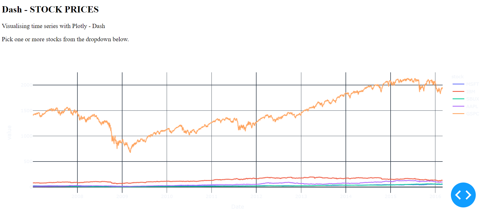
When I run my code I get the following output:
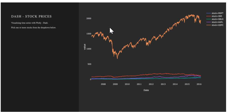
I want my desired output to be like below, so with a black layout color:
This is my code:
import dash
import dash_core_components as dcc
import dash_html_components as html

import plotly.express as px
import pandas as pd
import os

# Load data
df = pd.read_csv('c:\data\EK\Desktop\Python Microsoft Visual Studio\dashapp\data\stockdata2.csv', index_col=0, parse_dates=True)
df.index = pd.to_datetime(df['Date'])

#Initialize the application
app = dash.Dash(__name__)

#define de app
app.layout=html.Div(
    children=[
        html.Div(className='row',
            children=[
                html.Div(className='four columns div-user-controls'),
                html.Div(className='eight columns div-for-charts bg-grey'),
                html.H2('Dash - STOCK PRICES'),
                html.P('''Visualising time series with Plotly - Dash'''),
                html.P('''Pick one or more stocks from the dropdown below.'''),
                dcc.Graph(id='timeseries',
                    config={'displayModeBar': False},
                    animate=True,
                    figure=px.line(df,
                                    x='Date',
                                    y='value',
                                    color='stock',
                                    template='plotly_dark').update_layout(
                                            {'plot_bgcolor': 'rgba(0, 0, 0, 0)',
                                                'paper_bgcolor': 'rgba(0, 0, 0, 0)'})
                                    )

            ]
        )
    ]
)

#Run the app
if __name__ == '__main__':
    app.run_server(debug=True)
style.css looks like this:
/* Table of contents ––––––––––––––––––––––––––––––––––––––––––––––––––
Taken from https://codepen.io/chriddyp/pen/bWLwgP.css
- Grid
- Base Styles
 - Typography
 - Links
 - Buttons
 - Forms
 - Lists
 - Code
 - Tables
 - Spacing
 - Utilities
 - Clearing
 - Media Queries
 - Custom App CSS */


/* Grid –––––––––––––––––––––––––––––––––––––––––––––––––– */
.container {
  position: relative;
  width: 100%;
  max-width: 960px;
  margin: 0 auto;
  padding: 0 20px;
  box-sizing: border-box;
}
.column, .columns {
  width: 100%;
  float: left;
  box-sizing: border-box;
}
/* For devices larger than 400px */
@media (min-width: 400px) {
  .container {
      width: 85%;
      padding: 0;
 }
}
/* For devices larger than 550px */
@media (min-width: 550px) {
  .container {
      width: 80%;
 }
  .column, .columns {
      margin-left: 4%;
 }
  .column:first-child, .columns:first-child {
      margin-left: 0;
 }
  .one.column, .one.columns {
      width: 4.66666666667%;
 }
  .two.columns {
      width: 13.3333333333%;
 }
  .three.columns {
      width: 22%;
 }
  .four.columns {
      width: 30.6666666667%;
 }
  .five.columns {
      width: 39.3333333333%;
 }
  .six.columns {
      width: 48%;
 }
  .seven.columns {
      width: 56.6666666667%;
 }
  .eight.columns {
      width: 65.3333333333%;
 }
  .nine.columns {
      width: 74.0%;
 }
  .ten.columns {
      width: 82.6666666667%;
 }
  .eleven.columns {
      width: 91.3333333333%;
 }
  .twelve.columns {
      width: 100%;
      margin-left: 0;
 }
  .one-third.column {
      width: 30.6666666667%;
 }
  .two-thirds.column {
      width: 65.3333333333%;
 }
  .one-half.column {
      width: 48%;
 }
 /* Offsets */
  .offset-by-one.column, .offset-by-one.columns {
      margin-left: 8.66666666667%;
 }
  .offset-by-two.column, .offset-by-two.columns {
      margin-left: 17.3333333333%;
 }
  .offset-by-three.column, .offset-by-three.columns {
      margin-left: 26%;
 }
  .offset-by-four.column, .offset-by-four.columns {
      margin-left: 34.6666666667%;
 }
  .offset-by-five.column, .offset-by-five.columns {
      margin-left: 43.3333333333%;
 }
  .offset-by-six.column, .offset-by-six.columns {
      margin-left: 52%;
 }
  .offset-by-seven.column, .offset-by-seven.columns {
      margin-left: 60.6666666667%;
 }
  .offset-by-eight.column, .offset-by-eight.columns {
      margin-left: 69.3333333333%;
 }
  .offset-by-nine.column, .offset-by-nine.columns {
      margin-left: 78.0%;
 }
  .offset-by-ten.column, .offset-by-ten.columns {
      margin-left: 86.6666666667%;
 }
  .offset-by-eleven.column, .offset-by-eleven.columns {
      margin-left: 95.3333333333%;
 }
  .offset-by-one-third.column, .offset-by-one-third.columns {
      margin-left: 34.6666666667%;
 }
  .offset-by-two-thirds.column, .offset-by-two-thirds.columns {
      margin-left: 69.3333333333%;
 }
  .offset-by-one-half.column, .offset-by-one-half.columns {
      margin-left: 52%;
 }
}
/* Base Styles –––––––––––––––––––––––––––––––––––––––––––––––––– */
/* NOTE html is set to 62.5% so that all the REM measurements throughout Skeleton are based on 10px sizing. So basically 1.5rem = 15px :) */
html {
  font-size: 62.5%;
}
body {
  font-size: 1.5em;
 /* currently ems cause chrome bug misinterpreting rems on body element */
  line-height: 1.6;
  font-weight: 400;
  color: rgb(50, 50, 50);
}

/* Typography –––––––––––––––––––––––––––––––––––––––––––––––––– */
h1, h2, h3, h4, h5, h6 {
  margin-top: 0;
  margin-bottom: 0;
  font-weight: 300;
}
h1 {
  font-size: 4.5rem;
  line-height: 1.2;
  letter-spacing: -.1rem;
  margin-bottom: 2rem;
}
h2 {
  font-size: 3.6rem;
  line-height: 1.25;
  letter-spacing: -.1rem;
  margin-bottom: 1.8rem;
  margin-top: 1.8rem;
}
h3 {
  font-size: 3.0rem;
  line-height: 1.3;
  letter-spacing: -.1rem;
  margin-bottom: 1.5rem;
  margin-top: 1.5rem;
}
h4 {
  font-size: 2.6rem;
  line-height: 1.35;
  letter-spacing: -.08rem;
  margin-bottom: 1.2rem;
  margin-top: 1.2rem;
}
h5 {
  font-size: 2.2rem;
  line-height: 1.5;
  letter-spacing: -.05rem;
  margin-bottom: 0.6rem;
  margin-top: 0.6rem;
}
h6 {
  font-size: 2.0rem;
  line-height: 1.6;
  letter-spacing: 0;
  margin-bottom: 0.75rem;
  margin-top: 0.75rem;
}
p {
  margin-top: 0;
}
/* Blockquotes –––––––––––––––––––––––––––––––––––––––––––––––––– */
blockquote {
  border-left: 4px lightgrey solid;
  padding-left: 1rem;
  margin-top: 2rem;
  margin-bottom: 2rem;
  margin-left: 0rem;
}
/* Links –––––––––––––––––––––––––––––––––––––––––––––––––– */
a {
  color: #1EAEDB;
  text-decoration: underline;
  cursor: pointer;
}
a:hover {
  color: #0FA0CE;
}
/* Buttons –––––––––––––––––––––––––––––––––––––––––––––––––– */
.rc-slider-track{
  background-color: #007eff
}

.rc-slider-rail{
  background-color: #505050
}


.main-svg{
  font-family: "Open Sans Semi Bold"
}

.gtitle{
  font-family: "Open Sans Semi Bold" !important
}

.g-title{
  font-family: "Open Sans Semi Bold"
}


.button, button, input[type="submit"], input[type="reset"], input[type="button"] {
  display: inline-block;
  height: 38px;
  padding: 0 30px;
  color: #555;
  text-align: center;
  font-size: 11px;
  font-weight: 600;
  line-height: 38px;
  letter-spacing: .1rem;
  text-transform: uppercase;
  text-decoration: none;
  white-space: nowrap;
  background-color: transparent;
  border-radius: 4px;
  border: 1px solid #bbb;
  cursor: pointer;
  box-sizing: border-box;
}
.button:hover, button:hover, input[type="submit"]:hover, input[type="reset"]:hover, input[type="button"]:hover, .button:focus, button:focus, input[type="submit"]:focus, input[type="reset"]:focus, input[type="button"]:focus {
  color: #333;
  border-color: #888;
  outline: 0;
}
.button.button-primary, button.button-primary, input[type="submit"].button-primary, input[type="reset"].button-primary, input[type="button"].button-primary {
  color: #FFF;
  background-color: #33C3F0;
  border-color: #33C3F0;
}
.button.button-primary:hover, button.button-primary:hover, input[type="submit"].button-primary:hover, input[type="reset"].button-primary:hover, input[type="button"].button-primary:hover, .button.button-primary:focus, button.button-primary:focus, input[type="submit"].button-primary:focus, input[type="reset"].button-primary:focus, input[type="button"].button-primary:focus {
  color: #FFF;
  background-color: #1EAEDB;
  border-color: #1EAEDB;
}
/* Forms –––––––––––––––––––––––––––––––––––––––––––––––––– */
input[type="email"], input[type="number"], input[type="search"], input[type="text"], input[type="tel"], input[type="url"], input[type="password"], textarea, select {
  height: 38px;
  padding: 6px 10px;
 /* The 6px vertically centers text on FF, ignored by Webkit */
  background-color: #fff;
  border: 1px solid #D1D1D1;
  border-radius: 4px;
  box-shadow: none;
  box-sizing: border-box;
  font-family: inherit;
  font-size: inherit;
 /*https://stackoverflow.com/questions/6080413/why-doesnt-input-inherit-the-font-from-body*/
}
/* Removes awkward default styles on some inputs for iOS */
input[type="email"], input[type="number"], input[type="search"], input[type="text"], input[type="tel"], input[type="url"], input[type="password"], textarea {
  -webkit-appearance: none;
  -moz-appearance: none;
  appearance: none;
}
textarea {
  min-height: 65px;
  padding-top: 6px;
  padding-bottom: 6px;
}
input[type="email"]:focus, input[type="number"]:focus, input[type="search"]:focus, input[type="text"]:focus, input[type="tel"]:focus, input[type="url"]:focus, input[type="password"]:focus, textarea:focus, select:focus {
  border: 1px solid #33C3F0;
  outline: 0;
}
label, legend {
  display: block;
  margin-bottom: 0px;
}
fieldset {
  padding: 0;
  border-width: 0;
}
input[type="checkbox"], input[type="radio"] {
  display: inline;
}
label > .label-body {
  display: inline-block;
  margin-left: .5rem;
  font-weight: normal;
}
/* Lists –––––––––––––––––––––––––––––––––––––––––––––––––– */
ul {
  list-style: circle inside;
}
ol {
  list-style: decimal inside;
}
ol, ul {
  padding-left: 0;
  margin-top: 0;
}
ul ul, ul ol, ol ol, ol ul {
  margin: 1.5rem 0 1.5rem 3rem;
  font-size: 90%;
}
li {
  margin-bottom: 1rem;
}
/* Tables –––––––––––––––––––––––––––––––––––––––––––––––––– */
table {
  border-collapse: collapse;
}
th, td {
  padding: 12px 15px;
  text-align: left;
  border-bottom: 1px solid #E1E1E1;
}
th:first-child, td:first-child {
  padding-left: 0;
}
th:last-child, td:last-child {
  padding-right: 0;
}
/* Spacing –––––––––––––––––––––––––––––––––––––––––––––––––– */
button, .button {
  margin-bottom: 0rem;
}
input, textarea, select, fieldset {
  margin-bottom: 0rem;
}
pre, dl, figure, table, form {
  margin-bottom: 0rem;
}
p, ul, ol {
  margin-bottom: 0.75rem;
}
/* Utilities –––––––––––––––––––––––––––––––––––––––––––––––––– */
.u-full-width {
  width: 100%;
  box-sizing: border-box;
}
.u-max-full-width {
  max-width: 100%;
  box-sizing: border-box;
}
.u-pull-right {
  float: right;
}
.u-pull-left {
  float: left;
}
/* Misc –––––––––––––––––––––––––––––––––––––––––––––––––– */
hr {
  margin-top: 3rem;
  margin-bottom: 3.5rem;
  border-width: 0;
  border-top: 1px solid #E1E1E1;
}
/* Clearing –––––––––––––––––––––––––––––––––––––––––––––––––– */
/* Self Clearing Goodness */
.container:after, .row:after, .u-cf {
  content: "";
  display: table;
  clear: both;
}
/* Media Queries –––––––––––––––––––––––––––––––––––––––––––––––––– */
/* Note: The best way to structure the use of media queries is to create the queries near the relevant code. For example, if you wanted to change the styles for buttons on small devices, paste the mobile query code up in the buttons section and style it there. */
/* Larger than mobile */
@media (min-width: 400px) {
}
/* Larger than phablet (also point when grid becomes active) */
@media (min-width: 550px) {
}
/* Larger than tablet */
@media (min-width: 750px) {
}
/* Larger than desktop */
@media (min-width: 1000px) {
}
/* Larger than Desktop HD */
@media (min-width: 1200px) {
}
/* Custom App CSS Below --------------------------------- */
/* Main Layout ––––––––––––––––––––––––––––––––––––––––––––––––––*/
html, body{
  height: 100%;
}

body {
  background-color: #1E1E1E;
  color: #d8d8d8;
  height: 100%;
  margin: 0;
  padding: 0;
}

.react-entry-point{
  height: 100%;
}

h1, h2, h3, h4, h5 {
  font-family: "Open Sans Semi Bold";
  letter-spacing: 2.1px;
  font-size: 21px;
  padding-left: 12px;
}
p {
  font-family: "Open Sans Light";
  font-weight: 400;
  font-size: 14px;
  padding-left: 12px;
}
a {
  text-decoration: none;
}
.bg-grey{
  background-color: #31302F;
}
.text-padding{
  padding: 5px;
}
/* Graph Layout ––––––––––––––––––––––––––––––––––––––––––––––––––*/
.div-for-charts{
  display: flex;
  flex-direction: column;
  height: 100vh;
  width: 100%;
}
#histogram {
  flex-grow: 1
}
#map-graph {
  flex-grow: 2
}
.mapboxgl-canvas, .mapboxgl-map {
  min-width: 100%;
}
/* Graph Control Objects ––––––––––––––––––––––––––––––––––––––––––––––––––*/
.div-user-controls {
  padding-left: 55px;
  padding-top: 64px;
}
.div-for-dropdown {
  padding-top: 12px;
  padding-bottom: 12px;
}
.div-for-slider {
  width: 97%;
  text-align: center;
}
.logo {
  height: 50px;
  padding-bottom: 12px;
}
.Select-control, .Select-menu-outer, .Select-multi-value-wrapper, .select-up, .is-open .Select-control {
  background-color: #1E1E1E;
  color: white;

}

#modelselector .Select-control{
  max-height: 82px;
  overflow-y: auto;
  margin: 0px 0px -3px 0px;
  border: 0.5px solid #dbdbdb44;
}

.Select-control{
  border: 0.5px solid #dbdbdb44;
}

.has-value.Select--single>.Select-control .Select-value .Select-value-label, .has-value.is-pseudo-focused.Select--single>.Select-control .Select-value .Select-value-label {
  color: white;
  background: #1E1E1E;
  background-color: #1E1E1E;
}
._dash-app-content {
  overflow-x: hidden;
  overflow-y: hidden;
  position: relative;
}
.has-value.Select--single>.Select-control .Select-value .Select-value-label, .has-value.is-pseudo-focused.Select--single>.Select-control .Select-value .Select-value-labeln {
  color: #d8d8d8;
  font-weight: 400;
  font-size: 14px;
}

.Input.DateInput_1 {
  background-color: #1e1e1e;
}

#date {
  background-color: #1e1e1e;
  font-family: "Open Sans Light";
  font-weight: 400;
  color: #dbdbdb;
  border: 0.5px solid #dbdbdb44;
}

#date-picker{
  width: 100%;
}

._dash-undo-redo {
  display: none;
}

.DateInput.DateInput_1{
  width: 100%;
}

.SingleDatePickerInput__withBorder{
  border:none;
}

.DateInput.DateInput_1 {
  background-color: #1e1e1e;
}

.SingleDatePickerInput__withBorder {
  border-radius: 3px;
  color: #dbdbdb;
  background: #1e1e1e;
  background-color: #1e1e1e;
}

.SingleDatePickerInput.SingleDatePickerInput_1.SingleDatePickerInput__withBorder.SingleDatePickerInput__withBorder_2 {
  border: 0.0px solid #dbdbdb;
  display: block;
}

.SingleDatePicker_1 {
  border: 0.0px solid #dbdbdb;
  display: block;
}

.SingleDatePicker_picker, .SingleDatePicker_picker_1, .SingleDatePicker_picker__directionLeft,
.SingleDatePicker_picker__directionLeft_2{
  filter:invert(100%);
}

/* For Mobile Phones and small screens ––––––––––––––––––––––––––––––––––––––––––––––––––*/
@media only screen and (max-width: 768px) {
  .four, .eight {
      min-width: 100%;
 }
  h1, h2, h3, p {
      text-align: center;
 }
  body {
      display: block;
      margin: 0px;
      overflow-y: scroll;
  }
  .div-for-charts {
      padding: 0px;
      width: 100%;
      text-align: center;
 }

 .div-user-controls {
    padding: 32px;
 }

 .side-by-side{
    display: inline-block;
    width: 48%;
  }


 .side-by-side-right{
    display: inline-block;
    width: 48%;
    float:right;
  }
  .div-for-charts{
    margin: 0px;
  }
}

/* width */
::-webkit-scrollbar {
  width: 10px !important;
  display: block !important;
}

/* Track */
::-webkit-scrollbar-track {
  background: #1e1e1e !important;
  border-radius: 10px !important;
  display: block !important;
}

/* Handle */
::-webkit-scrollbar-thumb {
  background: transparent;
}

/* Handle on hover */
::-webkit-scrollbar-thumb:hover {
  background: #d8d8d870 !important;
}