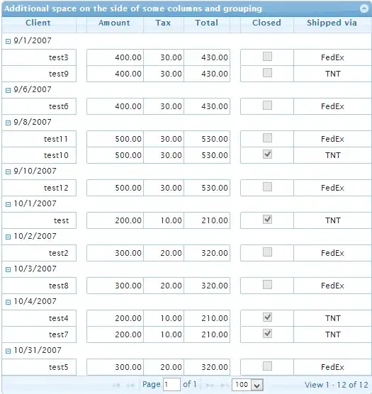
I am trying to create a plot in ggplot2 similar to this one:

Here is the code I am using:
Dataset %>%
  group_by(Participant, Group, Emotion) %>%
  ggplot(aes(y = Score, x = Emotion, fill = Group, colour = Group)) +
  geom_flat_violin(position = position_nudge(x = .2, y = 0), alpha = .4) +
  geom_point(aes(y = Score, color = Group), position = position_jitter(width = .15), size = 3, alpha = 0.4) +
  stat_summary(aes(y = Score, group = Emotion), fun.y = mean, geom="line", size = 2.2, alpha = 1.2, width = 0.25, colour = 'gray48') +
  stat_summary(fun = mean, geom = 'pointrange', width = 0.2, size = 2, alpha = 1.2, position=position_dodge(width=0.3)) +
  stat_summary(fun.data = mean_se, geom='errorbar', width = 0.25, size = 2.2, alpha = 1.2, linetype = "solid",position=position_dodge(width=0.3)) +
  guides(color = FALSE) +
  scale_color_brewer(palette = "Dark2") +
  scale_fill_brewer(palette = "Dark2") +
  ylim(0, 100) +
  graph_theme
What I am failing to do is set up the stat_summary(geom = 'line') to connect the green and orange means within each emotion on the x-axis. Could anyone give any pointers on this? I'd also like all the other features to stay the same if possible (e.g., I wouldn't like to use facet_grid or facet_wrap).
Thank you!
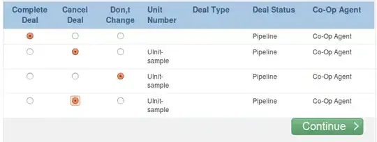
When I change the group argument in stat_summary to 'Group' instead of 'Emotion', means for each group are connected across emotions, but I can't figure out how to connect means of different groups within each emotion:

