14

To make clear what I'm asking I've created an easy example. Step one is to create some data:

gender <- factor(rep(c(1, 2), c(43, 41)), levels = c(1, 2),labels = c("male", "female"))
numberofdrugs <- rpois(84, 50) + 1
geneticvalue <- rpois(84,75)
death <- rpois(42,50) + 15
y <- data.frame(death, numberofdrugs, geneticvalue, gender)

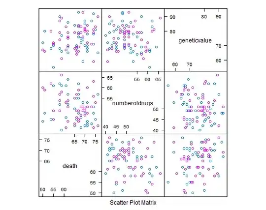
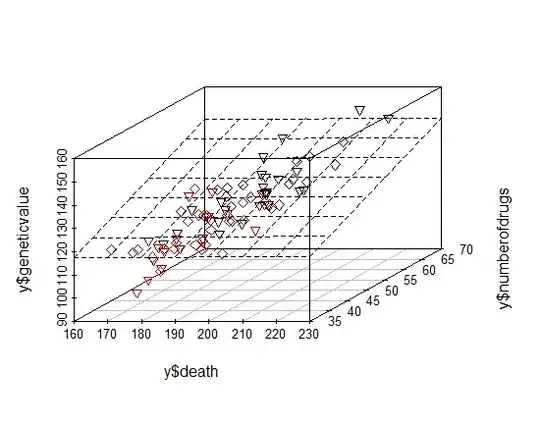
So these are some random dates merged to one data.frame. So from these dates I'd like to plot a cloud where I can differ between the males and females and where I add two simple regressions (one for females and one for males). So I've started, but I couldn't get to the point where I want to be. Please see below what I've done so far:

require(lattice)
cloud(y$death~y$numberofdrugs*geneticvalue)

cloud plot in basic form

xmale <- subset(y, gender=="male")
xfemale <- subset(y, gender=="female")

death.lm.male <- lm(death~numberofdrugs+geneticvalue, data=xmale)
death.lm.female <- lm(death~numberofdrugs+geneticvalue, data=xfemale)

How can I make different points for males or females when using the cloud command (for example blue and pink points instead of just blue crosses) and how can I add the two estimated models to the cloud graph?

Any thought is appreciated! Thanks for your ideas!

Marek
  • 49,472
  • 15
  • 99
  • 121
MarkDollar
  • 143
  • 1
  • 6

2 Answers2

18

Answer to the first half of your question, "How can I make different points for males or females when using the cloud command (for example blue and pink points insted of just blue crosses)?"

 cloud( death ~ numberofdrugs*geneticvalue , groups=gender, data=y )

grouped cloud plot

The meta-answer to this may involve some non-3d visualization. Perhaps you can use lattice or ggplot2 to split the data into small multiples? It will likely be more comprehensible and likely easier to add the regression results.

splom( ~ data.frame( death, numberofdrugs, geneticvalue ), groups=gender, data=y )

splom

The default splom panel function is panel.pairs, and you could likely modify it to add a regression line without an enormous amount of trouble.

ggplot2 does regressions within the plot matrix easily, but I can't get the colors to work.

pm <- plotmatrix( y[ , 1:3], mapping = aes(color=death) )
pm + geom_smooth(method="lm")

plotmatrix

And finally, if you really want to do a cloudplot with a regression plane, here's a way to do it using the scatterplot3d package. Note I changed the data to have a little more interesting structure to see:

numberofdrugs <- rpois( 84, 50 ) + 1
geneticvalue <- numberofdrugs + rpois( 84, 75 )
death <- geneticvalue + rpois( 42, 50 ) + 15
y <- data.frame( death, numberofdrugs, geneticvalue, gender )

library(scatterplot3d) 
pts <- as.numeric( as.factor(y$gender) ) + 4
s <-scatterplot3d( y$death, y$numberofdrugs, y$geneticvalue, pch=pts, type="p", highlight.3d=TRUE )
fit <- lm( y$death ~ y$numberofdrugs + y$geneticvalue )
s$plane3d(fit)

scatterplot3d with regression plane

Ari B. Friedman
  • 71,271
  • 35
  • 175
  • 235
  • thanks so far gsk3! BTW: Do you know how to change the colors of the points? – MarkDollar Jul 21 '11 at 12:10
  • I like your answers gsk3, but I'm still interested to visualize the to regressions (one for male, one for female) to the cloudplot. – MarkDollar Jul 22 '11 at 18:47
  • I'm not sure it supports it by default. Take a look at the panel function for cloud plots and see if you can rig it together: http://stat.ethz.ch/R-manual/R-devel/library/lattice/html/panel.cloud.html Perhaps using the panel.3dscatter and panel.3dwire panel functions overlaid? – Ari B. Friedman Jul 22 '11 at 18:52
  • Hmm I don't get this to work... Unfortunately :( I'll make a bounty and give the 100 points to you if you show me how it works! At least I just want to know how to add one linear regression (which should be an estimated layer) to the cloudplot! – MarkDollar Jul 24 '11 at 09:19
  • No bounty necessary, but appreciated anyway. I think using scatterplot3d I found a solution that works. There are some interesting options to play around with in the `type` argument. – Ari B. Friedman Jul 24 '11 at 09:33
  • Happy to help. And do consider using one of the splom/plotmatrix type of ideas alongside the 3d plot. Small multiples are very powerful (see Tufte or Gelman), and 3d plots are pretty but harder to obtain specific conclusions from. So maybe the two alongside each other would be a good complement. – Ari B. Friedman Jul 24 '11 at 12:39
17

There is nice fit visualization in car package using rgl package (openGL implementation):

require(car)
require(rgl)
scatter3d(death~numberofdrugs+geneticvalue, groups=y$gender, data=y, parallel=FALSE)

3d fit with car package

Marek
  • 49,472
  • 15
  • 99
  • 121
  • 2
    That's a nice one. I wish function names would somehow give more information about what they're doing. scatter3d vs. scatterplot3d vs. cloudplot -- and not a one gives you any clue what package it's in or why it's different from the others. – Ari B. Friedman Jul 25 '11 at 10:10