I have a little problem. I'm trying to program such a layout with HTML and CSS:
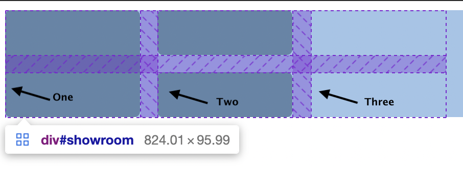
Here's the picture of what i want
I looked at this question: Flexbox 3 divs, two columns, one with two rows . The only problem is that you can't give the divs a margin without them destroying the layout.
If the left image is higher, then the two right images should use the remaining space. (There are only a few boxes that I tried to place correctly first. I wanted to do the styling privately, so do not wonder.)
Here is my code what I have tried so far (Press full page. In this little window you can only see the mobile version):
* {
  margin: 0;
  padding: 0;
}

#showroom {
  height: 500px;
  width: 100%;
  background: red; /* To see showroom Background */
  padding: 1em;
  display: flex;
}

#boxOne {
  height: 100%;
  width: 50%;
  background: grey;
  margin: 10px;
  float: left;
}

#showroom #boxTwo {
  width: 50%;
  height: 50%;
  background: grey;
  margin: 10px;
}

#showroom #boxThree {
  width: 50%;
  height: 50%;
  background: grey;
  margin: 10px;
}

@media only screen and (max-width: 750px) {
  #showroom {
    display: flex;
    align-items: center;
    flex-direction: column;
  }

  #showroom #boxOne, #showroom #boxTwo, #showroom #boxThree {
    height: 33.3%;
    width: 100%;
  }
}
<div id="showroom">
<div id="boxOne"></div>
<div id="boxTwo"></div>
<div id="boxThree"></div>
</div>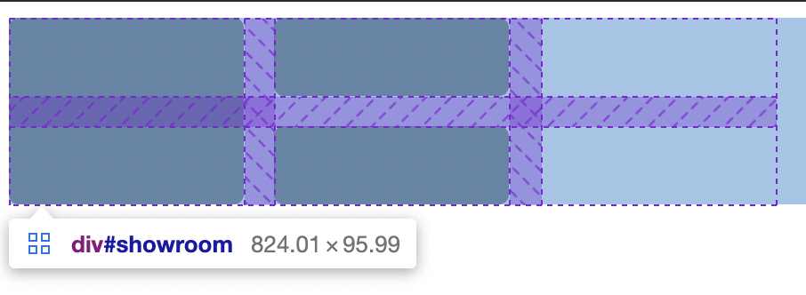