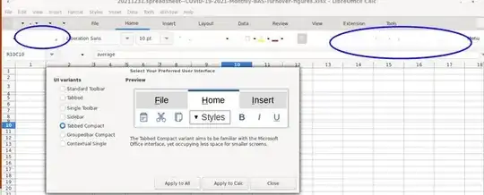
I have installed LibreOffice v7.2 and while it may be functionally OK, I am having extreme trouble actually reading toolbar-s. Here's an example screenshot:

- Note the circled areas. These are common toolbar buttons for alignment, indent, etc.
- They are so faint as to be unreadable.
- I have needed to rely on tooltips to figure-out were "common" things are located on the toolbar.
I recently upgraded from LibreOffice 6.7 and all buttons/icons were bright and legible. I can't imagine why things have gone "all faded" in this way.
I am hoping there's a stylesheet or something I can use to tweak the interface. I hope this is just me, it would be a pity if the GUI is like this out of the box.
I have been looking through help and options panels. NO luck as yet.
- I'd appreciate it if someone who recognises the situation can point me in the right direction or indentify any options that can restore readability.
- Is this a bug?
- Is this something in default config or something I've inadvertently selected to fade-out icons, etc?
- Could it be something else?