2

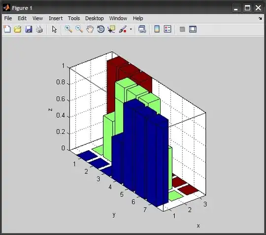
I have a daily annual energy consumption data set for a one year period. I would like to show a scatter graph of this data set separated into the four clusters which I expect exist (due to the differences of the four seasons)

I understand that matlab cluster function can do this but my statistics is very rusty and I was hoping to get some guidance into which function is the best to use

Thanks

Amro
  • 123,847
  • 25
  • 243
  • 454
Andrew
  • 21
  • 1
  • 2

1 Answers1

5

Consider the following example of hierarchical clustering applied to the Fisher Iris dataset (150 instances, each point is 4-dimensional):

%# load dataset
load fisheriris

%# Construct agglomerative clusters
NUM = 3;
D = pdist(meas, 'euclid');
T = linkage(D, 'ward');
IDX = cluster(T, 'maxclust',NUM);

%# visualize the hierarchy of clusters
figure
h = dendrogram(T, 0, 'colorthreshold',mean(T(end-NUM+1:end-NUM+2,3)));
set(h, 'LineWidth',2)
set(gca, 'XTickLabel',[], 'TickLength',[0 0])

%# plot scatter of data colored by clusters
figure
scatter3(meas(:,1),meas(:,2),meas(:,3), 100, IDX, 'filled')
xlabel SL, ylabel SW, zlabel PL

dendogram scatter

Amro
  • 123,847
  • 25
  • 243
  • 454
  • I'm using XX as shown below which is in my other question but an error "Error using ==> pdistmex Out of memory. Type HELP MEMORY for your options." NUM = 3; D = pdist(XX, 'euclid'); T = linkage(D, 'ward'); IDX = cluster(T, 'maxclust',NUM); %# visualize the hierarchy of clusters figure h = dendrogram(T, 0, 'colorthreshold',mean(T(end-NUM+1:end-NUM+2,3))); set(h, 'LineWidth',2) set(gca, 'XTickLabel',[], 'TickLength',[0 0]) %# plot scatter of data colored by clusters figure scatter3(meas(:,1),meas(:,2),meas(:,3), 100, IDX, 'filled') xlabel SL, ylabel SW, zlabel PL – Tak Aug 02 '13 at 15:12