You are trying to create a tabbed application, So I'd suggest using some sort of tab-control.
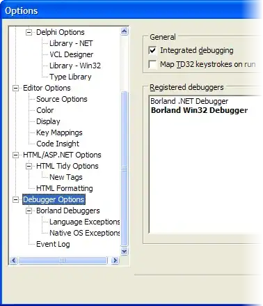
Even the Delphi default one allows you to add pictures to the tabs.
Something like this:

A few considerations:
How often is the app used?
If the app will be used very daily by your users, try to maximize usable space, i.e. make the controls as small as need be.
If the app is used rarely by your users, make the controls big and bright, label every button so things are clear, and time figuring out where is what is minimized, this also means using familiar user interface elements.
Are you targeting elephants or mice?
If you audience is computer savvy (mice), you can get away with more experiments and bling; if you are dealing with perpetual beginners you will need to stick to basic stuff.
Remember, the user interface is a contract
Make sure the controls behave as advertised. If something looks like a button make it behave like a button. Don't disguise a menu to look like a listbox/treeview.
A menu does an action (it's a hidden button), a listbox selects one item that can be acted upon.
My opinion
I dislike your initial screenshot because it tries to force a tabsheet/pagecontrol into the format of a treeview, whilst naming the items menus. This makes for a clumsy interface.
I've never seen a menu be used to switch between views, and the treeview makes for a mighty small target to hid. On top of that it allows for multiple nesting.
The tree is a concept that every programmer understands, but very few people outside that group grok, IMHO, don't use a tree in your application! and avoid the treeview.
It's a poor control to work with because:
- It allows nesting > 2 a NONO in my book;
- It is too small to hit with a mouse, even worse with a touchpad;
- What's up with the [>] sign in front, why would I want to collapse a tree with just 1 level of nesting and when I do and the [+] is visible in front of "main menu" where on earth have my submenu items gone?
I love your last version, but
- It needs text labels for every button;
- Make the vertical pagecontrol, look like some sort of tabbed sheet, this will make your intent instantly clear;
- I would love to see a statusbar;
- Glass may look cool, but having the junk from screens below shine through your app sure makes everything look busy, not a good thing if you're trying to focus on this particular app;
- Make sure to put splitters between all panels, and make sure to visually highlight the splitter by setting
beveled:= true and width/height:= 5 so you can actually hit that splitter
- The
info panel has its own caption, a huge waste of space. It's bad enough that every window has a title bar that does almost nothing, don't multiply non-interactive space.
Finally
Do as David says and buy a copy of about face, it's the best book on UI design I've seen by far. http://www.cooper.com/#about:books


