9

I have question probably similar to Fitting a density curve to a histogram in R. Using qplot I have created 7 histograms with this command:

 (qplot(V1, data=data, binwidth=10, facets=V2~.)   

For each slice, I would like to add a fitting gaussian curve. When I try to use lines() method, I get error:

Error in plot.xy(xy.coords(x, y), type = type, ...) : 
plot.new has not been called yet

What is the command to do it correctly?

Community
  • 1
  • 1
mkk
  • 7,583
  • 7
  • 46
  • 62
  • 1
    You can't mix base graphics functions (`lines()` etc) with grid graphics as used by the **gpplot2** and **lattice** packages. – Gavin Simpson Aug 24 '11 at 21:50

2 Answers2

14

Have you tried stat_function?

+ stat_function(fun = dnorm)

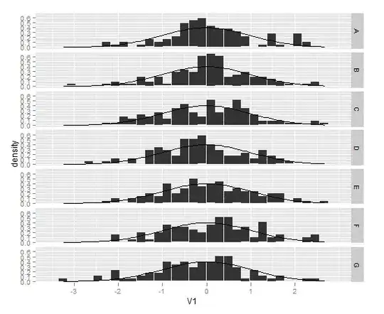
You'll probably want to plot the histograms using aes(y = ..density..) in order to plot the density values rather than the counts.

A lot of useful information can be found in this question, including some advice on plotting different normal curves on different facets.

Here are some examples:

dat <- data.frame(x = c(rnorm(100),rnorm(100,2,0.5)), 
                  a = rep(letters[1:2],each = 100))

Overlay a single normal density on each facet:

ggplot(data = dat,aes(x = x)) + 
  facet_wrap(~a) + 
    geom_histogram(aes(y = ..density..)) + 
    stat_function(fun = dnorm, colour = "red")

enter image description here

From the question I linked to, create a separate data frame with the different normal curves:

grid <- with(dat, seq(min(x), max(x), length = 100))
normaldens <- ddply(dat, "a", function(df) {
  data.frame( 
    predicted = grid,
    density = dnorm(grid, mean(df$x), sd(df$x))
  )
})

And plot them separately using geom_line:

ggplot(data = dat,aes(x = x)) + 
    facet_wrap(~a) + 
    geom_histogram(aes(y = ..density..)) + 
    geom_line(data = normaldens, aes(x = predicted, y = density), colour = "red")

enter image description here

Community
  • 1
  • 1
joran
  • 169,992
  • 32
  • 429
  • 468
  • i am very beginner in R, just have it for few days. I will take a look at it, thanks for the hint! – mkk Aug 24 '11 at 21:49
5

ggplot2 uses a different graphics paradigm than base graphics. (Although you can use grid graphics with it, the best way is to add a new stat_function layer to the plot. The ggplot2 code is the following.

Note that I couldn't get this to work using qplot, but the transition to ggplot is reasonably straighforward, the most important difference is that your data must be in data.frame format.

Also note the explicit mapping of the y aesthetic aes=aes(y=..density..)) - this is slighly unusual but takes the stat_function results and maps it to the data:

library(ggplot2)
data <- data.frame(V1 <- rnorm(700), V2=sample(LETTERS[1:7], 700, replace=TRUE))
ggplot(data, aes(x=V1)) + 
  stat_bin(aes(y=..density..)) + 
  stat_function(fun=dnorm) + 
  facet_grid(V2~.)

enter image description here

Andrie
  • 176,377
  • 47
  • 447
  • 496