103

Is there a function in R that fits a curve to a histogram?

Let's say you had the following histogram

hist(c(rep(65, times=5), rep(25, times=5), rep(35, times=10), rep(45, times=4)))

It looks normal, but it's skewed. I want to fit a normal curve that is skewed to wrap around this histogram.

This question is rather basic, but I can't seem to find the answer for R on the internet.

Gregor Thomas
  • 136,190
  • 20
  • 167
  • 294
boo-urns
  • 10,136
  • 26
  • 71
  • 107

7 Answers7

168

If I understand your question correctly, then you probably want a density estimate along with the histogram:

X <- c(rep(65, times=5), rep(25, times=5), rep(35, times=10), rep(45, times=4))
hist(X, prob=TRUE)            # prob=TRUE for probabilities not counts
lines(density(X))             # add a density estimate with defaults
lines(density(X, adjust=2), lty="dotted")   # add another "smoother" density

Edit a long while later:

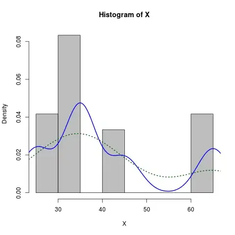
Here is a slightly more dressed-up version:

X <- c(rep(65, times=5), rep(25, times=5), rep(35, times=10), rep(45, times=4))
hist(X, prob=TRUE, col="grey")# prob=TRUE for probabilities not counts
lines(density(X), col="blue", lwd=2) # add a density estimate with defaults
lines(density(X, adjust=2), lty="dotted", col="darkgreen", lwd=2) 

along with the graph it produces:

enter image description here

Dirk Eddelbuettel
  • 360,940
  • 56
  • 644
  • 725
  • 3
    +1 - can you also do it the other way around, i.e. adjusting the density plot to fit the histogram? – vonjd Nov 14 '13 at 10:20
  • 2
    I suggest giving additional parameter to `lines(density(X,na.rm= TRUE)` as the vector may contain NA values. – Anirudh Jan 26 '14 at 04:56
  • I just added a new answer [below](https://stackoverflow.com/a/70344043/13210554) with a funciton to adjust the density plot to fit the histogram. – Dan Adams Dec 14 '21 at 07:45
34

Such thing is easy with ggplot2

library(ggplot2)
dataset <- data.frame(X = c(rep(65, times=5), rep(25, times=5), 
                            rep(35, times=10), rep(45, times=4)))
ggplot(dataset, aes(x = X)) + 
  geom_histogram(aes(y = ..density..)) + 
  geom_density()

or to mimic the result from Dirk's solution

ggplot(dataset, aes(x = X)) + 
  geom_histogram(aes(y = ..density..), binwidth = 5) + 
  geom_density()
JD Long
  • 59,675
  • 58
  • 202
  • 294
Thierry
  • 18,049
  • 5
  • 48
  • 66
30

Here's the way I do it:

foo <- rnorm(100, mean=1, sd=2)
hist(foo, prob=TRUE)
curve(dnorm(x, mean=mean(foo), sd=sd(foo)), add=TRUE)

A bonus exercise is to do this with ggplot2 package ...

Mike T
  • 41,085
  • 18
  • 152
  • 203
John Johnson
  • 538
  • 3
  • 5
  • However, if you want something that is skewed, you can either do the density example from above, transform your data (e.g. foo.log <- log(foo) and try the above), or try fitting a skewed distribution, such as the gamma or lognormal (lognormal is equivalent to taking the log and fitting a normal, btw). – John Johnson Sep 30 '09 at 13:35
  • 2
    But that still requires estimating the parameters of your distribution first. – Dirk Eddelbuettel Sep 30 '09 at 13:48
  • 1
    This gets a bit far afield from simply discussing R, as we are getting more into theoretical statistics, but you might try this link for the Gamma: http://en.wikipedia.org/wiki/Gamma_distribution#Parameter_estimation For lognormal, just take the log (assuming all data is positive) and work with log-transformed data. For anything fancier, I think you would have to work with a statistics textbook. – John Johnson Sep 30 '09 at 14:45
  • 4
    I think you misunderstand how both the original poster as well as all other answers are quite content to use non-parametric estimates -- like an old-school histogram or a somewhat more modern data-driven densisty estimate. Parametric estimates are great if you have good reason to suspect a distribution. But that was not the case here. – Dirk Eddelbuettel Sep 30 '09 at 19:25
11

Dirk has explained how to plot the density function over the histogram. But sometimes you might want to go with the stronger assumption of a skewed normal distribution and plot that instead of density. You can estimate the parameters of the distribution and plot it using the sn package:

> sn.mle(y=c(rep(65, times=5), rep(25, times=5), rep(35, times=10), rep(45, times=4)))
$call
sn.mle(y = c(rep(65, times = 5), rep(25, times = 5), rep(35, 
    times = 10), rep(45, times = 4)))

$cp
    mean     s.d. skewness 
41.46228 12.47892  0.99527 

Skew-normal distributed data plot

This probably works better on data that is more skew-normal:

Another skew-normal plot

Community
  • 1
  • 1
fmark
  • 57,259
  • 27
  • 100
  • 107
3

I had the same problem but Dirk's solution didn't seem to work. I was getting this warning messege every time

"prob" is not a graphical parameter

I read through ?hist and found about freq: a logical vector set TRUE by default.

the code that worked for me is

hist(x,freq=FALSE)
lines(density(x),na.rm=TRUE)
Matias Andina
  • 4,029
  • 4
  • 26
  • 58
0

It's the kernel density estimation, and please hit this link to check a great illustration for the concept and its parameters.

The shape of the curve depends mostly on two elements: 1) the kernel(usually Epanechnikov or Gaussian) that estimates a point in the y coordinate for every value in the x coordinate by inputting and weighing all data; and it is symmetric and usually a positive function that integrates into one; 2) the bandwidth, the larger the smoother the curve, and the smaller the more wiggled the curve.

For different requirements, different packages should be applied, and you can refer to this document: Density estimation in R. And for multivariate variables, you can turn to the multivariate kernel density estimation.

Lerner Zhang
  • 6,184
  • 2
  • 49
  • 66
0

Some comments requested scaling the density estimate line to the peak of the histogram so that the y axis would remain as counts rather than density. To achieve this I wrote a small function to automatically pull the max bin height and scale the y dimension of the density function accordingly.

hist_dens <- function(x, breaks = "Scott", main = "title", xlab = "x", ylab = "count") {
  
  dens <- density(x, na.rm = T)
  
  raw_hist <- hist(x, breaks = breaks, plot = F)
  
  scale <- max(raw_hist$counts)/max(raw_hist$density)
  
  hist(x, breaks = breaks, prob = F, main = main, xlab = xlab, ylab = ylab)
  
  lines(list(x = dens$x, y = scale * dens$y), col = "red", lwd = 2)
  
}

hist_dens(rweibull(1000, 2))

Created on 2021-12-19 by the reprex package (v2.0.1)

Dan Adams
  • 4,971
  • 9
  • 28