1

I want my images to be displayed as clear as they are displayed on my OS. What i discovered is that it doesn't matter if I specify in the html image tag the original size of the image, Firefox and Chromium will display it bigger and because of this blurrier.

Here's what is happening:

screenshot

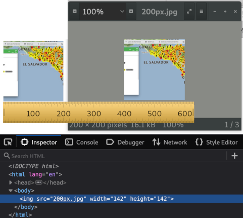
The image of the left is the image displayed on the web browser. As you can see with the pixel screen ruler it's width is 200px. The image on the right is my original image viewed with my OS image viewer at 100% size. Yo can see in the properties that the image is 200px by 200px. The thing is that I had to specify a smaller image size in the HTML in order for the browser to show it as it's original size so that it renders with no blur. You can see that my html specifies 142px width and height.

I think this browser behavior is totally wrong and it should not work like this but I don't expect this to change which is sad. So, how do you deal with this situation? Is there a way to write something in the HTML (like in the header) to make the browser render images at 100% size? How?

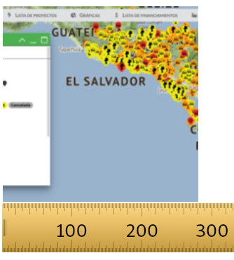
This is my "200px" image displayed on the browser in 280 pixels:

screensot

Ventolinmono
  • 361
  • 2
  • 12

4 Answers4

0

Try using this, this might work, you only need this in your HTML code.

 <img src"200px.jpg" style="width:142px;height:142px;">
ScpteR
  • 1
  • 4
  • Thank you but the inline style should be "width:200px;height:200px;" That's the real size of my image and it still displays it bigger than this. – Ventolinmono May 06 '22 at 19:17
-1

Instead of specifying the width and height in the HTML, use CSS to specify the width and height of the image. (Example below. Below that is a screenshot of that example (img highlighted by devtools.)

img {
  height: 142px;
  width: 142px;
}
<img src="http://teamcooper.co.uk/wordpress-content/uploads/2012/02/200px-HTML5-logo.svg_.png">
<!-- Note that the original dimensions of this image are 200x200 -->

screenshot of live example

AdamRaichu
  • 149
  • 1
  • 13
-1

Try using CSS so you can use this, this might solve your issue. FYI you will need to mess around with the width & height % so it fits your liking. Also, you will need to change the bottom and right numbers so they go where you want them to be on your page.

img{
  display:block;
  position:absolute;
  bottom:0;
  right:0;
  width:20%;
  height:20%;
}
ScpteR
  • 1
  • 4
  • 1
    You can use the unit "px" instead of "%" to specify pixels. Also, your answer creates more problems than it fixes, as you changes other values that weren't problematic. – AdamRaichu May 06 '22 at 18:36
  • If there is no other solution I'll look on fixing this with CSS, but I want it done in HTML. How come this ain't possible? I'm going to work in a website with lost of images and need the fix to be as straight forward and intuitive as possible, no messing around for every case. – Ventolinmono May 06 '22 at 18:41
  • CSS is an all-around better choice for styling images or anything about webpages, if you have the choice to use CSS I recommend using that instead of trying to make styles inside HTML. – ScpteR May 06 '22 at 18:46
  • Sorry, this is very important and I won't go with the first work around I get. – Ventolinmono May 06 '22 at 18:49
  • I have made a new answer using HTML this might fix your issue – ScpteR May 06 '22 at 19:08
-1

Are you sure you have your browser set to display at 100% scale? I suspect you may have the browser "zoomed", causing this to happen. On my system, doing what you are doing does display the image at the normal (200x200) size.

Dave
  • 1
  • 1
  • It's not zoomed. It's at 100%. Also checked if my monitor was scaling DPIs, it's not. At scale 1 DPIs the browser still makes images bigger. – Ventolinmono May 06 '22 at 19:19
  • Check the actual pixel size of the image with a screen ruler. Everybody's taking the word of the browser for granted when it's actually giving the size of the image but not the size at what it is being rendered. – Ventolinmono May 06 '22 at 19:31
  • I measured with a physical ruler against my screen, and the size of the image is identical to what my monitor is set to. Ie, my monitor is 20" wide, 1920 px wide, did the math, etc. As far as I've ever known, html does display the images at actual size given the simple code you're showing, and this is something specific to your browser or screen setup. – Dave May 06 '22 at 19:34
  • I've tested that simple code in three different screens with two different browsers and it enlarges it making it blurry (external monitor, laptop, tablet). The same image on the image preview of both OS's displays it correctly and clear at 100% (and it displays smaller in size). – Ventolinmono May 06 '22 at 19:55
  • That's frustrating. You have no way of posting the code and image somewhere that we can look at them directly? – Dave May 06 '22 at 20:04
  • Yes very frustrating. I don't see there's a difference in pasting the code or sharing the screenshot I already posted but here: https://codeshare.io/6pw0Lg – Ventolinmono May 06 '22 at 20:22
  • Posting the image will also help. Also, have you held a physical ruler up to your screen and done actual measurements to make sure your "pixel ruler" isn't also being scaled differently from 100%? – Dave May 06 '22 at 20:51
  • Thank you for the follow up. The screen ruler measures equally all images displayed on any program. What it shows is the actual displayed size change between my original image and the same image displayed on the browser. Posted on my question of the displayed image. – Ventolinmono May 06 '22 at 21:55