30

I am plotting a series of curves in x, y space, where each curve is identified by a scalar value z. I wish to map the z value to color for each line, but most colormaps / color tables are constructed with images in mind (e.g. on a white backround, the grayscale colormap hides one extreme of z).

The rainbow/spectral/jet colormap - which is the default in many plotting programs - is better, but suffers from poor visibility for the yellow/cyan lines on white backgrounds, and poor color contrast among the blue/cyan/green colors. Borland and Taylor further discuss this and other problems with the rainbow colormap:

Can someone recommend something better? Some aspects I'm looking for:

  1. High visibility for all colors against a white background
  2. Intuitive perceptual ordering (red-yellow-blue makes more sense than red-blue-yellow)
  3. Good chromaticity contrast between colors

Edit/update: per endolith's request, here's a simplified sample plot: sample plot with gray and jet colormaps 
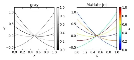
The "gray" colormap and it's relatives (starting at black and ending at white) are designed for images, however when used to plot lines or points on a white background, some will be hard to see or invisible. The "jet" colormap and it's spectral relatives typically also have a yellow, green, or other color that is hard to see on a white background.

albert
  • 8,112
  • 3
  • 47
  • 63
ryggyr
  • 3,341
  • 2
  • 20
  • 14
  • 1
    Can you include a picture of the plot you're trying to make? I'm imagining something like http://matplotlib.org/examples/pylab_examples/contour_demo.html or http://matplotlib.org/examples/mplot3d/contour3d_demo.html – endolith Nov 07 '12 at 14:58
  • 1
    @endolith included sample plot per your recommendation. – ryggyr Feb 20 '13 at 01:43
  • Similar: http://stackoverflow.com/q/13968520/125507 – endolith Apr 09 '13 at 03:03
  • 2
    Related: [Large color set for coloring of many datasets on a plot](http://graphicdesign.stackexchange.com/q/3682). – Alexey Popkov Oct 06 '13 at 07:47

6 Answers6

13

Perceptually improved colormaps has several variations of rainbow colormaps with constant luminance or luminance that increases monotonically, with some documentation at The rainbow is dead…long live the rainbow!:

Perceptually improved demo

Dave Green's `cubehelix' colour scheme is a rainbow colormap "intended to be perceived as increasing in intensity .. from black to white, deviating away from a pure greyscale (i.e. the diagonal from black to white in a colour cube) using a tapered helix in the colour cube, while ensuring a continuous increase in perceived intensity". You could cut off the white end to make it suitable for a white background.

enter image description here

CMRmap.m "we devised a colormap that preserves colors, but mixes the color components so that the black and white rendering of the colormap produces a grayscale representation that is monotonic with intensity". Again, you'd have to clip off the white end:

CMRmap demo

endolith
  • 25,479
  • 34
  • 128
  • 192
  • 2
    Thanks endolith. I was aware of the cubehelix colormap, but if used to color lines on a white background, it will suffer from invisible lines on one end of the scale, just like the grayscale colormap. – ryggyr Feb 20 '13 at 00:49
  • @ryggyr: Yes, but you can cut off the white end. You want a colormap that goes from dark to light, but they will all have this problem. – endolith Feb 20 '13 at 03:56
  • 1
    @ryggyr: Wait a second. You *don't* want a colormap that goes from dark to light. You want just dark colors. I had a very different idea of what you wanted when I answered this. – endolith Feb 21 '13 at 16:42
  • Thanks for including a reference to my Perceptually improved colormaps. Matteo, MyCarta. PS @ryggyr my submission includea a version of Kindlmann et al. 's isoluminant colormap. – MyCarta Dec 01 '14 at 17:52
  • http://stackoverflow.com/a/15623251/125507 is similar. Both answers were tailored more for heat maps, not for line plots with color-coding. – endolith Dec 01 '14 at 19:41
11

Here's the solution that I eventually used:

Kindlmann et al identified several isoluminant colors based on a face-based luminance matching study (available as html talk or pdf paper). The colors and RGB triples they found are as follows:

  1. red (0.847, 0.057, 0.057)
  2. yellow (0.527, 0.527, 0)
  3. green (0, 0.592, 0)
  4. cyan (0, 0.559, 0.559)
  5. blue (0.316, 0.316, 0.991)
  6. magenta (0.718, 0, 0.718)

Linear interpolation between these points creates a modified "isoluminant rainbow" colormap that provides better contrast with a white background than the typical rainbow colormap using fully saturated yellow and cyan. In some cases, I use only a subset of these points to interpolate the colormap (for example by dropping the green or cyan).

enter image description here

ryggyr
  • 3,341
  • 2
  • 20
  • 14
  • 2
    I like this idea, but in this form I would say it fails your point #2. As `edallme` says, multi-color rainbow maps are not discriminated well by the viewer. I think you need to stick with just two or three of these colors for any given color mapping to be intuitive. – weymouth Nov 11 '12 at 02:26
  • @weymouth I think #2 (intuitive perceptual ordering) is well satisfied by this order. Do you mean #3 (good chromaticity contrast between colors)? I'm not certain that it would be easier to determine the z-value if interpolating between 2-3 colors compared to 5-6, but perhaps you're right. – ryggyr Feb 20 '13 at 01:36
  • I think you have found a set of colors which contrast very well. I am saying that studies have shown that people don't intuitively get rainbows. Mentally inverting a mapping from a single value (z) through a rainbow of colors (R->O->Y->G->B->I->V) is hard. So people will need to continually reference your legend. Mentally mapping a single gradient (say R->B) to z is much easier. – weymouth Feb 23 '13 at 17:47
10

Rainbow/categorical color maps have been shown to be substantially worse than diverging ones for quantitative tasks. See this recent paper from InfoVis '11:

  • Michelle Borkin, Krzysztof Gajos, Amanda Peters, Dimitrios Mitsouras, Simone Melchionna, Frank Rybicki, Charles Feldman, and Hanspeter Pfister. 2011. Evaluation of Artery Visualizations for Heart Disease Diagnosis. IEEE Transactions on Visualization and Computer Graphics 17, 12 (December 2011), 2479-2488. DOI=10.1109/TVCG.2011.192 Link to PDF, Slides, and Images.

If you need a categorical scale, check out this excellent paper from CHI '12 that uses the XKCD survey dataset that talks about how we perceive differences in color. It allows you to rate a color scale by how well humans perceive the differences. Their web-based Color Palette Analyzer will let you evaluate your own color scale, too!

  • Jeffrey Heer and Maureen Stone. 2012. Color naming models for color selection, image editing and palette design. In Proceedings of the SIGCHI Conference on Human Factors in Computing Systems (CHI '12). ACM, New York, NY, USA, 1007-1016. DOI=10.1145/2207676.2208547 Link to PDF, online demos, etc.

Color Palette analysis example

edallme
  • 949
  • 5
  • 8
  • 2
    Thanks edallme. The problem with most diverging color maps is that they tend to have white or light colors in the middle or at the ends, which I was trying to avoid. The categorical scale is also not quite what I need, since I'm trying to display some quantitative information with the line color. Perhaps a quantitative colorscale constructed from colors defined by Heer and Stone would be satisfactory. – ryggyr Feb 20 '13 at 00:46
8

I would use Color Brewer for choosing colors. It gives various color palettes for maps depending on what your requirements are. The same palettes can be used for other visualizations.

Edit: Below are some more resources, but the recommended sequential colors start from a lighter color which is what you pointed out in your comment. Another option is to just copy what others are doing. For instance, the colors used in Many Eyes would probably work.

albert
  • 8,112
  • 3
  • 47
  • 63
Jay Askren
  • 10,282
  • 14
  • 53
  • 75
  • 4
    All of Color Brewer's "sequential" color schemes start from white or near-white, and the "diverging" color schemes have white or near-white in the middle, both of which won't work for plotting lines on white bg. The "qualitative" color schemes don't directly apply to sequential data, but perhaps interpolating between a selection of their suggested colors would suffice. – ryggyr Sep 02 '11 at 07:31
2

A good resource I found are the notes by Paul Tol, found here: http://www.sron.nl/~pault/

On that site you can find a few good colour palettes for plotting unordered, distinct datasets as well as diverging and rainbow colour maps for ordered data.

"To make graphics with your scientific results as clear as possible, it is handy to have a palette of colours that are:

  • distinct for all people, including colour-blind readers;
  • distinct from black and white;
  • distinct on screen and paper;
  • still match well together."
Community
  • 1
  • 1
-1

I have this problem all the time. What I usually end up doing is taking a two color sequential scheme and cutting off the excessively low saturation portion. This works as long as there are only a few lines. However, I don't love this method and I would love to hear a better suggestion...

weymouth
  • 521
  • 6
  • 17