The reason that it's overlapping with the navigation bar that the MaterialDatePicker defaults to a full-screen unless there is a customized style, like in this answer. But that is not what you want either as it will be like a floating dialog.
To fix this, you'd change the picker window to not fit its content view to the window insets by passing true to WindowCompat.setDecorFitsSystemWindows. Please check documentation for more clarification.
But, this also affects the top inset of the status bar, so now it will look like transparent; so you have to change its color to match with that of the picker head background.
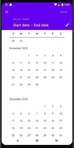
Here is a demo:
val picker = MaterialDatePicker.Builder.dateRangePicker().build()
picker.show(supportFragmentManager, "tag")

// Delay is used to give the dialog a chance to build as it would
// return null unitl it's shown. MaterialDatePicker is a final class;
// so, this wouldn't be embedded in a custom extended class.
Handler(Looper.getMainLooper()).postDelayed({
    picker.dialog?.window?.apply {
        WindowCompat.setDecorFitsSystemWindows(this, true)
        statusBarColor = ResourcesCompat.getColor(resources,
                                    R.color.purple_500,  /* default dialog head color */
                                    null)
    }
}, 100)
