8

Please Consider:

dalist={{21, 22}, {26, 13}, {32, 17}, {31, 11}, {30, 9}, 
        {25, 12}, {12, 16}, {18, 20}, {13, 23}, {19, 21}, 
        {14, 16}, {14, 22}, {18,22}, {10, 22}, {17, 23}}


ScreenCenter = {20, 15}

FrameXYs = {{4.32, 3.23}, {35.68, 26.75}}

Graphics[{EdgeForm[Thick], White, Rectangle @@ FrameXYs, 
          Black, Point@dalist, Red, Disk[ScreenCenter, .5]}]

enter image description here

What I would like to do is to compute, for each point, its angle in a coordinate system such as :

enter image description here

Above is the Deisred output, those are frequency count of point given a particular "Angle Bin". Once I know how to compute the angle i should be able to do that.

500
  • 6,509
  • 8
  • 46
  • 80

3 Answers3

12

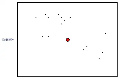
Mathematica has a special plot function for this purpose: ListPolarPlot. You need to convert your x,y pairs to theta, r pairs, for instance as follows:

ListPolarPlot[{ArcTan[##], EuclideanDistance[##]} & @@@ (#-ScreenCenter & /@ dalist), 
          PolarAxes -> True, 
          PolarGridLines -> Automatic, 
          Joined -> False, 
          PolarTicks -> {"Degrees", Automatic}, 
          BaseStyle -> {FontFamily -> "Arial", FontWeight -> Bold,FontSize -> 12}, 
          PlotStyle -> {Red, PointSize -> 0.02}
]

enter image description here


UPDATE

As requested per comment, polar histograms can be made as follows:

maxScale = 100;
angleDivisions = 20;
dAng = (2 \[Pi])/angleDivisions;

Some test data:

(counts = Table[RandomInteger[{0, 100}], {ang, angleDivisions}]) // BarChart

enter image description here

ListPolarPlot[{{0, maxScale}}, 
    PolarAxes -> True, PolarGridLines -> Automatic, 
    PolarTicks -> {"Degrees", Automatic}, 
    BaseStyle -> {FontFamily -> "Arial", FontWeight -> Bold, FontSize -> 12}, 
    PlotStyle -> {None}, 
    Epilog -> {Opacity[0.7], Blue, 
               Table[
                 Polygon@
                  {
                   {0, 0}, 
                   counts[[ang + 1]] {Cos[ang dAng - dAng/2],Sin[ang dAng- dAng/2]}, 
                   counts[[ang + 1]] {Cos[ang dAng + dAng/2],Sin[ang dAng+ dAng/2]}
                  },   
                 {ang, 0, angleDivisions - 1}
               ]}
]

enter image description here

A small visual improvement using Disk sectors instead of Polygons:

ListPolarPlot[{{0, maxScale}}, 
    PolarAxes -> True, PolarGridLines -> Automatic, 
    PolarTicks -> {"Degrees", Automatic}, 
    BaseStyle -> {FontFamily -> "Arial", FontWeight -> Bold, 
    FontSize -> 12}, PlotStyle -> {None}, 
    Epilog -> {Opacity[0.7], Blue, 
               Table[
                 Disk[{0,0},counts[[ang+1]],{ang dAng-dAng/2,ang dAng+dAng/2}],       
                 {ang, 0, angleDivisions - 1}
               ]
              }
]

enter image description here

A clearer separation of the 'bars' is obtained with the addition of EdgeForm[{Black, Thickness[0.005]}] in the Epilog. Now the numbers marking the rings still have the unnecessary decimal point trailing them. Following the plot with the replacement /. Style[num_?MachineNumberQ, List[]] -> Style[num // Round, List[]] removes those. The end result is:

enter image description here

The above plot can also be generated with SectorChart although this plot is primarily intended to show varying width and height of the data, and isn't fine-tuned for plots where you have fixed-width sectors and you want to highlight directions and data counts in those directions. But it can be done by using SectorOrigin. The problem is I take it that the midpoint of a sector codes for its direction so to have 0 deg in the mid of a sector I have to offset the origin by \[Pi]/angleDivisions and specify the ticks by hand as they get rotated too:

SectorChart[
   {ConstantArray[1, Length[counts]], counts}\[Transpose], 
   SectorOrigin -> {-\[Pi]/angleDivisions, "Counterclockwise"}, 
   PolarAxes -> True, PolarGridLines -> Automatic, 
   PolarTicks -> 
    {
     Table[{i \[Degree] + \[Pi]/angleDivisions, i \[Degree]}, {i, 0, 345, 15}], 
     Automatic
    }, 
   ChartStyle -> {Directive[EdgeForm[{Black, Thickness[0.005]}], Blue]},
   BaseStyle -> {FontFamily -> "Arial", FontWeight -> Bold, 
   FontSize -> 12}
 ]

enter image description here

The plot is almost the same, but it is more interactive (tooltips and so).

Sjoerd C. de Vries
  • 16,122
  • 3
  • 42
  • 94
  • Thank You Sjoerd, is there such thing as a polar histogram ? – 500 Sep 14 '11 at 19:11
  • http://t0.gstatic.com/images?q=tbn:ANd9GcTQrKELoYtiEuAElJwl6ocF60URjADZNW1KrFQ8q4npE3mxtMWP – Dr. belisarius Sep 14 '11 at 20:15
  • @belisarius Close, but no cigar ;-) – Sjoerd C. de Vries Sep 14 '11 at 20:33
  • @Simon Yep! I saw that one some time ago. I never understood the 250 upvotes for drawing a batfunction:) – Dr. belisarius Sep 14 '11 at 22:58
  • @Simon but there are a lot of highly voted answers [`beyond my comprehension`](http://stackoverflow.com/questions/3956478/understanding-randomness/3956538#3956538) – Dr. belisarius Sep 14 '11 at 23:08
  • @belisarius: Show off! It was a good answer and obviously useful to programmers who haven't seen the basic maths. – Simon Sep 14 '11 at 23:13
  • @Simon But just compare the conceptual problems discussed there with any good Leonid's (as an example) answer ... it's a shame – Dr. belisarius Sep 14 '11 at 23:17
  • @belisarius an excellent point, as a general statement. on the other hand, what you demonstrate there is hardly a trivial observation (and is not easy to grasp; once grasped it is trivial, but then again, everything is after you understand it--by definition!) – acl Sep 14 '11 at 23:53
  • @Sjoerd, Please see the Edit, could you tell me what I am doing wrong why the point in upper left are represented in lower right ? How could I get the polar plot to match the plot I have shown ? – 500 Sep 15 '11 at 03:33
  • @500 The code I gave is for angles results sorted from 0 to 2 pi whereas you have the angles going from -pi to +pi. If you want to use my function unedited you'll have to `RotateRight` your dataset so that it starts with angle 0. Alternatively, you can subtract pi from the angles in my code. BTW I think you should use the Disk version of the plot. The more I see the Polygon version the more I think it's ugly. (it's the flat top together with the rings that creates an illusion of the top bending inwards). – Sjoerd C. de Vries Sep 15 '11 at 08:12
  • @Sjoerd, check this out. Do you see any potential/way in/of adapting this ? : SectorChart[RandomReal[10, {10, 2}], PolarAxes -> True, PolarGridLines -> Automatic, PolarTicks -> {Drop[Table[i, {i, 0, 2 Pi, Pi/3}], -1], Automatic}] – 500 Sep 17 '11 at 00:58
  • @500 I'd looked at that before and thought it would't work as the primary input seemed to be width and height of the sectors, not direction. But I now realize that you can do this with the option SectorOrigin. I'll come up with an example asap – Sjoerd C. de Vries Sep 17 '11 at 07:35
  • @Sjoerd, Thank you, once again, very much ! – 500 Sep 17 '11 at 15:50
  • @Sjoerd, I am sorry I spent hours trying to make it work with my data but each time the binning goes wrong. RotateRight does not work, neither does Reverse. I am sorry, but could you make your exemple starting with coordinate and not Bins ? I am literally going insane, I don`t understand what goes wrong :-( – 500 Sep 17 '11 at 17:44
  • @Sjoerd, It is hard I cannot tell myself I won`t use your plot. They look so good, however each time I try I fail to get those straight. What I don`t understand is that Arctan gives us result from -Pi to Pi and I could not find any source telling me how to go from this to 0-2Pi ? – 500 Sep 17 '11 at 18:02
  • @500 You should know that angles remain the same when a multiple of 2 pi is added. So an angle of -pi/2 is also 3/2 pi. Another point is that I have the first sector centred around zero degrees whereas you end one at zero and start one at zero. Anyway, the following should work for you: – Sjoerd C. de Vries Sep 17 '11 at 21:23
  • @500 Using your previous definition of c1: `ListPolarPlot[{{0, maxScale}}, PolarAxes -> True, PolarGridLines -> {Automatic, {1, 2, 3, 4}}, PolarTicks -> {"Degrees", {1, 2, 3, 4}}, BaseStyle -> {FontFamily -> "Arial", FontWeight -> Bold, FontSize -> 12}, PlotStyle -> {None}, Epilog -> {Opacity[0.5], Blue, EdgeForm[{Black, Thickness[0.005]}], Table[Disk[{0, 0}, c1[[ang + 1]], {ang dAng - \[Pi], ang dAng - \[Pi] + dAng}], {ang, 0, angleDivisions - 1}]}] /. Style[num_?MachineNumberQ, List[]] :> Style[num // Round, List[]]` – Sjoerd C. de Vries Sep 17 '11 at 21:24
  • @Sjoerd, thank you very much, sorry I did not know if you were around and wanted to see the result of this plot so much. I believe this is one of my best plot. – 500 Sep 17 '11 at 21:32
5

That seems to be the polar coordinate system. The Cartesian-to-polar conversion formulas are in that same article:

enter image description here

This returns the angle in radians.

Blender
  • 289,723
  • 53
  • 439
  • 496
  • 5
    To add to Blender's answer, use the two parameter form of [`ArcTan`](http://reference.wolfram.com/mathematica/ref/ArcTan.html) as it automatically accounts for the quadrant. – rcollyer Sep 14 '11 at 16:25
  • Thank You, What would be the best way to set ScreenCenter = {20, 15} as my origin for the conversion ? – 500 Sep 14 '11 at 17:41
  • 1
    Replace all the `y`s with `y + ScreenCenter.y` and do similarly for `x`. – Blender Sep 14 '11 at 22:33
5

This

N@ArcTan[#[[1]], #[[2]]] & /@ (# - ScreenCenter & /@ dalist)

returns the list of angles of the ray from ScreenCenter to each point, in radians and between -pi and pi.

That is, I assumed you want the angle between each point in your plot and the red dot.

Note the use of ArcTan[x,y] rather than ArcTan[y/x], which automatically chooses the appropriate sign (otherwise you'd have to do it by hand, as in @Blender's answer).

acl
  • 6,490
  • 1
  • 27
  • 33
  • I am sorry I am going crazy. When i try to implement with you solution or Sjoerd and can`t draw hi histogram with either on my actual data the quadrant are visually wrong. I am so confused, could you show me an example ? For me Upper left if down right, Upper Right, down left. – 500 Sep 15 '11 at 03:17
  • @500 I don't understand what you are asking! What is "implement" here? Did you understand that these are angles, in radians, from -pi to pi and measured from the x-axis? – acl Sep 15 '11 at 09:56