17

I've got a series of dynamically created divs of varying heights in a container div.

<div id="container">
  <div id='d1'>Varying text...</div>
  <div id='d2'>Varying text...</div>
  <div id='d3'>Varying text...</div>
  <div id='d4'>Varying text...</div>
  <div id='d5'>Varying text...</div>
  <div id='d6'>Varying text...</div>
  <div id='d7'>Varying text...</div>
</div>

flow.jpg

When I "float: left" the divs wrap as expected leaving white space between the shorter divs and the next row of divs.

flow2.jpg

How would I get the divs to effectively "float: up", wrapping veritcally rather than horizonatally. Using only css.

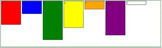
Ideally, item 2 would be under item 1 but any improvement would help.

So it would end up looking like this

enter image description here

Josh Crozier
  • 233,099
  • 56
  • 391
  • 304
DanielEli
  • 3,393
  • 5
  • 29
  • 36

5 Answers5

13

Try using jQuery Masonry. It could be a great fix for this.

http://masonry.desandro.com/

Or try Isotope, which has much better performance

http://isotope.metafizzy.co/

brenjt
  • 15,997
  • 13
  • 77
  • 118
  • Wow, this looks perfect. I hope the learning curve isn't to steep. thx! – DanielEli Sep 21 '11 at 12:44
  • can't we do with out using a jquery plugin. Because my web page is facing several issues like lazy loading and performance related. I used masonry but it doesn't seem to work in IE8. – Ramaraju.d Jan 05 '13 at 11:55
  • @Ramaraju.d try [isotope](http://isotope.metafizzy.co/) it has way better performance – brenjt Nov 25 '13 at 23:37
3

If you want the divs to stack vertically in all browser agents, you'll need to wrap each 'section' in a containing element. Here's an example of what I mean.

the css

// let's reset our elements
.site-container,
.element-container,
.my-element {
    margin: 0;
    padding: 0;
}
.site-container {
    display: block;
    width: 960px;
    margin: 0 auto; /* centers your site container on the page */
    clear: both; /* basic float clearing */
}
.element-container {
    display: inline-block;
    float: left;
    width: 300px; /* we'll have 3 sections width 10px spacing */
    margin-right: 10px;
}
.element-container.last {
    margin-right: 0;
}
.my-element {
    width: 280px; /* 300 - 20px [total padding] = 280px */
    margin-bottom: 10px; /* add a bottom margin */
    padding: 10px; /* makes our element 320px wide */
}

// make background-color classes
.bg-red {
    background-color: #ff0000;
}
.bg-blue {
    background-color: #3b8acd;
}

the markup

<html>
<head>
<title>Vertical boxes!</title>
</head>
<body>
    <div class="site-container">

        <div class="element-container">
            <div class="my-element bg-red">
                1
            </div>

            <div class="my-element bg-blue">
                2
            </div>
        </div><!-- /element-container -->

        <div class="element-container">
            <div class="my-element bg-blue">
                3
            </div>

            <div class="my-element bg-red">
                4
            </div>
        </div><!-- /element-container -->

        <div class="element-container last">
            <div class="my-element bg-red">
                5
            </div>

            <div class="my-element bg-blue">
                6
            </div>
        </div><!-- /element-container -->

    </div><!-- /site-container -->    
</body>
</html>

As far as the seventh div you have, I would suggest making it span across the entire site-container. It's aesthetically pleasing :)

  • yeah, that makes sense but because the blocks are of text of varying length I don't know how many will fit in a given height. So I'm looking for a way for them to "flow" to the next column. html does this so well horizontally, but seems to be missing key functions to do it vertically. – DanielEli Sep 21 '11 at 12:42
2

You should try placing each column of div's into it's own container, and float them left. For example:

<div id='container'>
    <div id='col1'>
        <div id='d1'>asdf</div>
        <div id='d2'>asdf</div>
    </div>
    <div id='col2'>
        <div id='d3'>asdf</div>
        <div id='d4'>asdf</div>
    </div>
</div>

etc, etc.

each column floats left against one another and each item in the columns flows vertically quite well... here's an example: http://jsfiddle.net/V6z8F/

Dan
  • 3,750
  • 5
  • 24
  • 38
  • Thanks for the tip, but I don't know how tall the inner divs are so I don't know how many will fit in a given column – DanielEli Sep 21 '11 at 12:43
1

Recently I did this for my project.

Add CSS for the parent class:

-webkit-column-count: 4;
-moz-column-count: 4;
column-count: 4;

Example:

<div class="parent">
  <div class="child"></div> 
</div>
Toby Speight
  • 27,591
  • 48
  • 66
  • 103
0

Two alternatives to Masonry that work very well:

Salvattore (CSS driven): http://salvattore.com/

Isotope: http://isotope.metafizzy.co/index.html

Charles Ingalls
  • 4,521
  • 5
  • 25
  • 33