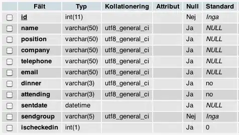
I have data that looks like this:
After running the following code:
axx <- list(
  nticks = 3,
  tickvals = c(0,1,2),
  ticktext = c("AA", "Aa", "aa"),
  title = "SNP2 Genotype")

axy <- list(
  nticks = 3,
  tickvals = c(0,1,2),
  ticktext = c("AA", "Aa", "aa"),
  title = "SNP3 Genotype")

axz <- list(
  nticks = 7,
  tickvals = c(0,1,2,3,4,5,6),
  ticktext = c("1", "2", "3", "4", "5", "6"),
  title = "BMI with Tail")

plot_ly(Add3W_T, x = ~SNP2, y = ~SNP3, z = ~phenotype, type = 'scatter3d', mode = 'lines', opacity = 1, color = ~Geno_color,
        line = list(width = 14, color = ~Geno_color, showspikes=FALSE)) %>%
  layout(scene = list(xaxis = axx, yaxis = axy, zaxis = axz),
         title = list(text = "3D Reaction Norms - Additive"),
         legend = list(title = list(text = "SNP1 Genotype")))
I get this:
I want to get rid of the connecting lines between the different colored lines (the ones that are a gradient from one color to another) As they are just distracting.

