Detailed to the point answer
Create a color resource in
res/values/colors.xml
<?xml version="1.0" encoding="utf-8"?>
<resources>


    <item name="yellow" type="color">#F7B500</item>
    <item name="yellow_dark" type="color">#AC7E00</item>

    <integer-array name="androidcolors">
        <item>@color/yellow</item>
        <item>@color/yellow_dark</item>
    </integer-array>

</resources>
Create a drawable at
res/drawable/bg_yellow_round.xml
<?xml version="1.0" encoding="utf-8"?>
<shape xmlns:android="http://schemas.android.com/apk/res/android"
    android:shape="rectangle" >

    <solid android:color="@color/yellow" />

    <stroke
        android:width="2dp"
        android:color="@color/yellow" />

    <corners
        android:bottomLeftRadius="20dp"
        android:bottomRightRadius="20dp"
        android:topLeftRadius="20dp"
        android:topRightRadius="20dp" />

</shape>
Create another drawable, you want for transition at same place and name it
res/drawable/bg_yellow_dark_round.xml
<solid android:color="@color/yellow_dark" />

<stroke
    android:width="2dp"
    android:color="@color/yellow_dark" />

<corners
    android:bottomLeftRadius="20dp"
    android:bottomRightRadius="20dp"
    android:topLeftRadius="20dp"
    android:topRightRadius="20dp" />
Now create a color state list at
res/color/btn_selector_yellow.xml
<?xml version="1.0" encoding="utf-8"?>
<selector xmlns:android="http://schemas.android.com/apk/res/android" android:exitFadeDuration="@android:integer/config_shortAnimTime">

    <item android:drawable="@color/yellow" android:state_focused="true" android:state_pressed="false"/>
    <item android:drawable="@drawable/bg_yellow_dark_round" android:state_pressed="true"/>
    <item android:drawable="@drawable/bg_yellow_round"/>

</selector>
Now set it to your button as following
<Button
                android:id="@+id/button1"
                android:layout_width="248dp"
                android:layout_height="44dp"
                android:layout_gravity="center_horizontal"
                android:layout_marginBottom="10dp"
                android:layout_marginTop="20dp"
                android:background="@color/btn_selector_yellow"
                android:text="AZ_ is so cool" />
Now this will do transition from 
to
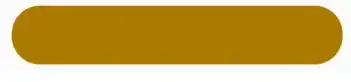 .
.