I have such type of the data:
head(data,10)
   Ratio Wealthness Cash Quality Variants
1      A          A    E       G        r
2      D          B    A       C        u
3      C          B    C       E        s
4      A          C    E       A        s
5      D          B    A       D        y
6      C          B    D       D        x
7      B          C    D       D        v
8      D          C    C       D        y
9      B          C    B       A        x
10     A          A    D       G        u
And created a combined plot adapting the solution by Rui Barradas provided to my previous question :
library(ggplot2)
library(tidyr)

color_clrs <- c(
    A = "white",
    B = "black",
    C = "black",
    D = "white",
    E = "black",
    F = "white",
    G = "white"
)

fill_clrs <- c(
    A = "#1f3560",
    B = "#B0C4DE",
    C = "#f2f3f3",
    D = "#ff0000",
    E = "#A9A9A9",
    F = "#B22222",
    G = "#1E90FF"
)

ggplot(data %>% pivot_longer(-Variants), aes(Variants, fill = value)) +
    geom_bar(position = "fill") +
    geom_text(stat = "count", aes(label = after_stat(count), color = value),
              position = position_fill(vjust = 0.5), show.legend = FALSE) +
    facet_wrap(~name) +
    scale_x_discrete(limit = rev) +
    scale_y_continuous(trans = "reverse") +
    scale_fill_manual(values = fill_clrs) +
    scale_color_manual(values = color_clrs) +
    coord_flip() +
    theme_classic() +
    theme(legend.position = "top",
          axis.ticks.x = element_blank(),
          axis.text.x = element_blank())
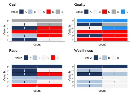
The output:

My question how to make separate legend with colors and groups (A-E) to each column? It is not real data example in this question, in reality some groups can be 1 to 1000 and it's even difficult to spot color in such cases. Or it can be that only to one time some letter appeared for all variants under the variable, so it will be more understandable if there would be seen what groups can be for that variable.