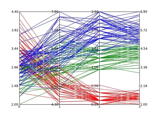
I was reproducing results from a paper and I came across this plot with these colors. I want to reproduce this plot, but I could not figure out how.
Here is my current code:
fig = plt.figure()
ax = fig.add_subplot(111, projection='3d')
x = np.array(range(0, 16), float)
y = x.copy()
xpos, ypos = np.meshgrid(x, y)
z = np.array(m).reshape(-1)
xpos = xpos.flatten()
ypos = ypos.flatten()
zpos = np.zeros_like(xpos)
dx = 0.75 * np.ones_like(zpos)
dy = dx.copy()
dz = z.flatten() # This is the actual data.
fig = plt.figure()
ax = fig.add_subplot(111,projection = '3d')
ax.bar3d(xpos, ypos, zpos, dx, dy, dz,
     shade=True
        )
title = titles[t]
t += 1
ax.title.set_text(r"{w}".format(w=title))
plt.show()
which outputs the following plot:
What parameters should I add/change to make it look like the plot from the paper?


