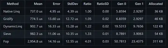
I'll start with some sample data:
set.seed(42)
data <- data.frame(lapply(setNames(nm=letters[1:4]), function(ign) runif(100, 1, 10)))
head(data)
#          a        b        c        d
# 1 9.233254 6.636208 8.966059 5.353913
# 2 9.433679 2.954419 5.653999 5.001126
# 3 3.575256 2.949106 8.667379 1.543470
# 4 8.474029 4.500505 4.985166 3.947554
# 5 6.775710 9.482101 2.420921 8.905861
# 6 5.671864 9.663472 4.980922 9.375444
The docs for boxplot includes
named arguments are arguments and graphical parameters to be passed to bxp ...
which, while not clear on what is available, does suggest one read bxp, which includes:
          Currently, ‘yaxs’ and ‘ylim’ are used ‘along the boxplot’,
          i.e., vertically, when ‘horizontal’ is false, and ‘xlim’
          horizontally.  ‘xaxt’, ‘yaxt’, ‘las’, ‘cex.axis’, ‘gap.axis’,
          and ‘col.axis’ are passed to axis, and ‘main’, ‘cex.main’,
          ‘col.main’, ‘sub’, ‘cex.sub’, ‘col.sub’, ‘xlab’, ‘ylab’,
          ‘cex.lab’, and ‘col.lab’ are passed to title.
Unfortunately, we can't control the y-axis much more with this, so we use yaxt="n" to suppress the automatic formatting of the y axis (see ?par and read about "xaxt" and "yaxt"). From there, we can use axis(...) ourselves.
boxplot(log(data[,2:4]), yaxt = "n")
axis(2, at = axTicks(2), labels = round(exp(axTicks(2)), 2), las = 1)

One might argue that the decimal axis ticks is not ideal, we can also bring in axisTicks:
boxplot(log(data[,2:4]), yaxt = "n")
ax <- axisTicks(exp(par("usr")[3:4]), log = FALSE)
axis(2, at = log(ax), labels = ax, las = 1)
As an aside, one could also use ggplot2, though it is very different from base graphics. First of all, it really benefits from "long" data, namely changing from the "wide" form of this data to
datalong <- reshape2::melt(data, id.vars=c())
head(datalong,3); tail(datalong,3)
#   variable    value
# 1        a 9.233254
# 2        a 9.433679
# 3        a 3.575256
#     variable    value
# 398        d 9.162482
# 399        d 5.961255
# 400        d 1.680392
For this, we can have some fun:
library(ggplot2)
ggplot(datalong, aes(variable, value)) +
  geom_boxplot() +
  coord_trans(y = "log")
(Oops, I didn't continue my example of omitting the first column ... which was really only useful to try to remain consistent with your original code. FYI, if you want/need help in this reshape2::melt operation, I suggest you visit Reshaping data.frame from wide to long format, Transforming wide data to long format with multiple variables. There are countless references, Q/As, and other places to learn about ggplot2; I often use https://r-graph-gallery.com for good examples.)


