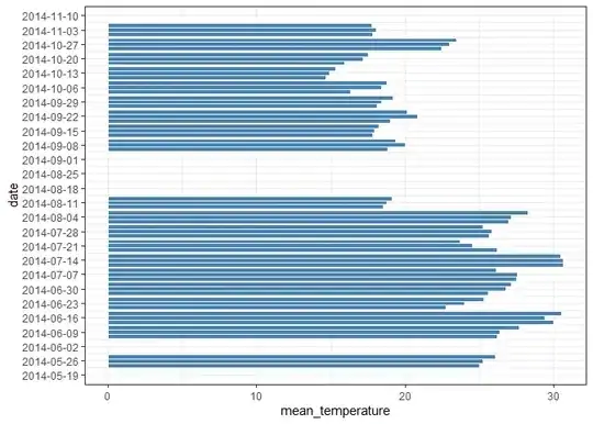
I have weather data collected in one-week-long experiments, with each week represented by the first day of the experiment, as shown below.

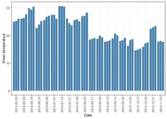
I want to create a graph to visualize hourly weather data within each week, where each column/line represents one hour's data for each week. To make x-axis similar to my experimental data figure, I added a date2 column using mutate(date2 = first(date)). I had to create date2 because the duration of the experiment was not exactly one week, I can't use 1 week in scale_x_date()
I want a create a plot that resembles the following graph, but I'd like to plot hourly data rather than daily data. My data is already collected at hourly intervals.

My weather data looks like this

Here is the reproducible example
df <-
  structure(
    list(
      date = c(
        "05/26/2014 11:00 AM",
        "05/26/2014 12:00 PM",
        "05/26/2014 01:00 PM",
        "06/09/2014 12:00 PM",
        "06/09/2014 01:00 PM",
        "06/09/2014 02:00 PM",
        "06/16/2014 12:00 PM",
        "06/16/2014 01:00 PM",
        "06/16/2014 02:00 PM",
        "06/23/2014 12:00 PM",
        "06/23/2014 01:00 PM",
        "06/23/2014 02:00 PM",
        "06/30/2014 12:00 PM",
        "06/30/2014 01:00 PM",
        "06/30/2014 02:00 PM",
        "07/07/2014 12:00 PM",
        "07/07/2014 01:00 PM",
        "07/07/2014 02:00 PM",
        "07/14/2014 12:00 PM",
        "07/14/2014 01:00 PM",
        "07/14/2014 02:00 PM",
        "07/21/2014 12:00 PM",
        "07/21/2014 01:00 PM",
        "07/21/2014 02:00 PM",
        "07/28/2014 12:00 PM",
        "07/28/2014 01:00 PM",
        "07/28/2014 02:00 PM",
        "08/04/2014 12:00 PM",
        "08/04/2014 01:00 PM",
        "08/04/2014 02:00 PM",
        "08/11/2014 12:00 PM",
        "08/11/2014 01:00 PM",
        "08/11/2014 02:00 PM",
        "09/08/2014 12:00 PM",
        "09/08/2014 01:00 PM",
        "09/08/2014 02:00 PM",
        "09/15/2014 12:00 PM",
        "09/15/2014 01:00 PM",
        "09/15/2014 02:00 PM",
        "09/22/2014 12:00 PM",
        "09/22/2014 01:00 PM",
        "09/22/2014 02:00 PM",
        "09/29/2014 12:00 PM",
        "09/29/2014 01:00 PM",
        "09/29/2014 02:00 PM",
        "10/06/2014 12:00 PM",
        "10/06/2014 01:00 PM",
        "10/06/2014 02:00 PM",
        "10/13/2014 12:00 PM",
        "10/13/2014 01:00 PM",
        "10/13/2014 02:00 PM",
        "10/20/2014 12:00 PM",
        "10/20/2014 01:00 PM",
        "10/20/2014 02:00 PM",
        "10/27/2014 12:00 PM",
        "10/27/2014 01:00 PM",
        "10/27/2014 02:00 PM",
        "11/03/2014 12:00 PM",
        "11/03/2014 01:00 PM",
        "11/03/2014 02:00 PM"
      ),
      date2 = structure(
        c(
          1401104700,
          1401104700,
          1401104700,
          1402317900,
          1402317900,
          1402317900,
          1402920000,
          1402920000,
          1402920000,
          1403524800,
          1403524800,
          1403524800,
          1404129600,
          1404129600,
          1404129600,
          1404734400,
          1404734400,
          1404734400,
          1405339200,
          1405339200,
          1405339200,
          1405944000,
          1405944000,
          1405944000,
          1406548800,
          1406548800,
          1406548800,
          1407153600,
          1407153600,
          1407153600,
          1407758400,
          1407758400,
          1407758400,
          1410177600,
          1410177600,
          1410177600,
          1410782400,
          1410782400,
          1410782400,
          1411387200,
          1411387200,
          1411387200,
          1411992000,
          1411992000,
          1411992000,
          1412596800,
          1412596800,
          1412596800,
          1413201600,
          1413201600,
          1413201600,
          1413806400,
          1413806400,
          1413806400,
          1414411200,
          1414411200,
          1414411200,
          1415016000,
          1415016000,
          1415016000
        ),
        tzone = "UTC",
        class = c("POSIXct",
                  "POSIXt")
      ),
      week = structure(
        c(
          1L,
          1L,
          1L,
          2L,
          2L,
          2L,
          3L,
          3L,
          3L,
          4L,
          4L,
          4L,
          5L,
          5L,
          5L,
          6L,
          6L,
          6L,
          7L,
          7L,
          7L,
          8L,
          8L,
          8L,
          9L,
          9L,
          9L,
          10L,
          10L,
          10L,
          11L,
          11L,
          11L,
          12L,
          12L,
          12L,
          13L,
          13L,
          13L,
          14L,
          14L,
          14L,
          15L,
          15L,
          15L,
          16L,
          16L,
          16L,
          17L,
          17L,
          17L,
          18L,
          18L,
          18L,
          19L,
          19L,
          19L,
          20L,
          20L,
          20L
        ),
        levels = c(
          "1",
          "2",
          "3",
          "4",
          "5",
          "6",
          "7",
          "8",
          "9",
          "10",
          "11",
          "12",
          "13",
          "14",
          "15",
          "16",
          "17",
          "18",
          "19",
          "20",
          "21",
          "22",
          "23",
          "24",
          "25",
          "26"
        ),
        class = "factor"
      ),
      mean_temperature = c(
        25,
        25.25,
        26.075,
        26.2,
        26.35,
        27.65,
        29.95,
        29.4,
        30.5,
        22.75,
        24,
        25.275,
        25.6,
        26.8,
        27.125,
        27.5,
        27.525,
        26.1,
        30.65,
        30.65,
        30.425,
        26.15,
        24.5,
        23.7,
        25.65,
        25.85,
        25.2,
        26.975,
        27.125,
        28.275,
        18.55,
        18.775,
        19.125,
        18.8,
        20,
        19.375,
        17.825,
        17.925,
        18.25,
        18.975,
        20.825,
        20.1,
        18.1,
        18.4,
        19.2,
        16.325,
        18.4,
        18.75,
        14.675,
        14.925,
        15.3,
        15.9,
        17.175,
        17.525,
        22.45,
        23,
        23.475,
        17.8,
        18.05,
        17.725
      )
    ),
    class = c("grouped_df", "tbl_df", "tbl",
              "data.frame"),
    row.names = c(NA,-60L),
    groups = structure(
      list(
        week = structure(
          1:20,
          levels = c(
            "1",
            "2",
            "3",
            "4",
            "5",
            "6",
            "7",
            "8",
            "9",
            "10",
            "11",
            "12",
            "13",
            "14",
            "15",
            "16",
            "17",
            "18",
            "19",
            "20",
            "21",
            "22",
            "23",
            "24",
            "25",
            "26"
          ),
          class = "factor"
        ),
        .rows = structure(
          list(
            1:3,
            4:6,
            7:9,
            10:12,
            13:15,
            16:18,
            19:21,
            22:24,
            25:27,
            28:30,
            31:33,
            34:36,
            37:39,
            40:42,
            43:45,
            46:48,
            49:51,
            52:54,
            55:57,
            58:60
          ),
          ptype = integer(0),
          class = c("vctrs_list_of",
                    "vctrs_vctr", "list")
        )
      ),
      row.names = c(NA,-20L),
      .drop = TRUE,
      class = c("tbl_df",
                "tbl", "data.frame")
    )
  )
EDIT
Column graph are not appropriate to plot hourly temperature data because every data point starts from zero, and I don't have zeros in my data. Appropriate graph would be point or line graph as shown here or here