1

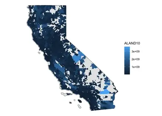
I'm trying to make a graph of California based on zip codes because I have some data that are based on them. I've tried excel-geography to plot but they only plotted a portion of zip codes with confidence.

excel map

Recently, I learned a mapping package in R called Tigris, which has been awesome. Even though zip codes aren't technically geography, they still have them listed, but they only 2010 data. Here's what I've done:

zipcodes <- zctas(year = 2010, state = "CA")
zipcodes <- zipcodes %>% filter(ZCTA5CE10>90000 & ZCTA5CE10 <96162) #Range of CA zip codes.
plot(zipcodes$geometry)

But the map seems incomplete using the proper range.

Update: R just produced a better one

I would like to get a map that's similar to the one produced in excel, but with more zip code coverages and aesthetic options. What are some suggestions in mapping using zip codes? I'm pretty new to spatial analysis and also open to learn about other packages if there's any. Thanks!

Yvonne
  • 15
  • 5

2 Answers2

3

If you select cb = TRUE and year = 2000 you will get complete coverage of the state:

library(tigris)
library(ggplot2)

zipcodes <- zctas(year = 2000, state = "CA", cb = TRUE)

ggplot() +
  geom_sf(data = ca, fill = "gray90") +
  geom_sf(data = zipcodes, aes(fill = AREA), linewidth = 0.1) +
  scale_fill_gradientn(colors = c("red", "cornsilk", "#f0d080"),
                       values = c(0, 0.03, 1), guide = "none") +
  theme_minimal()

enter image description here

Allan Cameron
  • 147,086
  • 7
  • 49
  • 87
  • Hi Allan, thank you very much! I understand the second line in ggplot is where I use my data. How should I format my data to map them out? I have a list of counts for each zip codes. – Yvonne Aug 07 '23 at 22:54
  • @Yvonne it sounds like you'll want to left join your data to the `zipcodes` data. – Allan Cameron Aug 07 '23 at 23:11
2

As you already mentioned, postal Codes (ZIP) are not a good fit for geo-spatial visualizations.

US Census on ZCTAs: "USPS ZIP Codes are not areal features but a collection of mail delivery routes."

The 2010 ZCTAs will not produce a complete map of California. To make the map look more coherent, you can plot the state's shape first and then the ZCTA shapes layered on top.

Here is an example of how to do that and use the land area of the ZCTAs for the shade of color:

library(tigris)
library(tidyverse)

zipcodes <- zctas(year = 2010, state = "CA", progress_bar = FALSE)

us_states <- states(progress_bar = FALSE)
ca <- us_states |> filter(STUSPS == "CA")

ggplot() +
  geom_sf(data = ca) +
  geom_sf(aes(fill = ALAND10, color = ALAND10), data = zipcodes) +
  theme_void()

Till
  • 3,845
  • 1
  • 11
  • 18