330

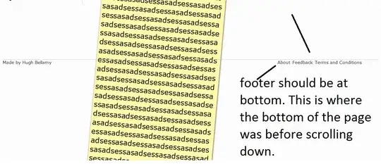
I am looking to implement the opposite behaviour to the following question: CSS Push Div to bottom of page. I.e., when content overflows to the scrollbars, I would like the footer to be at the bottom of the page, like Stack Overflow.

I have a div with id="footer" and the following CSS:

#footer {
    position: absolute;
    bottom: 30px;
    width: 100%;
}

This moves the div to the bottom of the viewport - but the element stays there even when you scroll the page down, so it is no longer at the bottom.

How can I make sure the div stays at the bottom of the page's contents even when the content overflows? I'm not looking for fixed positioning, only for the element to be at the bottom of all content.

Image: Example

H Bellamy
  • 22,405
  • 23
  • 76
  • 114

12 Answers12

686

This is precisely what position: fixed was designed for:

#footer {
    position: fixed;
    bottom: 0;
    width: 100%;
}

Here's the fiddle: http://jsfiddle.net/uw8f9/

Joseph Silber
  • 214,931
  • 59
  • 362
  • 292
  • 97
    That solution is not good for 90% of cases. if you re-size your window, your footer will overlay other content and won't stop right at the end of your content – vsync Oct 28 '12 at 16:53
  • 14
    @aroth that is because they are two totally different solutions. This solution will keep the footer at the bottom of the visual area of the screen at all times. The alternative solution keeps the footer at either the bottom of the screen or the bottom of the page, depending on which is larger - which was what the asker requested. – My Head Hurts Nov 26 '12 at 07:35
  • 11
    @MyHeadHurts - You're absolutely right. After answering, I realized that this was not what the OP wanted, but I left it here for people looking for a simple fixed footer. From the comments (and votes) it seems many people are struggling with this elementary CSS feature. – Joseph Silber Nov 26 '12 at 14:12
  • 1
    @MyHeadHurts - Fair enough, though for my money they're both still basically the same. Content scrolls underneath the `fixed` footer, when there is enough content to do so. That's good enough for me. Of course, I can see how *very large* footers like what they have on stackoverflow would not work well with the `fixed` approach, but for a basic one-line footer this approach works well in my opinion. – aroth Nov 26 '12 at 23:23
  • @aroth I agree, this is a good solution and it all depends what you want. I was just pointing out why one solution was more complicated than the other -> they don't do the same thing. – My Head Hurts Nov 27 '12 at 07:35
  • This is a solution for a "fixed" footer, not a "sticky" footer. – Robert Christian Nov 03 '13 at 20:42
  • @rob - Correct. Read the comments above yours. – Joseph Silber Nov 04 '13 at 02:03
209

Unfortunately you can't do this with out adding a little extra HTML and having one piece of CSS rely on another.

HTML

First you need to wrap your header,footer and #body into a #holder div:

<div id="holder">
    <header>.....</header>
    <div id="body">....</div>
    <footer>....</footer>
</div>

CSS

Then set height: 100% to html and body (actual body, not your #body div) to ensure you can set minimum height as a percentage on child elements.

Now set min-height: 100% on the #holder div so it fills the content of the screen and use position: absolute to sit the footer at the bottom of the #holder div.

Unfortunately, you have to apply padding-bottom to the #body div that is the same height as the footer to ensure that the footer does not sit above any content:

html,body{
    height: 100%
}

#holder{
    min-height: 100%;
    position:relative;
}

#body{
    padding-bottom: 100px;    /* height of footer */
}

footer{
    height: 100px; 
    width:100%;
    position: absolute;
    left: 0;
    bottom: 0; 
}

Working example, short body: http://jsfiddle.net/ELUGc/

Working example, long body: http://jsfiddle.net/ELUGc/1/

vsync
  • 118,978
  • 58
  • 307
  • 400
My Head Hurts
  • 37,315
  • 16
  • 75
  • 117
  • i can't get why width:100%; is required – Somnath Kharat Oct 16 '13 at 13:37
  • 5
    @sTACKoVERFLOW - If you do not specify a `width` **or both** `left` and `right` then the values are set to `auto` and the element will wrap to fit its content. Specifying `width: 100%` **or** `left: 0` and `right:0` ensures that the absolutely positioned element takes the full width of the container element – My Head Hurts Oct 16 '13 at 18:21
  • I was looking for similar behavior, but in my case the #body div is floated, by say "float: left". The short body example works, but the long body example does not. Any suggestions how I can get the desired behavior using float on the #body div. – Jatin Feb 17 '14 at 14:33
  • @Ian said, in an answer because he didn't have enough rep to comment:If you are having problems in asp.net with the answer from 'My Head Hurts' - you need to add 'height : 100%' to the main generated FORM tag as well as HTML and BODY tags in order for this to work. – msouth May 28 '15 at 14:38
  • If you're trying to get this to work inside a div rather than inside the whole body, make sure you specify `height=100%` on _all_ of your containing elements, including `
    ` elements.
    – Ben Caine Feb 04 '16 at 19:05
  • the main point you did that he didnt was close your position: fixed with a ; – AlexHighHigh Jun 19 '16 at 20:42
  • I still don't get why all this boilerplate is needed, but it was indeed the only way that prevented my footer from moving out of place or covering other content for any window size, when combined with this other answer: https://stackoverflow.com/a/12408519 – vctls Jul 25 '17 at 08:26
19

Just worked out for another solution as above example have bug( somewhere error ) for me. Variation from the selected answer.

html,body {
    height: 100%
}

#nonFooter {
    min-height: 100%;
    position:relative;
    /* Firefox */
    min-height: -moz-calc(100% - 30px);
    /* WebKit */
    min-height: -webkit-calc(100% - 30px);
    /* Opera */
    min-height: -o-calc(100% - 30px);
    /* Standard */
    min-height: calc(100% - 30px);
}

#footer {
    height:30px;
    margin: 0;
    clear: both;
    width:100%;
    position: relative;
}

for html layout

<body>
    <div id="nonFooter">header,middle,left,right,etc</div>
    <div id="footer"></div>
</body>

Well this way don't support old browser however its acceptable for old browser to scrolldown 30px to view the footer

brooksrelyt
  • 3,925
  • 5
  • 31
  • 54
Anonymous
  • 1,405
  • 4
  • 17
  • 26
8

I realise it says not to use this for 'responding to other answers' but unfortunately I don't have enough rep to add a comment onto the appropriate answer (!) but ...

If you are having problems in asp.net with the answer from 'My Head Hurts' - you need to add 'height : 100%' to the main generated FORM tag as well as HTML and BODY tags in order for this to work.

Ian
  • 160
  • 2
  • 9
7

You didn't close your ; after position: absolute. Otherwise your above code would have worked perfectly!

#footer {
   position:absolute;
   bottom:30px;
   width:100%;
}
AlexHighHigh
  • 340
  • 2
  • 10
5

I would comment if i could , but i have no permissions yet, so i will post a hint as an answer, for unexpected behavior on some android devices:

Position: Fixed only works in Android 2.1 thru 2.3 by using the following meta tag:

<meta name="viewport" content="width=device-width, user-scalable=no">.

see http://caniuse.com/#search=position

Tarciso Junior
  • 549
  • 9
  • 16
2

This is an intuitive solution using the viewport command that just sets the minimum height to the viewport height minus the footer height.

html,body{
height: 100%
}
#nonFooter{
min-height: calc(100vh - 30px)
}

#footer {
height:30px;
margin: 0;
clear: both;
width:100%;
}
Obromios
  • 15,408
  • 15
  • 72
  • 127
2
position: fixed;
bottom: 0;
(if needs element in whole display and left align)
left:0;
width: 100%;
lczapski
  • 4,026
  • 3
  • 16
  • 32
  • 1
    Please describe in your answer, what was the problem, and how will this snippet solve it, to help others understand this answer – FZs Nov 08 '19 at 21:31
1

I've solved a similar issue by putting all of my main content within an extra div tag (id="outer"). I've then moved the div tag with id="footer" outside of this last "outer" div tag. I've used CSS to specify the height of "outer" and specified the width and height of "footer". I've also used CSS to specify the margin-left and margin-right of "footer" as auto. The result is that the footer sits firmly at the bottom of my page and scrolls with the page too (although, it's still appears inside the "outer" div, but happily outside of the main "content" div. which seems strange, but it's where I want it).

David B
  • 11
  • 1
1

I just want to add - most of the other answers worked fine for me; however, it took a long time to get them working!

This is because setting height: 100% only picks up parent div's height!

So if your entire html (inside of the body) looks like the following:

<div id="holder">
    <header>.....</header>
    <div id="body">....</div>
    <footer>....</footer>
</div>

Then the following will be fine:

html,body{
    height: 100%
}

#holder{
    min-height: 100%;
    position:relative;
}

#body{
    padding-bottom: 100px;    /* height of footer */
}

footer{
    height: 100px; 
    width:100%;
    position: absolute;
    left: 0;
    bottom: 0; 
}

...as "holder" will pick up it's height directly from "body".

Kudos to My Head Hurts, whose answer was the one I ended up getting to work!

However. If your html is more nested (because it's only an element of the full page, or it's within a certain column, etc) then you need to make sure every containing element also has height: 100% set on the div. Otherwise, the information on height will be lost between "body" and "holder".

E.g. the following, where I've added the "full height" class to every div to make sure the height gets all the way down to our header/body/footer elements:

<div class="full-height">
    <div class="container full-height">
        <div id="holder">
            <header>.....</header>
            <div id="body">....</div>
            <footer>....</footer>
        </div>
    </div>
</div>

And remember to set height on full-height class in the css:

#full-height{
    height: 100%;
}

That fixed my issues!
Tim L
  • 141
  • 9
0

if you have a fixed height footer (for example 712px) you can do this with js like so:

var bgTop = 0;
window.addEventListener("resize",theResize);
function theResize(){
    bgTop = winHeight - 712;
    document.getElementById("bg").style.marginTop = bgTop+"px";
}
George Carlin
  • 447
  • 5
  • 22
0

I hit my footer with a margin-top: auto and it did the trick! Im commenting this here just in case it could help any future visitors.