54

I've managed to plot a series of points with the following code:

plt = pp.figure()
for i in range(spt.shape[1]):
    spktrain = spt[0,i]
    for trial in spktrain:
        non_z = np.nonzero(trial)
        non_z = non_z[0]
        pp.plot(t[non_z], trial[non_z], 'bo')

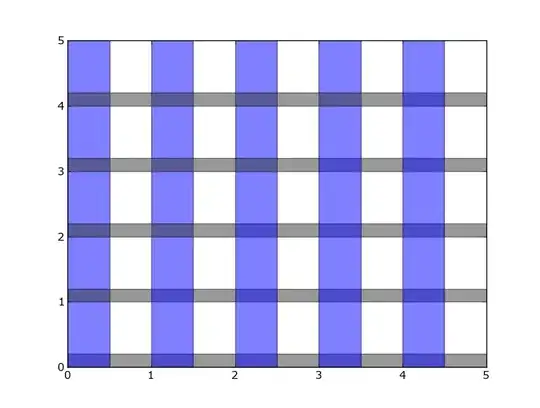
I would like to place alternating bands of white and gray background on the figure in order to separate the data from each iteration of the outer for loop. In other words, I would like the data from each "spktrain" to have it's own background color (the data does not overlap).

How can I go about changing the background color of a figure in a specific region?

Trenton McKinney
  • 56,955
  • 33
  • 144
  • 158
Louis Thibault
  • 20,240
  • 25
  • 83
  • 152

1 Answers1

121

You can use axhspan and/or axvspan like this:

import matplotlib.pyplot as plt

plt.figure()
plt.xlim(0, 5)
plt.ylim(0, 5)

for i in range(0, 5):
    plt.axhspan(i, i+.2, facecolor='0.2', alpha=0.5)
    plt.axvspan(i, i+.5, facecolor='b', alpha=0.5)

plt.show()

enter image description here

tom10
  • 67,082
  • 10
  • 127
  • 137
  • 7
    You can also set these rectangles to be drawn behind your actual plot with `zorder`. For example: `plt.axhspan(i, i+.2, facecolor='0.2', alpha=0.5, zorder=-100)` – HuaTham May 28 '19 at 12:23
  • I am drawing a plot similar to the [yahoo finance charts](https://finance.yahoo.com/quote/%5EGSPC/chart). So, I need that the color spans automatically fits the ticks' values. Can you expand your answer to include this aspect? Thanks in advance for any help! =) – xicocaio Apr 17 '20 at 22:15
  • 1
    @xicocaio: As I understand it, I think your question is different enough from this so that it would be preferable to ask it as a separate question. – tom10 Apr 17 '20 at 22:56
  • @tom10 Sure, Thank you for the fast response! Just asked, [here is the link](https://stackoverflow.com/q/61282135/2464671). – xicocaio Apr 17 '20 at 23:10