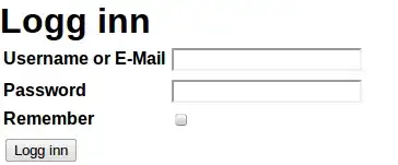
The `` tag specifies an input element. `input` elements are used within a `form` element to declare input controls that allow users to input data. An input control can vary depending on its `type` attribute.
The <input> tag specifies an input field where the user can enter data.
<input> elements are used within a <form> element to declare input controls that allow users to input data.
An input field can vary in many ways, depending on the type attribute
Browser Support


 SAFARI http://www.w3schools.com/images/compatible_safari.gif

Tips and Notes
Note: The <input> element is empty, it contains attributes only.
Tip: Use the <label> element to define labels for <input> elements.
Type Attribute Values
button
Defines a clickable button (mostly used with a JavaScript to activate a script)
checkbox
Defines a checkbox
color
Defines a color picker
date
Defines a date control (year, month and day (no time))
datetime-local
Defines a date and time control (year, month, day, hour, minute, second, and fraction of a second (no time zone)
Defines a field for an e-mail address
file
Defines a file-select field and a Browse... button (for file uploads)
hidden
Defines a hidden input field
image
Defines an image as the submit button
month
Defines a month and year control (no time zone)
number
Defines a field for entering a number
password
Defines a password field (characters are masked)
radio
Defines a radio button
range
Defines a control for entering a number whose exact value is not important (like a slider control)
reset
Defines a reset button (resets all form values to default values)
search
Defines a text field for entering a search string
submit
Defines a submit button
tel
Defines a field for entering a telephone number
text
Default. Defines a single-line text field (default width is 20 characters)
time
Defines a control for entering a time (no time zone)
url
Defines a field for entering a URL
week
Defines a week and year control (no time zone)
Refers From :
