How to add margin top to class="row" elements using twitter bootstrap framework?
Asked
Active
Viewed 8.2e+01k times
512
itsme
- 48,972
- 96
- 224
- 345
21 Answers
832
Editing or overriding the row in Twitter bootstrap is a bad idea, because this is a core part of the page scaffolding and you will need rows without a top margin.
To solve this, instead create a new class "top-buffer" that adds the standard margin that you need.
.top-buffer { margin-top:20px; }
And then use it on the row divs where you need a top margin.
<div class="row top-buffer"> ...
Acyra
- 15,864
- 15
- 46
- 53
-
Nielsen says both to use a new class or to edit the native .row ... you are replicating i think :P – itsme Jan 20 '13 at 22:26
-
50Editing the native row is wrong for a framework, and the new class should just complement the row class...it is a subtle difference but in Twitter Bootstrap the row has a specific page layout role. Anyway, I'm just trying to help, my solution is a working one for the problem. – Acyra Jan 21 '13 at 02:10
-
11no way, these answers are slightly different IMHO. This one is more usable as it embraces the "name your class style so your html reads easier" and you can read margin-top in the html instead of rowSpecificForName. This answer is more inline with twitter bootstrap patterns. – Dean Hiller May 14 '13 at 03:04
-
2They're going to add specific vertical spacing classes into Bootstrap 4: https://github.com/twbs/bootstrap/issues/4286 – icc97 Jan 08 '16 at 19:02
-
3All I learned from these comments is that developers are very opinionated and some prefer 2 + 3 = 5 and others 3 + 2 = 5. Moving on... – Fabio S. Nov 05 '16 at 05:58
-
3@FabioS. What should be learned is that for a framework like Bootstrap, editing the native code or overwriting it is a bad idea. The scenarios are endless but here are a couple examples. a.) overwriting - if you overwrite the .row class you now need to go through your project and add an additional class to rows that shouldn't receive the margin b.) editing native code - you inherit a project at work and you want to move up to bootstrap4; OOPS! Nothing looks right!? Now you have the burden of going through the bootstrap 3 file trying to find what on earth the previous developer altered. – peroija Feb 17 '17 at 18:09
-
terrible answer, it is not encapsulating the css change by calling something from bootstrap framework itself. – RollRoll May 09 '17 at 15:06
187
Ok just to let you know what's happened then, i fixed using some new classes as Acyra says above:
.top5 { margin-top:5px; }
.top7 { margin-top:7px; }
.top10 { margin-top:10px; }
.top15 { margin-top:15px; }
.top17 { margin-top:17px; }
.top30 { margin-top:30px; }
whenever i want i do <div class="row top7"></div>
for better responsive you can add margin-top:7% instead of 5px for example :D
itsme
- 48,972
- 96
- 224
- 345
-
15I feel that this solution is much more elegant than the accepted solution. – rdiaz82 Jun 03 '14 at 11:40
-
-
6How is `.top-buffer { margin-top:20px; }` different from `.top30 { margin-top:30px; }`? Well, from the point of any developer: It is the same. Adjustemts to fit the use case do not count here. Specially not, if the OP answered his own question. – alexander Aug 10 '16 at 08:41
-
clearly the most generic solution would be to manipulate the DOM from javascript to dynamically change the class or the style... – cowbert Aug 30 '17 at 19:34
-
2
185
Bootstrap 3
If you need to separate rows in bootstrap, you can simply use .form-group. This adds 15px margin to the bottom of row.
In your case, to get margin top, you can add this class to previous .row element
<div class="row form-group">

/* From bootstrap.css */
.form-group {
        margin-bottom: 15px;
}
Bootstrap 4
You can use built-in spacing classes
<div class="row mt-3"></div>
The "t" in class name makes it apply only to "top" side, there are similar classes for bottom, left, right. The number defines space size.
-
-
3No, [`form-group` is still present](https://github.com/twbs/bootstrap/blob/v4-dev/dist/css/bootstrap.css#L1990), but special classes for margin/padding has been added that can do the job and has more options. – Buksy Dec 01 '17 at 20:23
-
Have there been multiple changes to this in Bootstrap V 4? I'm on a version of 4 now and `mt-3` does not work so used `form-group` – Nick Schwaderer Jul 31 '18 at 13:06
-
[It should work](https://jsfiddle.net/buksy/8nybvmzd/), check if bootstrap css you linked to your project contains ".mt-3" class definition. – Buksy Aug 01 '18 at 11:52
96
For Bootstrap 4 spacing should be applied using
shorthand utility classes
in the following format:
{property}{sides}-{size}
Where property is one of:
- m - for classes that set margin
- p - for classes that set padding
Where sides is one of:
- t - for classes that set margin-top or padding-top
- b - for classes that set margin-bottom or padding-bottom
- l - for classes that set margin-left or padding-left
- r - for classes that set margin-right or padding-right
- x - for classes that set both *-left and *-right
- y - for classes that set both *-top and *-bottom
- blank - for classes that set a margin or padding on all 4 sides of the element
Where size is one of:
- 0 - for classes that eliminate the margin or padding by setting it to 0
- 1 - (by default) for classes that set the margin or padding to $spacer * .25
- 2 - (by default) for classes that set the margin or padding to $spacer * .5
- 3 - (by default) for classes that set the margin or padding to $spacer
- 4 - (by default) for classes that set the margin or padding to $spacer * 1.5
- 5 - (by default) for classes that set the margin or padding to $spacer * 3
- auto - for classes that set the margin to auto
So you should be doing any of these:
<div class="row mt-1">
<div class="row mt-2">
          ...
<div class="row mt-5">
Read the docs for more explanation. Try live examples over here.
Babak Habibi
- 1,819
- 1
- 8
- 14
Rajkaran Mishra
- 4,532
- 2
- 36
- 61
-
5This should be the accepted answer now with the release of Bootstrap 4. It comes with these built-in classes, no need to create new ones. – Matt K Apr 05 '18 at 20:25
44
Sometimes margin-top can causes design problems:
http://www.w3.org/TR/CSS2/box.html#collapsing-margins
So, i recommend create "margin-bottom classes" instead of "margin-top classes" and apply them to the previous item.
If you are using Bootstrap importing LESS Bootstrap files try to define the margin-bottom classes with proportional Bootstrap Theme spaces:
.margin-bottom-xs {margin-bottom: ceil(@line-height-computed / 4);}
.margin-bottom-sm {margin-bottom: ceil(@line-height-computed / 2);}
.margin-bottom-md {margin-bottom: @line-height-computed;}
.margin-bottom-lg {margin-bottom: ceil(@line-height-computed * 2);}
kurroman
- 978
- 10
- 12
32
I added these classes to my bootstrap stylesheet
.voffset  { margin-top: 2px; }
.voffset1 { margin-top: 5px; }
.voffset2 { margin-top: 10px; }
.voffset3 { margin-top: 15px; }
.voffset4 { margin-top: 30px; }
.voffset5 { margin-top: 40px; }
.voffset6 { margin-top: 60px; }
.voffset7 { margin-top: 80px; }
.voffset8 { margin-top: 100px; }
.voffset9 { margin-top: 150px; }
Example
<div class="container">
  <div class="row voffset2">
    <div class="col-lg-12">
      <p>
        Vertically offset text.
      </p>
    </div>
  </div>
</div>
Igor Ivancha
- 3,413
- 4
- 30
- 39
Md. Saidur Rahman Milon
- 2,761
- 23
- 29
26
I'm using these classes to alter top margin:
.margin-top-05 { margin-top: 0.5em; }
.margin-top-10 { margin-top: 1.0em; }
.margin-top-15 { margin-top: 1.5em; }
.margin-top-20 { margin-top: 2.0em; }
.margin-top-25 { margin-top: 2.5em; }
.margin-top-30 { margin-top: 3.0em; }
When I need an element to have 2em spacing from the element above I use it like this:
<div class="row margin-top-20">Something here</div>
If you prefere pixels so change the em to px to have it your way.
Hexodus
- 12,361
- 6
- 53
- 72
-
6Good idea, but I abstract away the numbers, as they are too specific. If you stick with abstractions like s, m, l, xl, xxl, etc, you can change the sizes via css without having to change names in templates. – Mike Purcell Jan 23 '15 at 20:06
-
1@MikePurcell Good thought and it may be the right solution for you. But I prefer a more exact way to define margins. Using em instead of px gives me a loose way to achieve it without getting too specific. – Hexodus Feb 01 '15 at 17:31
-
3
-
@icc97 Basically, separate of concerns, but here you can see other opinions: http://stackoverflow.com/a/2612494/1683224. – Wiley Marques Mar 17 '16 at 13:22
-
@WileyMarques That's true for a class named e.g. "top-buffer" (as in the accepted answer), but doesn't make sense for a class named margin-top-20. Unless you're happy for margin-top-20 to actually add something other than 2ems of padding, which would just be confusing. – thelem Oct 12 '16 at 14:56
-
@Hexodus then the class name would have no meaning. As others point out, having sensible class names like `xs`, `sm` etc. makes sense, but when your class name is so completely tied to the style name as in this answer the whole point of classes goes away. Why don't you just call the class `margin-top-2.0em` instead of `margin-top-20`? At what point does this all become pointless and we all just accept that we should all just have been taken up flower arranging instead? – icc97 Apr 27 '17 at 01:13
-
@icc97 This is used for fine adjusting certain elements and not for global changes. Some people including me are preferring this approach as you can see from the class name what it's doing. You can as well have global classes. but inline style is never a good idea. Css classes are reusable and are there to separate the styling from the content. – Hexodus Apr 27 '17 at 11:48
10
You can use the following class for bootstrap 4:
mt-0
mt-1
mt-2
mt-3
mt-4
...
Smilefounder
- 469
- 5
- 12
5
Bootstrap 4 alpha, for margin-top: shorthand CSS class names mt-1, mt-2 ( mt-lg-5, mt-sm-2) same for the bottom, right, left, and you have also auto class ml-auto
<div class="mt-lg-1" ...>
Units are from 1 to 5 : in the variables.scss
which means if you set mt-1 it gives .25rem of margin top.
$spacers: (
  0: (
    x: 0,
    y: 0
  ),
  1: (
    x: ($spacer-x * .25),
    y: ($spacer-y * .25)
  ),
  2: (
    x: ($spacer-x * .5),
    y: ($spacer-y * .5)
  ),
  3: (
    x: $spacer-x,
    y: $spacer-y
  ),
  4: (
    x: ($spacer-x * 1.5),
    y: ($spacer-y * 1.5)
  ),
  5: (
    x: ($spacer-x * 3),
    y: ($spacer-y * 3)
  )
) !default;
read-more here
https://v4-alpha.getbootstrap.com/utilities/spacing/#horizontal-centering
Matt K
- 6,620
- 3
- 38
- 60
Sherif SALEH
- 97
- 1
- 5
3
Add to this class in the .css file:
.row {
    margin-left: -20px;
    *zoom: 1;
    margin-top: 50px;
}
or make a new class and add it to the element
.rowSpecificFormName td {
    margin-top: 50px;
}
Tepken Vannkorn
- 9,648
- 14
- 61
- 86
Nielsen Ramon
- 911
- 1
- 8
- 16
-
7uhmmmmm i don't like totouch the css , what if i need rows with no margin in other pages? – itsme Apr 10 '12 at 09:30
-
-
2But there is no defined css class for only 'margin-top' in Twitter Bootstrap. – Nielsen Ramon Apr 10 '12 at 09:33
-
strange they didn't setted few class forspacing vertically, i need to add them there is no other solution :/, thanks Nielsen – itsme Apr 10 '12 at 09:35
-
8
-
This is not a good way to do it, Since its accepted people may follow it but i suggest using less for bootstrap and define margin otherwise look at my answer below. – Sakthivel Oct 10 '13 at 10:50
-
Overriding framework specific code is not a good approach because it will lead to strange code behavior and will make it more difficult to debug your own code. – Yuri Nov 01 '13 at 02:19
2
In Bootstrap 4 alpha+ you can use this
class margin-bottom-5
The classes are named using the format: {property}-{sides}-{size}
Al Quarashi
- 107
- 2
2
just take a new class beside every row and apply css of margin-top: 20px;
here is the code below
<style>
  .small-top
   {
     margin-top: 25px;
   }
</style>
<div class="row small-top">
   <div class="col-md-12">
   </div>
 </div>
shiva krishna
- 222
- 2
- 11
-
Please add explanations to your answer. Answering without explanations is useless. – ADreNaLiNe-DJ Jul 07 '17 at 09:56
2
Bootstrap3
CSS (gutter only, without margins around):
.row.row-gutter {
  margin-bottom: -15px;
  overflow: hidden;
}
.row.row-gutter > *[class^="col"] {
  margin-bottom: 15px;
}
CSS (equal margins around, 15px/2):
.row.row-margins {
  padding-top: 7px; /* or margin-top: 7px; */
  padding-bottom: 7px; /* or margin-bottom: 7px; */
}
.row.row-margins > *[class^="col"] {
  margin-top: 8px;
  margin-bottom: 8px;
}
Usage:
<div class="row row-gutter">
    <div class="col col-sm-9">first</div>
    <div class="col col-sm-3">second</div>
    <div class="col col-sm-12">third</div>
</div>
(with SASS or LESS 15px could be a variable from bootstrap)
Isometriq
- 371
- 3
- 8
2
<div class="row row-padding">
simple code
Harshvardhan Singh Baghel
- 1,103
- 12
- 22
-
1using bootstrap - 4 you can add this class to make the spacing between row – Harshvardhan Singh Baghel Aug 09 '19 at 12:57
1
If you want to change just on one page, add the following style rule:
 #myCustomDivID .row {
     margin-top:20px;
 }
fredyfx
- 403
- 10
- 22
1
There is a trick for adding margin automatically only for the 2nd+ row in the container.
.container-row-margin .row + .row {
    margin-top: 1rem;
}
Adding the .container-row-margin to the container, results in:
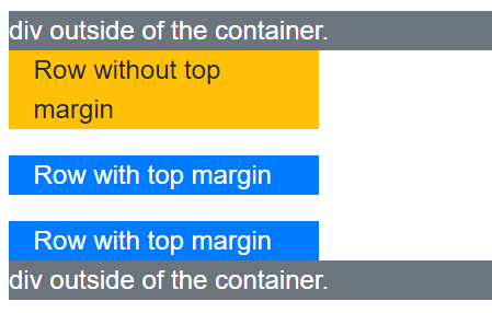
Complete HTML:
<div class="bg-secondary text-white">
    div outside of the container.
</div>
<div class="container container-row-margin">
    <div class="row">
        <div class="col col-4 bg-warning">
            Row without top margin
        </div>
    </div>
    <div class="row">
        <div class="col col-4 bg-primary text-white">
            Row with top margin
        </div>
    </div>
    <div class="row">
        <div class="col col-4 bg-primary text-white">
            Row with top margin
        </div>
    </div>
</div>
<div class="bg-secondary text-white">
    div outside of the container.
</div>
Taken from official samples.
Alamakanambra
- 5,845
- 3
- 36
- 43
0
If you're using BootStrap 3.3.7, you can use the open source library bootstrap-spacer via NPM
npm install bootstrap-spacer
or you can visit the github page:
https://github.com/chigozieorunta/bootstrap-spacer
Here's an example of how this works to space rows using the .row-spacer class:
<div class="row row-spacer">
    <div class="col-md-4">
    </div>
    <div class="col-md-4">
    </div>
    <div class="col-md-4">
    </div>
</div>

<div class="row row-spacer">
    <div class="col-md-4">
    </div>
    <div class="col-md-4">
    </div>
    <div class="col-md-4">
    </div>
</div>
If you'd require spaces between columns, you can also add the .row-col-spacer class:
<div class="row row-col-spacer">
    <div class="col-md-4">
    </div>
    <div class="col-md-4">
    </div>
    <div class="col-md-4">
    </div>
</div>
And you can also combine various the .row-spacer & .row-col-spacer classes together:
<div class="row row-spacer row-col-spacer">
    <div class="col-md-4">
    </div>
    <div class="col-md-4">
    </div>
    <div class="col-md-4">
    </div>
</div>
Chigozie Orunta
- 448
- 3
- 13
0
Bootstrap 5
In Bootstrap 5 you could do something like this:
<div class="row mt-X"></div>
where X is a number from 0 (no space) to 5 (a lot of space). For more information on the different margin/padding sizes and the breakpoint specific control, please have a look at the docs.
KingKevin23
- 71
- 4
- 7