194

I know that in Safari on an iPhone you can detect the screen's orientation and change of orientation by listening for the onorientationchange event and querying window.orientation for the angle.

Is this possible in the browser on Android phones?

To be clear, I am asking whether the rotation of an Android device can be detected by JavaScript running on a standard web page. It is possible on an iPhone, and I wondered whether it could be done for Android phones.

Peter Mortensen
  • 30,738
  • 21
  • 105
  • 131
philnash
  • 70,667
  • 10
  • 60
  • 88

12 Answers12

235

The actual behavior across different devices is inconsistent. The resize and orientationChange events can fire in a different sequence with varying frequency. Also, some values (e.g. screen.width and window.orientation) don't always change when you expect. Avoid screen.width -- it doesn't change when rotating in iOS.

The reliable approach is to listen to both resize and orientationChange events (with some polling as a safety catch), and you'll eventually get a valid value for the orientation. In my testing, Android devices occasionally fail to fire events when rotating a full 180 degrees, so I've also included a setInterval to poll the orientation.

var previousOrientation = window.orientation;
var checkOrientation = function(){
    if(window.orientation !== previousOrientation){
        previousOrientation = window.orientation;
        // orientation changed, do your magic here
    }
};

window.addEventListener("resize", checkOrientation, false);
window.addEventListener("orientationchange", checkOrientation, false);

// (optional) Android doesn't always fire orientationChange on 180 degree turns
setInterval(checkOrientation, 2000);

Here are the results from the four devices that I've tested (sorry for the ASCII table, but it seemed like the easiest way to present the results). Aside from the consistency between the iOS devices, there is a lot of variety across devices. NOTE: The events are listed in the order that they fired.

|==============================================================================|
|     Device     | Events Fired      | orientation | innerWidth | screen.width |
|==============================================================================|
| iPad 2         | resize            | 0           | 1024       | 768          |
| (to landscape) | orientationchange | 90          | 1024       | 768          |
|----------------+-------------------+-------------+------------+--------------|
| iPad 2         | resize            | 90          | 768        | 768          |
| (to portrait)  | orientationchange | 0           | 768        | 768          |
|----------------+-------------------+-------------+------------+--------------|
| iPhone 4       | resize            | 0           | 480        | 320          |
| (to landscape) | orientationchange | 90          | 480        | 320          |
|----------------+-------------------+-------------+------------+--------------|
| iPhone 4       | resize            | 90          | 320        | 320          |
| (to portrait)  | orientationchange | 0           | 320        | 320          |
|----------------+-------------------+-------------+------------+--------------|
| Droid phone    | orientationchange | 90          | 320        | 320          |
| (to landscape) | resize            | 90          | 569        | 569          |
|----------------+-------------------+-------------+------------+--------------|
| Droid phone    | orientationchange | 0           | 569        | 569          |
| (to portrait)  | resize            | 0           | 320        | 320          |
|----------------+-------------------+-------------+------------+--------------|
| Samsung Galaxy | orientationchange | 0           | 400        | 400          |
| Tablet         | orientationchange | 90          | 400        | 400          |
| (to landscape) | orientationchange | 90          | 400        | 400          |
|                | resize            | 90          | 683        | 683          |
|                | orientationchange | 90          | 683        | 683          |
|----------------+-------------------+-------------+------------+--------------|
| Samsung Galaxy | orientationchange | 90          | 683        | 683          |
| Tablet         | orientationchange | 0           | 683        | 683          |
| (to portrait)  | orientationchange | 0           | 683        | 683          |
|                | resize            | 0           | 400        | 400          |
|                | orientationchange | 0           | 400        | 400          |
|----------------+-------------------+-------------+------------+--------------|
two-bit-fool
  • 4,978
  • 6
  • 28
  • 26
  • In the iOS5 emulator, if you refresh in landscape then rotate, this code does not fire. – worked May 26 '12 at 14:23
  • 1
    Great answer. `previousOrientation` should be initialized with the then-current orientation: `var previousOrientation = window.orientation;` If you want to ignore 180-degree rotations, i.e., you don't need to distinguish between the left-or-right landscape and upside-down-or-not variants, add the following as the first line to `checkOrientation()`: `if (0 === (previousOrientation + window.orientation) % 180) return;` However, without additional `setTimeout` trickery, you will only benefit from this on iOS, where a swift 180-degree rotation only creates a *single* `orientationchange` event. – mklement0 Dec 10 '12 at 15:04
  • Thanks @mklement, I tweaked the code to initialize the previousOrientation. – two-bit-fool Dec 11 '12 at 15:23
  • Cheers for the great information. This was doing my head in because windows phone 8.1 doesn't feature a resize or orientationchange event when you use cordova. Resorted to using the setInterval aswell as failsafe. – Perfection Jan 07 '16 at 15:26
  • @mklement0 To this day window.orientation will always be undefined on windows phone 8.1. – Perfection Jan 07 '16 at 15:27
220

To detect an orientation change on an Android browser, attach a listener to the orientationchange or resize event on window:

// Detect whether device supports orientationchange event, otherwise fall back to
// the resize event.
var supportsOrientationChange = "onorientationchange" in window,
    orientationEvent = supportsOrientationChange ? "orientationchange" : "resize";

window.addEventListener(orientationEvent, function() {
    alert('HOLY ROTATING SCREENS BATMAN:' + window.orientation + " " + screen.width);
}, false);

Check the window.orientation property to figure out which way the device is oriented. With Android phones, screen.width or screen.height also updates as the device is rotated. (this is not the case with the iPhone).

Gajus
  • 69,002
  • 70
  • 275
  • 438
jb.
  • 9,987
  • 12
  • 39
  • 38
  • does this really work? i tried jquery $(window).bind("orientationchange",fn); but it didnt work, do i have to use the form above? i tried "onorientationchange" in window, it retuns false – Ayyash Aug 16 '10 at 01:19
  • It works well. Ayyash - the whole point here that when "orientationchange" is not supported it will fall back to "resize" – Dror Sep 21 '10 at 08:15
  • 9
    On the Droid this is completely insane. It alerts screen.width of 320 when the phone is rotated in landscape mode, and it detects screen.width 569 when the phone is rotated in portrait mode! How come?? – IgorGanapolsky Jul 26 '11 at 14:34
  • For me - the alert is issuing repeatedly once orientation change triggers - I need it to issue a function just once. – mheavers Aug 23 '11 at 17:51
  • @ Igor and @mheavers: Android 2.2 and 2.3 have a bug such that screen width and height are not reported reliably. See http://stackoverflow.com/q/5021090/436641 and http://stackoverflow.com/q/3702073/436641. – Trott Oct 06 '11 at 20:09
  • 1
    Just to clarify: Those looking for a solution that _also works on iOS_ should look at two-bit-fool's or my answer. – mklement0 Dec 10 '12 at 16:39
  • 4
    No need to use two-bit-fool's hack for iOS. Just use screen.width and screen.height on Android and on iOS use window.innerWidth and window.innerHeight. – Justin Jan 08 '13 at 18:59
  • Nice approach. console.log('/\\/\\/ BATMAN \\ /\\/\\'); – Marco Ramires Sep 25 '14 at 00:05
43

two-bit-fool's excellent answer provides all the background, but let me attempt a concise, pragmatic summary of how to handle orientation changes across iOS and Android:

  • If you only care about window dimensions (the typical scenario) - and not about the specific orientation:
    • Handle the resize event only.
    • In your handler, act on window.innerWidth and window.InnerHeight only.
    • Do NOT use window.orientation - it won't be current on iOS.
  • If you DO care about the specific orientation:
    • Handle only the resize event on Android, and only the orientationchange event on iOS.
    • In your handler, act on window.orientation (and window.innerWidth and window.InnerHeight)

These approaches offer slight benefits over remembering the previous orientation and comparing:

  • the dimensions-only approach also works while developing on desktop browsers that can otherwise simulate mobile devices, e.g., Chrome 23. (window.orientation is not available on desktop browsers).
  • no need for a global/anonymous-file-level-function-wrapper-level variable.
mklement0
  • 382,024
  • 64
  • 607
  • 775
  • The problem is that when resize or orientation event fires the window.innerWidth reports wrong and Droid devices – albanx Dec 16 '15 at 17:25
  • @albanx that is still a problem in chrome on ios :/ safari is fine tho – oldboy Mar 24 '19 at 04:05
  • This was useful! It made me realize I don't care about the orientation and that made things a whole lot easier. – Mmm Aug 28 '21 at 00:08
12

You could always listen to the window resize event. If, on that event, the window went from being taller than it is wide to wider than it is tall (or vice versa), you can be pretty sure the phone orientation was just changed.

Joel Mueller
  • 28,324
  • 9
  • 63
  • 88
  • That's a good idea, I'll try that (and ask my friend with the Android phone to test!) – philnash Oct 30 '09 at 18:01
  • I've just realised that this method doesn't give me the orientation of the phone. I will know whether it is portrait or landscape, but not if it is upside down or has been turned to the left or to the right. Any further ideas? – philnash Nov 03 '09 at 11:44
  • I'm not sure how it could possibly matter... Why do you need to know if the phone is upside down? The phone's browser has a top, and the web page will be oriented to the browser's top. Any user with two brain cells to rub together who's looking at a web page upside-down will just turn their phone around if they want to see it right-side-up – Joel Mueller Nov 03 '09 at 18:54
  • 1
    That's a little harsh. I'm interested to know so that I can show different content based on the orientation of the screen, this could be up to 4 different pages, requiring the browser to know whether it had been rotated by 0, 90, 180 and 270 degrees. This is all possible, in JavaScript, on the iPhone and is why I am asking. – philnash Nov 05 '09 at 10:19
  • I'm still having a hard time picturing what a web page could usefully do differently when the device it's rendered on is rotated 270 degrees, but if you say you've got a valid use-case, I won't quibble. In that case: I'm sorry, but I have no idea if the Android browser provides this level of detail. – Joel Mueller Nov 05 '09 at 20:35
  • This is a very important question for webapps rather then websites. Native android apps do also know the orientation. Why shouldn't web apps do? – Federico Elles Nov 22 '09 at 12:54
  • I'm not saying web apps shouldn't be able to find this out! I'd just like a concrete example of a web page that's not a game that is made better by being aware of the degree rotation of the phone it's rendered on. Perhaps my imagination is poor because I don't own an iPhone or an Android, but the only thing I can think of to do with the exact degree of rotation in a web page is make a gimmicky game. – Joel Mueller Nov 23 '09 at 17:40
  • I only see the portrait and landscape knowledge as important, not if its upside down etc. I care about if the design is wide or narrow on the device. The user WILL eventually turn the device if needed. I have played many games on iOS devices that needs me to turn the hardware, which I do. Even my son who isnt two years old yet, does this automatically. So the problem isnt really a problem. Ofcause its nice if we know the orientation, but the browser still shows "whats up" in the top on the device. – BerggreenDK Sep 04 '12 at 11:33
  • On my Samsung Galaxy S2 (Android 4.x) the orientation on eg. the mobile Firefox is possible to be "0"(normal portrait), sideways, both clockwise and anti-clockwise (-90, +90) turns the browser too. BUT upside down doesnt work on the device. I guess people wouldnt use their phone upside down the developers think - dunno if this is an Android rule or only Firefox. Will check it out. – BerggreenDK Sep 04 '12 at 11:34
  • This may be too much of a generalization, but it seems that phones don't do upside-down portrait, whereas tablets do (true for iPad and a Kindle Fire, for instance). In the context of web-page rendering, though, it seems that the native browsers/web-view controls handle appropriate [re]rendering automatically, so there's no need to distinguish in code. – mklement0 Dec 10 '12 at 15:12
  • for some reason this doesnt work in some situations in the sense that the values of `innerWidth` and `innerHeight`, although changed, dont seem to accurately reflect the actual, current values on mobile, specifically in chrome on ios – oldboy Mar 24 '19 at 04:01
3

I had the same problem. I am using Phonegap and Jquery mobile, for Adroid devices. To resize properly I had to set a timeout:

$(window).bind('orientationchange',function(e) {
  fixOrientation();
});

$(window).bind('resize',function(e) {
  fixOrientation();
});

function fixOrientation() {

    setTimeout(function() {

        var windowWidth = window.innerWidth;

        $('div[data-role="page"]').width(windowWidth);
        $('div[data-role="header"]').width(windowWidth);
        $('div[data-role="content"]').width(windowWidth-30);
        $('div[data-role="footer"]').width(windowWidth);

    },500);
}
tauanz
  • 291
  • 3
  • 4
3

It is possible in HTML5.
You can read more (and try a live demo) here: http://slides.html5rocks.com/#slide-orientation.

window.addEventListener('deviceorientation', function(event) {
    var a = event.alpha;
    var b = event.beta;
    var g = event.gamma;
}, false);

It also supports deskop browsers but it will always return the same value.

Derek 朕會功夫
  • 92,235
  • 44
  • 185
  • 247
  • 4
    This event is really more for access to the motion sensors, although I suppose it can also be used to detect orientation change. – René Aug 21 '11 at 20:46
  • On my Android Galaxy S2 it's not supported on the stock browser nor the Dolphin Browser. But works well with mobile firefox. – Eduardo Jan 27 '12 at 22:55
2

Here is the solution:

var isMobile = {
    Android: function() {
        return /Android/i.test(navigator.userAgent);
    },
    iOS: function() {
        return /iPhone|iPad|iPod/i.test(navigator.userAgent);
    }
};
if(isMobile.Android())
    {
        var previousWidth=$(window).width();
        $(window).on({
        resize: function(e) {
        var YourFunction=(function(){

            var screenWidth=$(window).width();
            if(previousWidth!=screenWidth)
            {
                previousWidth=screenWidth;
                alert("oreientation changed");
            }

        })();

        }
    });

    }
    else//mainly for ios
    {
        $(window).on({
            orientationchange: function(e) {
               alert("orientation changed");
            }   
        });
    }
Shishir Arora
  • 5,521
  • 4
  • 30
  • 35
  • This is the solution that worked best for me, I know its not 100% accurate but you can detect horizontal vs vertical using this: var screenWidth=$(window).width(); var screenHeight=$(window).height(); if(screenWidth > screenHeight) { doSomething(); } – math0ne Sep 04 '15 at 19:17
  • This one was the solution for me on a crappy Android tablet. window.onresize, attachevent and addeventlistener failed on multiple events (resize, onresize, orientationchange, deviceorientation). Only Jquery $(window).on() worked. – Lego Mar 09 '16 at 18:15
2

you can try the solution, compatible with all browser.

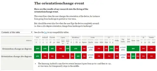
Following is orientationchange compatibility pic: compatibility therefore, I author a orientaionchange polyfill, it is a based on @media attribute to fix orientationchange utility library——orientationchange-fix

window.addEventListener('orientationchange', function(){
 if(window.neworientation.current === 'portrait|landscape'){
    // do something……
 } else {
    // do something……
 }
}, false);
Zhansingsong
  • 302
  • 3
  • 11
1

Another gotcha - some Android tablets (the Motorola Xoom I believe and a low-end Elonex one I'm doing some testing on, probably others too) have their accelerometers set up so that window.orientation == 0 in LANDSCAPE mode, not portrait!

james-geldart
  • 709
  • 7
  • 9
0

Cross browser way

$(window).on('resize orientationchange webkitfullscreenchange mozfullscreenchange fullscreenchange',  function(){
//code here
});
Tim Kozak
  • 4,026
  • 39
  • 44
0

Worth noting that on my Epic 4G Touch I had to set up the webview to use WebChromeClient before any of the javascript android calls worked.

webView.setWebChromeClient(new WebChromeClient());
calebisstupid
  • 423
  • 5
  • 13
-1

A little contribution to the two-bit-fool's answer:

As described on the table on droid phones "orientationchange" event gets fired earlier than "resize" event thus blocking the next resize call (because of the if statement). Width property is still not set.

A workaround though maybe not a perfect one could be to not fire the "orientationchange" event. That can be archived by wrapping "orientationchange" event binding in "if" statement:

if (!navigator.userAgent.match(/android/i))
{
    window.addEventListener("orientationchange", checkOrientation, false);
}

Hope it helps

(tests were done on Nexus S)

Alex
  • 843
  • 8
  • 15