6

I am trying to plot vertical bar plots over a map. I went through examples online but somehow not being able to.

My data is currently in this format:

University| Count | Category | lat | long

Here is the code that I am trying execute:

library(ggplot2)
library(ggmap)
library(ggsubplot)

df1 <- data.frame(
  University = c(rep("University1", 4), rep("University2", 4), rep("University3", 4), 
    rep("University4", 4)),
  Count = sample(1:10, 16, replace = T),
  Category = rep(c("A", "B", "C", "D")),
  lat = c(rep(10.902469, 4), rep(17.921959, 4), rep(18.606910, 4), rep(13.202366, 4)),
  long = c(rep(76.90020, 4), rep(83.42510, 4), rep(73.87501, 4), rep(77.62340, 4))
)

india <- get_map("India", zoom = 5)
p <- ggmap(india)
p + geom_subplot(data = df1, mapping=aes(x = long, y = lat, group = University,
subplot= geom_bar(aes(x = Category, y = Count, color = Category, stat = "identity"))))

When I run the above code, I get the following error:

Error in get(x, envir = this, inherits = inh)(this, ...) : 
   could not find function "%:::%"
Bhargav Rao
  • 50,140
  • 28
  • 121
  • 140
Indrajit
  • 2,152
  • 1
  • 14
  • 20
  • 2
    I didn't downvote your question but I assume that it is because your question isn't reproducible - we don't have your data frame so we can't reproduce your code. See [this for reproducible example and question](http://stackoverflow.com/questions/5963269/how-to-make-a-great-r-reproducible-example) – Didzis Elferts Dec 09 '13 at 08:39
  • Made the necessary change. Now the problem can be reproduced. – Indrajit Dec 09 '13 at 09:23
  • 1
    I think the problem has to do with the version of R. My answer below was produced with R 2.15.3. On my other computer, which is running R 3.0.2, I got the same error message. – Jaap Dec 09 '13 at 13:00
  • I updated my answer. It now also works in R 3.0.2. If it also works for you, it would be appreciated if you accept the answer. This will give future readers a clue about the value of the solution. – Jaap Jan 16 '14 at 18:30
  • Jaap, I haven't been able to install R 3.0.2 and test out. Anyway I managed to make some plots using CartoDB and hence this requirement is no longer there. Maybe somebody else will get chance to verify. – Indrajit Feb 10 '14 at 12:03
  • Possible duplicate of [Plots on a map using ggplot2](http://stackoverflow.com/questions/16028659/plots-on-a-map-using-ggplot2) – Andre Silva Dec 13 '16 at 11:50

2 Answers2

11

You should also use the mapproj package. With the following code:

ggmap(india) +
  geom_subplot(data = df1, aes(x = long, y = lat, group = University,
                           subplot = geom_bar(aes(x = Category, y = Count,
                                                  fill = Category, stat = "identity"))))

I got the following result:

enter image description here

As noted in the comments of the question: this solution works in R 2.15.3 but for some reason not in R 3.0.2


UPDATE 16 januari 2014: when you update the ggsubplot package to the latest version, this solution now also works in R 3.0.2


UPDATE 2 oktober 2014: Below the answer of the package author (Garret Grolemund) about the issue mentioned by @jazzuro (text formatting mine):

Unfortunately, ggsubplot is not very stable. ggplot2 was not designed to be extensible or recursive, so the api between ggsubplot and ggplot2 is very jury rigged. I think entropy will assert itself as R continues to update.

The future plan for development is to implement ggsubplot as a built in part of Hadley's new package ggvis. This will be much more maintainable than the ggsubplot + ggplot2 pairing.

I won't be available to debug ggsubplot for several months, but I would be happy to accept pull requests on github.


UPDATE 23 december 2016: The ggsubplot-package is no longer actively maintained and is archived on CRAN:

Package ‘ggsubplot’ was removed from the CRAN repository.

Formerly available versions can be obtained from the archive.

Archived on 2016-01-11 as requested by the maintainer .

Community
  • 1
  • 1
Jaap
  • 81,064
  • 34
  • 182
  • 193
  • Thanks I will try and get 2.15.3. BTW, I tried with R 2.15.1 and it did not work. – Indrajit Dec 10 '13 at 03:07
  • I am testing this code with R3.1.1., and I am receiving errors. Any updates? – jazzurro Sep 20 '14 at 15:18
  • @Jaap I used your answer and got `Error : Mapping a variable to y and also using stat="bin".` I, then, compared your code to one in [this link](http://stackoverflow.com/questions/20685379/specifying-plot-order-with-ggsubplot). I thought `)` was missing after `fill = Category`. Once I corrected this bracket issue, I got the following error message, `Error in layout_base(data, vars, drop = drop) : At least one layer must contain all variables used for facetting`. Do you have any ideas of what is happening? – jazzurro Sep 21 '14 at 14:22
  • @jazzurro I added an update from the package author: unfortunately, no solution on the short term – Jaap Oct 02 '14 at 13:48
  • @Jaap Thank you for that. So it seems that we will have to wait for a little bit to see this kind of graphics then. – jazzurro Oct 02 '14 at 13:52
1

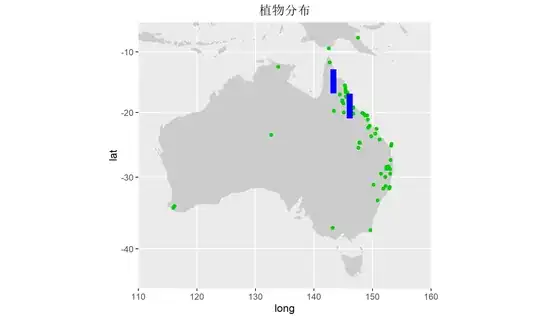
In fact we can use geom_errorbar() to add a bar in map actually. As long as we set the x and y of geom_errorbar() is longitude and latitude; and the ymin and ymax is stat of your data .

library(tidyverse)

plant_data <- read.csv("DV.csv")
colnames(plant_data) <- c("name", "lat", "lon", "p", "t", "hmi")
head(plant_data)
# name      lat      lon    p    t         hmi
# 1 Dodonaea viscosa subsp. viscosa -17.3000 145.9667 4084 24.1 8.905719509
# 2 Dodonaea viscosa subsp. viscosa -18.0833 146.0000 2562 24.0 13.18851823
# 3 Dodonaea viscosa subsp. viscosa -18.0833 146.0000 2562 24.0 13.18851823
# 4 Dodonaea viscosa subsp. viscosa -18.0833 146.0000 2562 24.0 13.18851823
# 5 Dodonaea viscosa subsp. viscosa -18.0833 146.0000 2562 24.0 13.18851823
# 6 Dodonaea viscosa subsp. viscosa -18.0833 146.0000 2562 24.0 13.18851823

plot part

aus <- map_data('world', region = "(Australia)|(Indonesia)|(Papua New Guinea)")
ggplot() +
  geom_polygon(data = aus, aes(x = long, y = lat, group = group), 
               fill = "gray80") + 
  geom_point(data = plant_data, aes(x = lon, y = lat), color = '#00CC00') +
  coord_map(xlim = c(110, 160), ylim = c(-45, -5)) +
  ggtitle("植物分布") + 
  theme(plot.title = element_text(hjust = 0.5)) + 
  geom_errorbar(data = plant_data[c(50, 99), ], 
                aes(x = lon,ymin=lat-3,ymax=lat+1), 
                color='blue', size = 3, width=0)

this part is very smart:

geom_errorbar(data = plant_data[c(50, 99), ], 
                aes(x = lon,ymin=lat-3,ymax=lat+1), 
                color='blue', size = 3, width=0)

it is very amazing!!

enter image description here

Jaap
  • 81,064
  • 34
  • 182
  • 193
yuanzz
  • 1,359
  • 12
  • 15