182

Histograms and scatterplots are great methods of visualizing data and the relationship between variables, but recently I have been wondering about what visualization techniques I am missing. What do you think is the most underused type of plot?

Answers should:

  1. Not be very commonly used in practice.
  2. Be understandable without a great deal of background discussion.
  3. Be applicable in many common situations.
  4. Include reproducible code to create an example (preferably in R). A linked image would be nice.
Ian Fellows
  • 17,228
  • 10
  • 49
  • 63
  • 16
    I think this is a very useful discussion, and am sad it's closed. – Alex Brown Mar 20 '12 at 04:50
  • 2
    @AlexBrown: then why not vote to reopen? I can see why the wording of this question may feel as "not constructive", but this question resulted in some of the most thoughtful and insightful answers on this topic anywhere on the web. I would love to see these answers updated and extended. – max Apr 08 '12 at 23:31
  • 2
    This should probably be moved to stats.stackoverflow.com. It's much more suited to that site. – naught101 May 11 '12 at 05:01
  • 5
    Pity no-one mentioned [QQ-plots](http://en.wikipedia.org/wiki/Q-Q_plot) here before this was closed. They're so damn useful! – naught101 Jul 19 '12 at 07:11
  • 1
    This should be re-opened. – Peter Flom Sep 03 '15 at 10:34
  • I have created a list of Visualization Tools and Libraries. I think this article would get you the most wanted visualization tools you would ever look for. http://shivganesh.com/2015/05/infovizgeek-encyclopedia-for-visualization-tools/ – Shiv Kumar Ganesh Sep 24 '15 at 09:31

15 Answers15

91

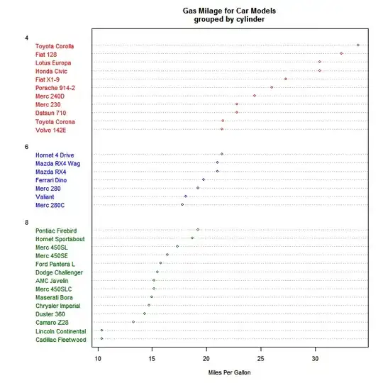
I really agree with the other posters: Tufte's books are fantastic and well worth reading.

First, I would point you to a very nice tutorial on ggplot2 and ggobi from "Looking at Data" earlier this year. Beyond that I would just highlight one visualization from R, and two graphics packages (which are not as widely used as base graphics, lattice, or ggplot):

Heat Maps

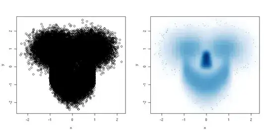
I really like visualizations that can handle multivariate data, especially time series data. Heat maps can be useful for this. One really neat one was featured by David Smith on the Revolutions blog. Here is the ggplot code courtesy of Hadley:

stock <- "MSFT"
start.date <- "2006-01-12"
end.date <- Sys.Date()
quote <- paste("http://ichart.finance.yahoo.com/table.csv?s=",
                stock, "&a=", substr(start.date,6,7),
                "&b=", substr(start.date, 9, 10),
                "&c=", substr(start.date, 1,4), 
                "&d=", substr(end.date,6,7),
                "&e=", substr(end.date, 9, 10),
                "&f=", substr(end.date, 1,4),
                "&g=d&ignore=.csv", sep="")    
stock.data <- read.csv(quote, as.is=TRUE)
stock.data <- transform(stock.data,
  week = as.POSIXlt(Date)$yday %/% 7 + 1,
  wday = as.POSIXlt(Date)$wday,
  year = as.POSIXlt(Date)$year + 1900)

library(ggplot2)
ggplot(stock.data, aes(week, wday, fill = Adj.Close)) + 
  geom_tile(colour = "white") + 
  scale_fill_gradientn(colours = c("#D61818","#FFAE63","#FFFFBD","#B5E384")) + 
  facet_wrap(~ year, ncol = 1)

Which ends up looking somewhat like this:

alt text

RGL: Interactive 3D Graphics

Another package that is well worth the effort to learn is RGL, which easily provides the ability to create interactive 3D graphics. There are many examples online for this (including in the rgl documentation).

The R-Wiki has a nice example of how to plot 3D scatter plots using rgl.

GGobi

Another package that is worth knowing is rggobi. There is a Springer book on the subject, and lots of great documentation/examples online, including at the "Looking at Data" course.

Community
  • 1
  • 1
Shane
  • 98,550
  • 35
  • 224
  • 217
  • nice. Thanks for including the code/image. – Ian Fellows Jan 16 '10 at 18:33
  • what is indicated by the vertical position of the 'Z' or bend in each solid black vertical line? – doug Jan 23 '10 at 18:06
  • Those are month boundaries (months don't end on the same day). – Shane Jan 23 '10 at 19:48
  • 3
    That's beautiful. How did you get the month boundaries to happen? – Alex Brown Mar 20 '12 at 04:47
  • @AlexBrown Taking a look at the [R file](http://blog.revolution-computing.com/downloads/calendarHeat.R) it seems they're made painstakingly with `grid.lines`. – sebastian-c Oct 11 '12 at 08:13
  • 1
    [working link to R file](http://blog.revolutionanalytics.com/downloads/calendarHeat.R) – iolsmit Nov 25 '13 at 17:57
  • Most of the links in your post are broken i.e. `http://ichart.finance.yahoo.com/table.csv?s=` Can you please post anything that will hint what data should be instead of that link? Like FistColumn = Date, second column Values. – Przemyslaw Remin May 29 '18 at 13:36
59

I really like dotplots and find when I recommend them to others for appropriate data problems they are invariably surprised and delighted. They don't seem to get much use, and I can't figure out why.

Here's an example from Quick-R: dotplot on car data

I believe Cleveland is most responsible for the development and promulgation of these, and the example in his book (in which faulty data was easily detected with a dotplot) is a powerful argument for their use. Note that the example above only puts one dot per line, whereas their real power comes with you have multiple dots on each line, with a legend explaining which is which. For instance, you could use different symbols or colors for three different time points, and thence easily get a sense of time patterns in different categories.

In the following example (done in Excel of all things!), you can clearly see which category might have suffered from a label swap.

Dotplot with 2 groups

Ari B. Friedman
  • 71,271
  • 35
  • 175
  • 235
  • 1
    How is a dotplot different from a scatterplot with switched axis one of which is categorical? – DrSAR Nov 10 '11 at 06:32
  • 5
    @DrSAR How is a histogram different than a barchart, or a density plot different than a line plot? You can describe many standard chart types in terms of more fundamental geometries (c.f. Bertin's _Semiologie Graphique_), but that doesn't make the insight to plot something a particular way any less unique. In this case, you are plotting two pieces of categorical information (one vertically, one by the shape of the plotting character) against one piece of continuous data. While in most software packages you would hack a scatterplot to create it, it is most emphatically not a scatterplot. – Ari B. Friedman Nov 10 '11 at 11:45
  • 3
    @gsk3 Didn't mean to sound snarky. In fact, I now (after reading more about grammar of graphics and similar works) realize that this higher-level distinction can be quite important for presentation. Thanks for showing this. – DrSAR Nov 11 '11 at 06:17
  • @DrSAR And I didn't mean to sound defensive. Nature of SO comments I guess ;-) – Ari B. Friedman May 11 '12 at 11:14
56

Plots using polar coordinates are certainly underused--some would say with good reason. I think the situations which justify their use are not common; I also think that when those situations arise, polar plots can reveal patterns in data that linear plots cannot.

I think that's because sometimes your data is inherently polar rather than linear--eg, it is cyclical (x-coordinates representing times during 24-hour day over multiple days), or the data were previously mapped onto a polar feature space.

Here's an example. This plot shows a Website's mean traffic volume by hour. Notice the two spikes at 10 pm and at 1 am. For the Site's network engineers, those are significant; it's also significant that they occur near each other other (just two hours apart). But if you plot the same data on a traditional coordinate system, this pattern would be completely concealed--plotted linearly, these two spikes would be 20 hours apart, which they are, though they are also just two hours apart on consecutive days. The polar chart above shows this in a parsimonious and intuitive way (a legend isn't necessary).

Polar chart showing site traffic, with peaks at hours 1 and 22

There are two ways (that I'm aware of) to create plots like this using R (I created the plot above w/ R). One is to code your own function in either the base or grid graphic systems. They other way, which is easier, is to use the circular package. The function you would use is 'rose.diag':

data = c(35, 78, 34, 25, 21, 17, 22, 19, 25, 18, 25, 21, 16, 20, 26, 
                 19, 24, 18, 23, 25, 24, 25, 71, 27)
three_palettes = c(brewer.pal(12, "Set3"), brewer.pal(8, "Accent"), 
                   brewer.pal(9, "Set1"))
rose.diag(data, bins=24, main="Daily Site Traffic by Hour", col=three_palettes)
SuperBiasedMan
  • 9,814
  • 10
  • 45
  • 73
doug
  • 69,080
  • 24
  • 165
  • 199
  • 4
    Copying your code, I get a very different plot (that is quite ugly); any idea why? I get this warning: 1: In as.circular(xx[, 1]) : an object is coerced to the class 'circular' using default value for the following components: type: 'angles' units: 'radians' template: 'none' modulo: 'asis' zero: 0 rotation: 'counter' rose.diagdata24Daily Site Traffic by Hourthree_palettes – datayoda Apr 20 '11 at 00:04
  • You could do this with a line-plot too. Can be a bit harder to read, but it can also be really awesome for more granular data, or data that undergoes more than one cycle (e.g. plot ten cycles, then plot their average). – naught101 Jul 19 '12 at 07:08
  • 1
    I also had trouble replicating the plot. I eventually decided it was easier to use ggplot2. I've left a short demo on Rpubs with code and results: http://rpubs.com/mattbagg/circular – MattBagg Apr 24 '13 at 16:46
  • @doug -- Brilliantly written explanation! Thanks! – d_a_c321 Nov 03 '13 at 05:44
  • 1
    ggplot2 equivalent: `qplot(y=data, x=1:length(data), fill=factor(1:length(data)), stat='identity', geom='bar') + coord_polar()` – naught101 Sep 11 '14 at 00:32
  • I coded some ggplot2 wrappers that aimed at representing the measurement as the area of the wedge as opposed to the radius. See the readMe at https://github.com/swihart/aaroseplot – swihart Sep 29 '14 at 11:17
55

If your scatter plot has so many points that it becomes a complete mess, try a smoothed scatter plot. Here is an example:

library(mlbench) ## this package has a smiley function
n <- 1e5 ## number of points
p <- mlbench.smiley(n,sd1 = 0.4, sd2 = 0.4) ## make a smiley :-)
x <- p$x[,1]; y <- p$x[,2]
par(mfrow = c(1,2)) ## plot side by side
plot(x,y) ## left plot, regular scatter plot
smoothScatter(x,y) ## right plot, smoothed scatter plot

The hexbin package (suggested by @Dirk Eddelbuettel) is used for the same purpose, but smoothScatter() has the advantage that it belongs to the graphics package, and is thus part of the standard R installation.

Smiley as a regular or smoothed scatter plot

nullglob
  • 6,903
  • 1
  • 29
  • 31
31

Regarding sparkline and other Tufte idea, the YaleToolkit package on CRAN provides functions sparkline and sparklines.

Another package that is useful for larger datasets is hexbin as it cleverly 'bins' data into buckets to deal with datasets that may be too large for naive scatterplots.

Dirk Eddelbuettel
  • 360,940
  • 56
  • 644
  • 725
  • 5
    +1 to the sparklines. I'm currently working on a package that is focused on sparkline creation in R-- they make great additions to tables in Sweave reports. – Sharpie Jan 22 '10 at 23:51
  • 1
    Cool! I am not too happy with what Jay has in YaleToolkit and would love to have sparklines in tables! – Dirk Eddelbuettel Jan 23 '10 at 00:20
  • I've just documented a way to produce sparklines only using `plot` over in an update to my [question](http://stackoverflow.com/q/8337980/1036500), with some help from this [Tufte forum post](http://www.edwardtufte.com/bboard/q-and-a-fetch-msg?msg_id=00037p) – Ben Dec 02 '11 at 09:51
  • 1
    The `Hmisc::latex()` version of output from `Hmisc::describe` includes a mini-histogram that gets included in the table. – IRTFM Nov 07 '13 at 23:07
30

Violin plots (which combine box plots with kernel density) are relatively exotic and pretty cool. The vioplot package in R allows you to make them pretty easily.

Here's an example (The wikipedia link also shows an example):

enter image description here

Jason Sundram
  • 12,225
  • 19
  • 71
  • 86
26

Another nice time series visualization that I was just reviewing is the "bump chart" (as featured in this post on the "Learning R" blog). This is very useful for visualizing changes in position over time.

You can read about how to create it on http://learnr.wordpress.com/, but this is what it ends up looking like:

alt text

Community
  • 1
  • 1
Shane
  • 98,550
  • 35
  • 224
  • 217
  • I do like the bump chart for this particular data, but have a hard time thinking of more general situations where it would be of use. That said, I think we can all agree that the Learning R blog rocks the socks. – Ian Fellows Jan 21 '10 at 04:27
  • 7
    A bump chart is a parallel coordinate plot of ranked data. – hadley Jan 25 '10 at 04:26
  • 1
    this reminds me of slopegraph which is good for representing ranking change over time or relationships between rankings: http://charliepark.org/slopegraphs/ – topchef Apr 24 '13 at 04:01
22

I also like Tufte's modifications of boxplots which let you do small multiples comparison much more easily because they are very "thin" horizontally and don't clutter up the plot with redundant ink. However, it works best with a fairly large number of categories; if you've only got a few on a plot the regular (Tukey) boxplots look better since they have a bit more heft to them.

library(lattice)
library(taRifx)
compareplot(~weight | Diet * Time * Chick, 
  data.frame=cw , 
  main = "Chick Weights",
  box.show.mean=FALSE,
  box.show.whiskers=FALSE,
  box.show.box=FALSE
  )

compareplot

Other ways of making these (including the other kind of Tufte boxplot) are discussed in this question.

Community
  • 1
  • 1
Ari B. Friedman
  • 71,271
  • 35
  • 175
  • 235
  • @daroczig Thanks. One of these days I'll rewrite it to take different configurations of groupings. I've learned a lot since I wrote that function! – Ari B. Friedman Sep 09 '11 at 23:47
  • 1
    I like your plots much better than tufte's, which are ridiculously hard to read. I still think that Tukey-style boxplots are better, although a good compromise might be something like what you have here, but with 3px wide lines for the box, instead of the 1px offset. And I think a 1px wide horisontal line for the median is probably neater, and more exact. – naught101 May 11 '12 at 05:00
20

We shouldn't forget about cute and (historically) important stem-and-leaf plot (that Tufte loves too!). You get a directly numerical overview of you data density and shape (of course if your data set is not larger then about 200 points). In R, the function stem produces your stem-and-leaf dislay (in workspace). I prefer to use gstem function from package fmsb to draw it directly in a graphic device. Below is a beaver body temperature variance (data should be in your default dataset) in a stem-by-leaf display:

  require(fmsb)
  gstem(beaver1$temp)

enter image description here

Geek On Acid
  • 6,330
  • 4
  • 44
  • 64
18

Horizon graphs (pdf), for visualising many time series at once.

Parallel coordinates plots (pdf), for multivariate analysis.

Association and mosaic plots, for visualising contingency tables (see the vcd package)

Richie Cotton
  • 118,240
  • 47
  • 247
  • 360
16

In addition to Tufte's excellent work, I recommend the books by William S. Cleveland: Visualizing Data and The Elements of Graphing Data. Not only are they excellent, but they were all done in R, and I believe the code is publicly available.

Peter Flom
  • 2,008
  • 4
  • 22
  • 35
15

Boxplots! Example from the R help:

boxplot(count ~ spray, data = InsectSprays, col = "lightgray")

In my opinion it is the most handy way to take a quick look at the data or to compare distributions. For more complex distributions there is an extension called vioplot.

mbq
  • 18,510
  • 6
  • 49
  • 72
  • 2
    Beanplot could be mentioned here as well http://www.jstatsoft.org/v28/c01/paper and http://cran.r-project.org/web/packages/beanplot/index.html – radek Nov 08 '10 at 17:41
  • Boxplots aren't that underused, are they? I mean sure, in many papers bar charts are used for data that should be boxplotted, but they're still pretty common. – naught101 May 11 '12 at 05:10
12

Mosaic plots seem to me to meet all four criteria mentioned. There are examples in r, under mosaicplot.

Peter Flom
  • 2,008
  • 4
  • 22
  • 35
  • 4
    A better implementation of mosaic plots is in the vcd library (function name 'mosaic'). It has a much more flexible method signature and it is implemented in grid (rather than the 'base' graphics system). – doug Jan 18 '10 at 05:52
11

Check out Edward Tufte's work and especially this book

You can also try and catch his travelling presentation. It's quite good and includes a bundle of four of his books. (i swear i don't own his publisher's stock!)

By the way, i like his sparkline data visualization technique. Surprise! Google's already written it and put it out on Google Code

Paul Sasik
  • 79,492
  • 20
  • 149
  • 189
0

Summary plots? Like mentioned in this page:

Visualizing Summary Statistics and Uncertainty

Gökhan Sever
  • 8,004
  • 13
  • 36
  • 38