224

I want 1 larger image with 4 smaller images in a 2x2 format like this:

Figure 1 Example

My initial thought was to house everything in one row. Then create two columns, and, in the second column, create two rows and two columns to create the 1x1 and 2x2 effect.

However, this doesn't seem to be possible, or I am just not doing it correctly?

KyleMit
  • 30,350
  • 66
  • 462
  • 664
Greg
  • 2,643
  • 2
  • 15
  • 9

2 Answers2

352

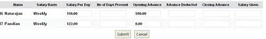
Bootstrap Version 3.x

As always, read Bootstrap's great documentation:

3.x Docs: https://getbootstrap.com/docs/3.3/css/#grid-nesting

Make sure the parent level row is inside of a .container element. Whenever you'd like to nest rows, just open up a new .row inside of your column.

Here's a simple layout to work from:

<div class="container">
    <div class="row">
        <div class="col-xs-6">
            <div class="big-box">image</div>
        </div>
        <div class="col-xs-6">
            <div class="row">
                <div class="col-xs-6"><div class="mini-box">1</div></div>
                <div class="col-xs-6"><div class="mini-box">2</div></div>
                <div class="col-xs-6"><div class="mini-box">3</div></div>
                <div class="col-xs-6"><div class="mini-box">4</div></div>
            </div>
        </div>
    </div>
</div>

Bootstrap Version 4.0

4.0 Docs: http://getbootstrap.com/docs/4.0/layout/grid/#nesting

Here's an updated version for 4.0, but you should really read the entire docs section on the grid so you understand how to leverage this powerful feature

<div class="container">
  <div class="row">
    <div class="col big-box">
      image
    </div>

    <div class="col">
      <div class="row">
        <div class="col mini-box">1</div>
        <div class="col mini-box">2</div>
      </div>
      <div class="row">
        <div class="col mini-box">3</div>
        <div class="col mini-box">4</div>
      </div>
    </div>

  </div>
</div>

Demo in Fiddle jsFiddle 3.x | jsFiddle 4.0

Which will look like this (with a little bit of added styling):

screenshot

KyleMit
  • 30,350
  • 66
  • 462
  • 664
  • 2
    sorry to hijack a 1 year old thread, but do you know how to get 0px between image and 1 and 3 – alex Mar 20 '15 at 19:21
  • 3
    @alex, sure - just set `margin: 0;` on the `.mini-box` element. My example was just adding one for clarity, but you can just remove the line altogether. [**Here's a demo**](http://jsfiddle.net/KyleMit/fbtw6/210/) – KyleMit Mar 31 '15 at 15:04
  • 5
    why is there no row between col for minibox 2 and col for minibox 3? and what will happen if there is? – pashute Aug 14 '15 at 11:24
  • 5
    @pashute, see [Bootstrap 3 grid, does it *really* matter how many columns are in a row?](http://stackoverflow.com/a/23502516/1366033). Each mini box takes up 50% of the available space (constrained by the column) so two will take up the first row. Any extra ones will just wrap down into a new line. You *can* also pair each of them in rows, but you don't need to. Bootstrap wraps by default so you don't have to clutter your markup with new rows. If it's semantically meaningful, I'd say go for it. But if you're just displaying a list of 4 objects, keep them in the same row. – KyleMit Aug 14 '15 at 12:40
  • OK thanks. I fiddled with the extra row and of course it worked exactly the same. Still seems to me a better idea to keep things explicit. – pashute Aug 15 '15 at 21:56
  • Is that normal there is 4 elements with `col-xs-6` in only 1 row ? – Ellone Dec 18 '15 at 16:48
  • sorry for bringing this back to life again..but, how can I fit the height of the big box to the height of the combined small boxes? I was able to do it by using min-height and max-height, I wonder if there is/are more proper way/s – user3921890 Mar 21 '16 at 13:00
  • 2
    @user3921890, that's too big a topic to answer in a comment line. Can you post a new thread explaining what you're trying to do and at least one attempt at doing it, and then link to that here. – KyleMit Mar 21 '16 at 13:13
  • Awesome! And this (apparently) is because "row" adds a margin of -10px counteracting the 10px margin added by the grid (ie. col-xs-6) – Chris Allinson Aug 02 '17 at 15:14
  • 1
    @Jordan.J.D - broke because of v4 since the libraries in the fiddle were pointed to the the dist/ channel. Updated with v3 libraries – KyleMit Jan 24 '18 at 22:36
  • 1
    @Jordan.J.D - added demos for v3.3.7 and v4.0 – KyleMit Jan 24 '18 at 22:58
  • What does `mini-box` do? – Aaron Franke Feb 03 '19 at 00:54
  • @AaronFranke, `.mini-box` is just there to apply some styling like height and background color to have parity to OP's question / grid layout. You can see the full code in the jsFiddle – KyleMit Feb 04 '19 at 14:53
9

Adding to what @KyleMit said, consider using:

  • col-md-* classes for the larger outer columns
  • col-xs-* classes for the smaller inner columns

This will be useful when you view the page on different screen sizes.

On a small screen, the wrapping of larger outer columns will then happen while maintaining the smaller inner columns, if possible

Gurpartap Singh
  • 2,744
  • 1
  • 26
  • 30
ezzadeen
  • 1,033
  • 10
  • 9