4

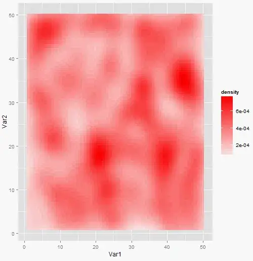
I want to plot a heatmap in R from a set of points.

I have a data frame like

X  Y  col
1  2  1
1  1  4
2  4  9
.......

I want to have a heatmap from this, with X and Y being the coordinates of the point, and col can be from 0 to 40. I tried to plot in points or using melt(), but with no luck.

I can plot some points with geom_point(), but I'd like to have a smooth transition from one color to another, some probably this is not the reight thing to do.

jlhoward
  • 58,004
  • 7
  • 97
  • 140
lbedogni
  • 7,917
  • 8
  • 30
  • 51
  • 1
    I think this question is closely related to [this one](http://stackoverflow.com/questions/8421536/a-true-heat-map-in-r). – Vincent Guillemot Aug 01 '14 at 15:08
  • If there is a smooth transition, then it's NOT a heatmap. I think you need to get some statistical advice. – IRTFM Aug 01 '14 at 15:58
  • It is a continuous heatmap. Like this: http://stackoverflow.com/questions/11531059/creating-a-continuous-heat-map-in-r – lbedogni Aug 01 '14 at 16:00

1 Answers1

6
set.seed(1)
library(ggplot2)
df <- as.data.frame(expand.grid(1:50, 1:50))
df$col <- sample(0:40, size = nrow(df), replace = TRUE)
ggplot(df, aes(x = Var1, y = Var2, colour = col, fill = col )) + 
  geom_tile()

produces:

enter image description here

Edit:

And this

set.seed(1)
library(ggplot2)
df <- as.data.frame(expand.grid(1:50, 1:50))
df$col <- sample(0:40, size = nrow(df), replace = TRUE)
df <- df[sample(1:nrow(df), nrow(df) * .2, replace = FALSE), ]  # make holes
df <- df[rep(1:nrow(df), df$col), -3]
ggplot(df, aes(x = Var1, y = Var2)) + 
  geom_point() + 
  stat_density2d(aes(fill=..density..), geom = "tile", contour = FALSE) +
  scale_fill_gradient2(low = "white", high = "red")

produces

enter image description here

lukeA
  • 53,097
  • 5
  • 97
  • 100
  • The problem is that I don't have all the points, and thus I get some white areas which I don't want. – lbedogni Aug 01 '14 at 15:29
  • And what do you want? I mean, it's obvious that you got holes if you matrix is incomplete... :) – lukeA Aug 01 '14 at 15:39
  • I want that the colours interpolate. So if I have a white tile next to a let's say red tile, I want the white tile to be a lighter red. – lbedogni Aug 01 '14 at 15:47
  • 1
    @lbedogni Why don't you then replace NAs in your data by actually interpolating? – konvas Aug 01 '14 at 16:35
  • 1
    Because I thought there would have been a proper method instead of doing it manually. – lbedogni Aug 02 '14 at 06:44