8

I have a heatmap that continues to become more and more complex. An example of the melted data:

head(df2)
  Class     Subclass         Family               variable value
1     A chemosensory family_1005117 caenorhabditis_elegans    10
2     A chemosensory family_1011230 caenorhabditis_elegans     4
3     A chemosensory family_1022539 caenorhabditis_elegans    10
4     A        other family_1025293 caenorhabditis_elegans    NA
5     A chemosensory family_1031345 caenorhabditis_elegans    10
6     A chemosensory family_1033309 caenorhabditis_elegans    10
tail(df2)
     Class Subclass        Family        variable value
6496     C  class c family_455391 trichuris_muris     1
6497     C  class c family_812893 trichuris_muris    NA
6498     F  class f family_225491 trichuris_muris     1
6499     F  class f family_236822 trichuris_muris     1
6500     F  class f family_276074 trichuris_muris     1
6501     F  class f family_768194 trichuris_muris    NA

Using ggplot2 and geom_tile, I was able to produce a beautiful heatmap of the data. I am proud of the code (this is my first experience in R), so have posted it below:

df2[df2 == 0] <- NA
df2[df2 > 11] <- 10
df2.t <- data.table(df2)
df2.t[, clade := ifelse(variable %in% c("pristionchus_pacificus", "caenorhabditis_elegans", "ancylostoma_ceylanicum", "necator_americanus", "nippostrongylus_brasiliensis", "angiostrongylus_costaricensis", "dictyocaulus_viviparus", "haemonchus_contortus"), "Clade V",
                 ifelse(variable %in% c("meloidogyne_hapla","panagrellus_redivivus", "rhabditophanes_kr3021", "strongyloides_ratti"), "Clade IV",
                 ifelse(variable %in% c("toxocara_canis", "dracunculus_medinensis", "loa_loa", "onchocerca_volvulus", "ascaris_suum", "brugia_malayi", "litomosoides_sigmodontis", "syphacia_muris", "thelazia_callipaeda"), "Clade III",
                 ifelse(variable %in% c("romanomermis_culicivorax", "trichinella_spiralis", "trichuris_muris"), "Clade I",
                 ifelse(variable %in% c("echinococcus_multilocularis", "hymenolepis_microstoma", "mesocestoides_corti", "taenia_solium", "schistocephalus_solidus"), "Cestoda",
                 ifelse(variable %in% c("clonorchis_sinensis", "fasciola_hepatica", "schistosoma_japonicum", "schistosoma_mansoni"), "Trematoda", NA))))))]
df2.t$clade <- factor(df2.t$clade, levels = c("Clade I", "Clade III", "Clade IV", "Clade V", "Cestoda", "Trematoda"))
plot2 <- ggplot(df2.t, aes(variable, Family))
tile2 <- plot2 + geom_tile(aes(fill = value)) + facet_grid(Class ~ clade, scales = "free", space = "free")
tile2 <- tile2 + scale_x_discrete(expand = c(0,0)) + scale_y_discrete(expand = c(0,0))
tile2 <- tile2 + theme(axis.text.y = element_blank(), axis.ticks.y = element_blank(), legend.position = "right", axis.text.x = element_text(angle = 90, hjust = 1, vjust = 0.55), axis.text.y = element_text(size = rel(0.35)), panel.border = element_rect(fill=NA,color="grey", size=0.5, linetype="solid"))
tile2 <- tile2 + xlab(NULL)
tile2 <- tile2 + scale_fill_gradientn(breaks = c(1,2,3,4,5,6,7,8,9,10),labels = c("1", "2", "3", "4", "5", "6", "7", "8", "9", ">10"), limits = c(1, 10), colours = palette(11), na.value = "white", name = "Members")'

As you can see, there is quite a bit of manual reordering involved, otherwise the code is pretty simple. Here's the image output:

heatmap

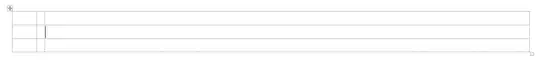
However, you may notice that a whole column of information, "Subclass" is not utilized. Basically, each Subclass fits within a Class. It would be perfect if I was able to facet these Subclasses within the Class facet already displayed. As far as I know, this is impossible. To be precise, only Class A has varying Subclasses. The other Classes simply have their class name mirrored (F = class f). Is there another way to organize this heatmap so that I can display all of the relevant information? The missing Subclasses contain some of the most crucial data and will be the most necessary for drawing inferences from the data.

An alternative approach would be to facet the Subclases instead of the Classes, manually reorder them so that the Classes are clustered together, and then draw some sort of box around them to demarcate each Class. I have no idea how this would be done.

Any help would be very useful. Please let me know if you need any additional information.

Gregor Thomas
  • 136,190
  • 20
  • 167
  • 294
Nic
  • 113
  • 1
  • 1
  • 8
  • Where you have `facet_grid(Class ~ clade,`, change it to `facet_grid(Class + Subclass ~ clade,` – Gregor Thomas Mar 27 '15 at 23:31
  • Though, for ordering of the labels, you probably want `Subclass + Class`. – Gregor Thomas Mar 27 '15 at 23:35
  • That's one way to do it, thank you. It's not exactly what I envisioned (nested facets), as it simply breaks it into the Subclasses and then adds a Class label. I guess it's not as pretty as I would like, but maybe that's as good as it gets. Thanks for your input, @Gregor. – Nic Mar 27 '15 at 23:37
  • I guess I'm not sure what you're after if that isn't it. – Gregor Thomas Mar 27 '15 at 23:39

2 Answers2

10

This will put a new strip to the right of the orignal strip, and to the left of the legend.

library(ggplot2)
library(gtable)
library(grid)

p <- ggplot(mtcars, aes(mpg, wt, colour = factor(vs))) + geom_point()
p <- p + facet_grid(cyl ~ gear)

# Convert the plot to a grob
gt <- ggplotGrob(p)

# Get the positions of the right strips in the layout: t = top, l = left, ...
strip <-c(subset(gt$layout, grepl("strip-r", gt$layout$name), select = t:r))

#  New column to the right of current strip
gt <- gtable_add_cols(gt, gt$widths[max(strip$r)], max(strip$r))  

# Add grob, the new strip, into new column
gt <- gtable_add_grob(gt, 
  list(rectGrob(gp = gpar(col = NA, fill = "grey85", size = .5)),
  textGrob("Number of Cylinders", rot = -90, vjust = .27, 
        gp = gpar(cex = .75, fontface = "bold", col = "black"))), 
        t = min(strip$t), l = max(strip$r) + 1, b = max(strip$b), name = c("a", "b"))

# Add small gap between strips
gt <- gtable_add_cols(gt, unit(1/5, "line"), max(strip$r))

# Draw it
grid.newpage()
grid.draw(gt)

enter image description here

Sandy Muspratt
  • 31,719
  • 12
  • 116
  • 122
2

Turning my comment into an answer with some simple demo data:

This isn't hard (there's even examples in ?facet_grid, though they're towards the bottom).

# generate some nested data
dat = data.frame(x = rnorm(12), y = rnorm(12), class = rep(LETTERS[1:2], each = 6),
                 subclass = rep(letters[1:6], each = 2))

# plot it
ggplot(dat, aes(x, y)) + geom_point() +
    facet_grid(subclass + class ~ .)

You can do this with arbitrarily many factors on either side of the ~!

Gregor Thomas
  • 136,190
  • 20
  • 167
  • 294
  • Functionally, it's exactly what I want. Aesthetically, it's not what I'm looking for. But that's probably my problem, not ggplot2's. I don't like how it repeats the Class labels for every nested Subclass. Am I making sense? To me, it seems that the right way to do it would be to have one larger Class bar (the gray label area) spanning the entirety of the data that it contains with a subset of nested Subclass labels. @Gregor – Nic Mar 27 '15 at 23:46
  • @Nic Yes, I understand now. The problem is that `ggplot` doesn't know that the factors are nested, so the solution is general for whether they're nested or crossed. – Gregor Thomas Mar 28 '15 at 01:36
  • @Nic, something like this [http://stackoverflow.com/.../annotating-facet-title-as-strip-over-facet.....](http://stackoverflow.com/questions/22818061/annotating-facet-title-as-strip-over-facet/22825447#22825447) – Sandy Muspratt Mar 28 '15 at 03:06
  • @Sandy I guess I don't have enough rep to comment on the source... Anyway, I think I was able to get the grob positioned at the right place, but now it's much bigger than it ought to be. I think what's happening is that it is being placed in the same column as the legend, which is relatively wide, so it's completely covering the legend and spanning quite a large area. I imagine this has to do with the organization of the original gtable. Unfortunately, the table is so large that gtable_show_layout isn't very helpful. Can you help me? – Nic Mar 28 '15 at 14:30
  • I've posted a new answer here. It deals with the legend, and is a bit more general that the answer following the link. – Sandy Muspratt Mar 28 '15 at 23:16