129

Is there a way to make CardView only have corner radius at the top?

<android.support.v7.widget.CardView
    xmlns:android="http://schemas.android.com/apk/res/android"
    xmlns:tools="http://schemas.android.com/tools"
    xmlns:app="http://schemas.android.com/apk/res-auto"
    android:layout_width="match_parent"
    android:layout_height="wrap_content"
    app:cardCornerRadius="10dp"
    >
Gabriele Mariotti
  • 320,139
  • 94
  • 887
  • 841
terencey
  • 3,282
  • 4
  • 32
  • 40
  • In case if we just need to shape an image, use the material [ShapeableImageView](https://stackoverflow.com/a/67851035/4694013) that draws the bitmap with the provided Shape. – Anoop M Maddasseri Jun 05 '21 at 15:21

17 Answers17

145

Unless you try to extend the Android CardView class, you cannot customize that attribute from XML.

Nonetheless, there is a way of obtaining that effect.

Place a CardView inside another CardView and apply a transparent background to your outer CardView and remove its corner radius ("cornerRadios = 0dp"). Your inner CardView will have a cornerRadius value of 3dp, for example. Then apply a marginTop to your inner CardView, so its bottom bounds will be cut by the outer CardView. This way, the bottom corner radius of your inner CardView will be hidden.

The XML code is the following:

 <android.support.v7.widget.CardView
    xmlns:card_view="http://schemas.android.com/apk/res-auto"
    android:id="@+id/card_view_outer"
    android:layout_width="match_parent"
    android:layout_height="200dp"
    android:layout_gravity="center"
    card_view:cardBackgroundColor="@android:color/transparent"
    card_view:cardCornerRadius="0dp"
    card_view:cardElevation="3dp" >

    <android.support.v7.widget.CardView
        xmlns:card_view="http://schemas.android.com/apk/res-auto"
        android:id="@+id/card_view_inner"
        android:layout_width="match_parent"
        android:layout_height="200dp"
        android:layout_gravity="center"
        android:layout_marginTop="3dp"
        card_view:cardBackgroundColor="@color/green"
        card_view:cardCornerRadius="4dp"
        card_view:cardElevation="0dp" >
    </android.support.v7.widget.CardView>
</android.support.v7.widget.CardView>

And the visual effect is the following:

CardView with rounded corners only on top

Always put your content in your Inner CardView. Your outer CardView serves only the purpose of "hiding" the bottom Rounded Corners of the inner CardView.

joao2fast4u
  • 6,868
  • 5
  • 28
  • 42
71

You can use the standard MaterialCard included in the official Material Components library.

Use in your layout:

<com.google.android.material.card.MaterialCardView
        style="@style/MyCardView"
        ...>

In your style use the shapeAppearanceOverlay attribute to customize the shape (the default corner radius is 4dp)

  <style name="MyCardView" parent="@style/Widget.MaterialComponents.CardView">
    <item name="shapeAppearanceOverlay">@style/ShapeAppearanceOverlay.MaterialCardView.Cut</item>
  </style>


  <style name="ShapeAppearanceOverlay.MaterialCardView.Cut" parent="">
    <item name="cornerFamily">rounded</item>
    <item name="cornerSizeTopRight">8dp</item>
    <item name="cornerSizeTopLeft">8dp</item>
    <item name="cornerSizeBottomRight">0dp</item>
    <item name="cornerSizeBottomLeft">0dp</item>
  </style>

You can also use:

<com.google.android.material.card.MaterialCardView
     app:shapeAppearanceOverlay="@style/ShapeAppearanceOverlay.MaterialCardView.Cut"
     ...>

It is the result:

enter image description here


With Jetpack compose you can use the shape parameter in the Card.

Something like:

Card(
    shape = RoundedCornerShape(
        topStart = 8.dp,
        topEnd = 8.dp,
        bottomEnd = 0.dp,
        bottomStart = 0.dp,
    )
){
    Text("Content Card")
}
Gabriele Mariotti
  • 320,139
  • 94
  • 887
  • 841
  • this is not working with TabLayout. My corner tabs r not rounded. My requirement is only top corners of tabs should be rounded where bottom should remain sqare like. can you help me out in this? – Tara Mar 31 '20 at 06:49
  • 2
    If you're only applying this to a single component you can apply the shape appearance overlay directly in XML without needing a custom style. `app:shapeAppearanceOverlay="@style/ShapeAppearanceOverlay.MaterialCardView.Cut"` – Affian May 19 '20 at 05:32
  • This works well for me. – lloydyu24 Oct 18 '21 at 03:36
  • not working with bottomnavigation. – LMaker May 13 '22 at 06:28
  • it doesn't work with `app:cardPreventCornerOverlap="false"`, when I set it removes all corners. But with `CardView` it works, it removes corners and still keeps the corners – user924 Apr 06 '23 at 17:04
  • now you have to use this ' app:shapeAppearanceOverlay="@style/ShapeAppearanceOverlay.Material3.Corner.Top" ' – Mateen Chaudhry Jul 31 '23 at 10:07
45
dependencies: compile 'com.android.support:cardview-v7:23.1.1'

<android.support.v7.widget.CardView
    android:layout_width="80dp"
    android:layout_height="80dp"
    android:elevation="12dp"
    android:id="@+id/view2"
    app:cardCornerRadius="40dp"
    android:layout_centerHorizontal="true"
    android:innerRadius="0dp"
    android:shape="ring"
    android:thicknessRatio="1.9">
    <ImageView
        android:layout_height="80dp"
        android:layout_width="match_parent"
        android:id="@+id/imageView1"
        android:src="@drawable/Your_image"
        android:layout_alignParentTop="true"
        android:layout_centerHorizontal="true">
    </ImageView>
</android.support.v7.widget.CardView>
ColdFire
  • 6,764
  • 6
  • 35
  • 51
shreedhar bhat
  • 4,779
  • 1
  • 18
  • 23
  • 11
    Could you explain what does this block of code do? I can't seem to find any resources explaining about the XML property `innerRadius`, `shape`, and `thicknessRatio` – atjua Jun 11 '18 at 07:21
  • 2
    Only **`app:cardCornerRadius="40dp"`** will work too. – Rumit Patel Jul 23 '19 at 07:06
12

There is an example how to achieve it, when the card is at the very bottom of the screen. If someone has this kind of problem just do something like that:

<android.support.v7.widget.CardView
    android:layout_width="match_parent"
    android:layout_height="wrap_content"
    android:layout_marginBottom="-5dp"
    card_view:cardCornerRadius="4dp">

    <SomeView
        android:layout_width="wrap_content"
        android:layout_height="wrap_content"
        android:layout_marginBottom="5dp">

    </SomeView>

</android.support.v7.widget.CardView>

Card View has a negative bottom margin. The view inside a Card View has the same, but positive bottom margin. This way rounded parts are hidden below the screen, but everything looks exactly the same, because the inner view has a counter margin.

koras
  • 1,107
  • 2
  • 13
  • 28
7

You can use this drawable xml and set as background to cardview :

<?xml version="1.0" encoding="UTF-8"?>
<shape xmlns:android="http://schemas.android.com/apk/res/android">
    <solid android:color="#ffffffff"/>

    <stroke android:width="1dp"
        android:color="#ff000000"
        />

    <padding android:left="1dp"
        android:top="1dp"
        android:right="1dp"
        android:bottom="1dp"
        />

    <corners 
        android:topLeftRadius="7dp"
        android:topRightRadius="7dp"/>
</shape>
Surender Kumar
  • 1,123
  • 8
  • 15
6

I wrote a drawable lib to custom round corner position, it looks like this:

example.png

You can get this lib at here:

https://github.com/mthli/Slice

mthli
  • 130
  • 1
  • 7
5

As @Gabriele Mariotti at feedback#2 suggested. Thanks so much @Gabriele bcz your feedback helped me on this case but my account can't vote for you at this time, so sorry :( (I also need helping like this topic creater)

I recommend to you shoud use MaterialCardView component (not CardView). Exactly is MaterialCardView.

So, this is the code in XML layout:

    <com.google.android.material.card.MaterialCardView
        android:id="@+id/cardView"
        android:layout_width="match_parent"
        android:layout_height="260dp"
        android:layout_marginTop="0dp"
        app:shapeAppearanceOverlay="@style/ShapeAppearanceOverlay.CardView" >

    <ImageButton
        android:id="@+id/arrow"
        android:layout_width="wrap_content"
        android:layout_height="wrap_content"
        android:src="@drawable/ic_arrow"
        android:layout_marginTop="15dp"
        android:layout_marginStart="15dp"
        android:background="@android:color/transparent"
        tools:ignore="ContentDescription" />

    <ImageView
        android:id="@+id/imagePoke"
        android:layout_width="220dp"
        android:layout_height="220dp"
        android:layout_gravity="center"
        android:scaleType="fitXY"
        tools:ignore="ContentDescription" />

    </com.google.android.material.card.MaterialCardView>

And below is the code in style/ShapeAppearanceOverlay atribute:

<style name="ShapeAppearanceOverlay.CardView" parent="">
    <item name="cornerFamilyBottomLeft">rounded</item>
    <item name="cornerFamilyBottomRight">rounded</item>
    <item name="cornerSizeBottomLeft">30%</item>
    <item name="cornerSizeBottomRight">30%</item>
</style>

Output:

enter image description here

Nghien Nghien
  • 189
  • 2
  • 6
  • I really wanna vote Useful these feedbacks that i saw in past when i'm learn to code. But, so sad is my account be limited by rules of SOF. So sad :( – Nghien Nghien Oct 11 '21 at 17:19
2

You need to do 2 things :

1) Call setPreventCornerOverlap(false) on your CardView.

2) Put rounded Imageview inside CardView

About rounding your imageview, I had the same problem so I made a library that you can set different radii on each corner. Finally I got the result what I wanted like below.

https://github.com/pungrue26/SelectableRoundedImageView

Rounded ImageView inside CardView

김준호
  • 15,997
  • 9
  • 44
  • 38
2

The simple way to make rounded corners is by using the CardCornerRadius attribute

app:cardCornerRadius="value"

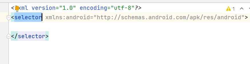
simply write this in your XML code

<androidx.cardview.widget.CardView
android:id="@+id/cv_info"
...
app:cardCornerRadius="5dp"
...>

and it will work perfectly 
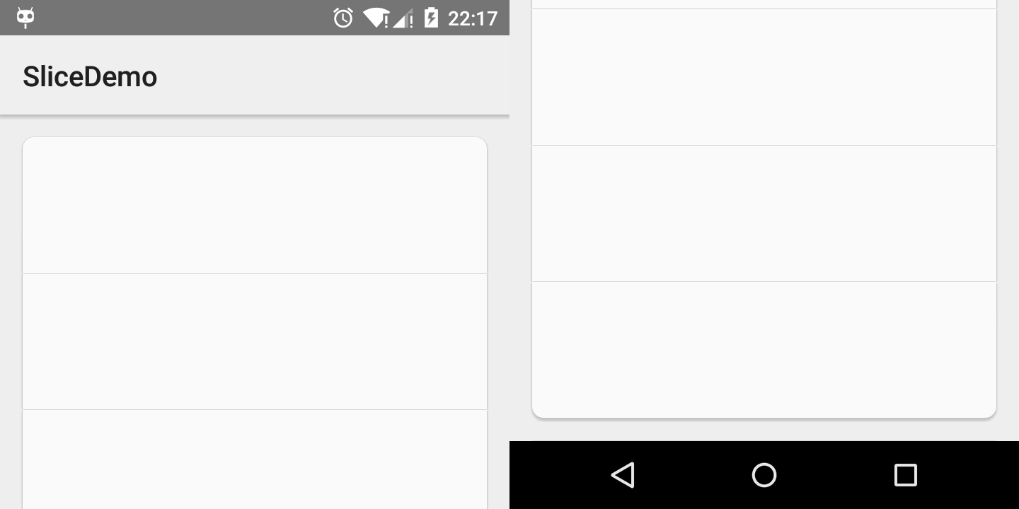
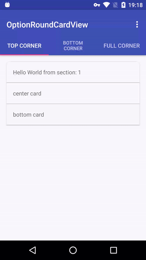
image of the cardview

the highest value you'll put in the rounded it will be.

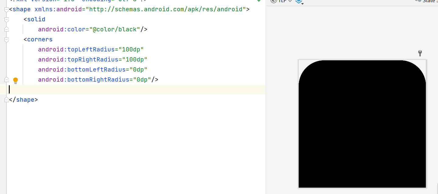
but when we would like to make rounded corners only in certain spots like left bottom, right bottom and so on we will run into a problem, because the CardCornerRadius attribute does it to each side. I managed to find a solution, not a perfect one, and sometimes this solution is irrelevant for example when you want to do it in the middle of the activity, it will work only if you want this to card view who's in the corners of the activity. 
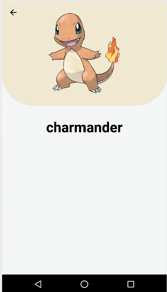
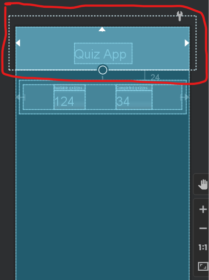
something like that rounded corner image cardView

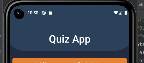
so what I'm trying to achieve is to make the card view to overflow to activity overflowed cardview

to do this you may set the width of the card view higher than the width of the phone or a better way is to set the width to match the parent and then set the margin to minus. The XML code will be something like that

android:layout_width="0dp"
android:layout_height="wrap_content"
android:layout_marginStart="-16dp"
android:layout_marginLeft="-16dp"
android:layout_marginTop="-26dp"
android:layout_marginEnd="-16dp"
android:layout_marginRight="-16dp"

and then set the app:cardCornerRadius to something high

app:cardCornerRadius="200dp"

and you should get the final result final solution

you can also play with this and make some cool things with that!

I hope it will help someone in the future, I know it's not the most elegant solution or good solution at all but it should do the job, I tried some other things but it seems to be more complicated.

Elazar Halperin
  • 133
  • 1
  • 13
1

NOTE: This here is a workaround if you want to achieve rounded corners at the bottom only and regular corners at the top. This will not work if you want to have different radius for all four corners of the cardview. You will have to use material cardview for it or use some third party library.

Here's what seemed to work for me:

<?xml version="1.0" encoding="utf-8"?>
<RelativeLayout xmlns:android="http://schemas.android.com/apk/res/android"
    android:layout_width="match_parent"
    android:layout_height="match_parent"
    xmlns:app="http://schemas.android.com/apk/res-auto"
    android:background="#F9F9F9">

    <androidx.cardview.widget.CardView
        android:layout_width="match_parent"
        android:layout_height="wrap_content">

        <LinearLayout
            android:layout_width="match_parent"
            android:layout_height="200dp"
            android:background="@drawable/profile_bg"/>

    </androidx.cardview.widget.CardView>

    <androidx.cardview.widget.CardView
        android:id="@+id/cvProfileHeader"
        android:layout_width="match_parent"
        android:layout_height="wrap_content"
        app:cardCornerRadius="32dp">
    
        <LinearLayout
            android:layout_width="match_parent"
            android:layout_height="280dp"
            android:orientation="vertical"
            android:background="@drawable/profile_bg"
            android:id="@+id/llProfileHeader"
            android:gravity="center_horizontal">

            <!--Enter your code here-->

        </LinearLayout>
    
    </androidx.cardview.widget.CardView>

</RelativeLayout>

There's two cardview's in all. The second cardview is the one that will have rounded corners (on all sides as usual) and will hold all other subviews under it. The first cardview above it is also at the same level (of elevation), and has the same background but is only about half the height of the second cardview and has no rounded corners (just the usual sharp corners). This way I was able to achieve partially rounded corners on the bottom and normal corners on the top. But for all four sides, you may have to use the material cardview.

You could do the reverse of this to get rounded corners at the top and regular ones at the bottom, i.e. let the first cardview have rounded corners and the second cardview have regular corners.

Max
  • 183
  • 2
  • 8
1

My custom way to implemented with a lib

//Rounded card

add this implementation on build.gradle

implementation 'com.github.captain-miao:optroundcardview:1.0.0'

in XML:

<com.github.captain_miao.optroundcardview.OptRoundCardView
    android:layout_width="match_parent"
    android:layout_height="match_parent"
    android:layout_marginTop="10dp"
    app:optRoundCardCornerRadius="40dp"
    app:optRoundCardLeftBottomCorner="false"
    app:optRoundCardRightBottomCorner="false"
    app:optRoundCardBackgroundColor="#E2EAF8">
0

you can use the library:OptionRoundCardview

enter image description here

qinmiao
  • 5,559
  • 5
  • 36
  • 39
0

Easiest way to achieve it in Android Studio is explained below:

Step 1:
Write below line in dependencies in build.gradle:

compile 'com.android.support:cardview-v7:+'

Step 2:
Copy below code in your xml file for integrating the CardView.

For cardCornerRadius to work, please be sure to include below line in parent layout: xmlns:card_view="http://schemas.android.com/apk/res-auto"

And remember to use card_view as namespace for using cardCornerRadius property.

For example : card_view:cardCornerRadius="4dp"

XML Code:

<android.support.v7.widget.CardView
    xmlns:card_view="http://schemas.android.com/apk/res-auto"
    android:id="@+id/card_view_outer"
    android:layout_width="match_parent"
    android:layout_height="200dp"
    android:layout_gravity="center"
    card_view:cardBackgroundColor="@android:color/transparent"
    card_view:cardCornerRadius="0dp"
    card_view:cardElevation="3dp" >

    <android.support.v7.widget.CardView
        xmlns:card_view="http://schemas.android.com/apk/res-auto"
        android:id="@+id/card_view_inner"
        android:layout_width="match_parent"
        android:layout_height="200dp"
        android:layout_gravity="center"
        android:layout_marginTop="3dp"
        card_view:cardBackgroundColor="@color/green"
        card_view:cardCornerRadius="4dp"
        card_view:cardElevation="0dp" >
    </android.support.v7.widget.CardView>

</android.support.v7.widget.CardView>
Myth
  • 1,218
  • 12
  • 15
0

You can put your ImageView inside a CardView, and add those properties to the ImageView:

android:cropToPadding="true"
android:paddingBottom="15dp"

That way you will get rid of the rounded bottom corner, but keep in mind that this comes in the price of having a small portion of your image cut off.

omzer
  • 1,200
  • 11
  • 14
0

You will find many ninja techniques on the internet but the best way to do this is to create a "Drawable Resource file" and design your own background and give a radius to every side or only one side. So, these are the following steps:

  1. Right-click on the Drawable file.

Screenshot

  1. Then Click New and then click drawable resource file.

Screenshot

  1. Then a page will popup you only need to set the name of your file.

Screenshot

  1. Change the Selecter to Shape.

Screenshot

  1. And add this code.

Screenshot

  1. The final step is to set this newly created drawable file as the background.

Screenshot

RiveN
  • 2,595
  • 11
  • 13
  • 26
Abubakar Khalid
  • 109
  • 2
  • 5
-1

An easy way to achieve this would be:

1.Make a custom background resource (like a rectangle shape) with rounded corners.

2.set this custom background using the command -

cardView = view.findViewById(R.id.card_view2);
cardView.setBackgroundResource(R.drawable.card_view_bg);

this worked for me.

The XML layout I made with top left and bottom right radius.

<shape xmlns:android="http://schemas.android.com/apk/res/android">
<solid android:color="@color/white" />
<corners android:topLeftRadius="18dp" android:bottomRightRadius="18dp" />
</shape>

In your case, you need to change only topLeftRadius as well as topRightRadius.

If you have a layout that overlaps with the corners of the card view and has a different color maybe, then you might need a different background resource file for the layout and in the xml set this background resource to your layout.

I tried and tested the above method. Hope this helps you.

Mazin Ibrahim
  • 7,433
  • 2
  • 33
  • 40
Ankit Deshmukh
  • 549
  • 5
  • 11
-3

If you're setting the card background programmatically, make use you use cardView.setCardBackgroundColor() and not cardView.setBackgroundColor() and make sure use using app:cardPreventCornerOverlap="true" on the cardView.xml. That fixed it for me.

Btw, the above code (in quotations) is in Kotlin and not Java. Use the java equivalent if you're using Java.

scopchanov
  • 7,966
  • 10
  • 40
  • 68