I am using android design library's TextinputLayout. But couldn't customize the hint color, label color and the underline color of EditText inside TextinputLayout. Please help.
Asked
Active
Viewed 1.9e+01k times
143
Vasily Kabunov
- 6,511
- 13
- 49
- 53
Nitesh Verma
- 2,460
- 4
- 20
- 36
-
1It should have the accent color according to design guidelines right? – Raghunandan Jul 30 '15 at 11:04
-
ya, but I will have many editTexts with colors different from theme's accent color. – Nitesh Verma Jul 30 '15 at 11:08
-
possible duplicate of [EditText underline below text property](http://stackoverflow.com/questions/21480398/edittext-underline-below-text-property) – Anirudh Sharma Jul 30 '15 at 11:30
-
I could change underline reliably in both focused and unfocused state by using custom background drawable specified in https://stackoverflow.com/a/36543554/2413303 – EpicPandaForce Apr 25 '18 at 02:37
16 Answers
278
Change bottom line color:
From this answer
 <item name="colorControlNormal">#c5c5c5</item>
 <item name="colorControlActivated">@color/accent</item>
 <item name="colorControlHighlight">@color/accent</item>
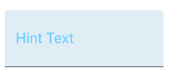
Change hint color when it is floating
<style name="MyHintStyle" parent="@android:style/TextAppearance">
    <item name="android:textColor">@color/main_color</item>
</style>
and use it like this:
<android.support.design.widget.TextInputLayout
    ...
    app:hintTextAppearance="@style/MyHintStyle">
Change hint color when it is not a floating label:
<android.support.design.widget.TextInputLayout
    ...
    app:hintTextAppearance="@style/MyHintStyle"
    android:textColorHint="#c1c2c4">
Thanks to @AlbAtNf
Machavity
- 30,841
- 27
- 92
- 100
Pankaj Arora
- 10,224
- 2
- 37
- 59
-
I am not able to change hint color (when its not label).Could you help? – Nitesh Verma Jul 30 '15 at 12:25
-
I am really concerned about my app size , considering that, any idea on how much addition size is it expected to put on my app? – Nitesh Verma Jul 31 '15 at 06:09
-
sorry, didn't get your question, please explain more, size in what context, graphics size of app weight (Like apk is of above 20mb or something), and earlier you accept my answer and again you remove your acceptance,can i ask, y so? – Pankaj Arora Jul 31 '15 at 06:17
-
becoz , I couldn't change hint color following your answer. Some part of it worked for me but this is not complete solution to what I asked.Regarding app size, doesn't adding external library like Material EdiTText increase app size? – Nitesh Verma Jul 31 '15 at 06:22
-
-
5@NiteshVerma found the solution for setting Hint Color, when it is not a floating lable: simply set `android:textColorHint` to `TextInputLayout` in XML. – AlbAtNf Mar 18 '16 at 09:37
-
-
I was able to change the bottom color but when I select the box, it becames the same color of the AccentColor, and not from `
- @color/Black
` – Feb 15 '17 at 03:19 -
`app:hintTextAppearance` is completly ignored in my case in favor of `android:textColorHint` – murt Oct 02 '18 at 07:52
-
I don't think this worked for me as I tried many, I had to use https://stackoverflow.com/questions/31758958/change-thickness-of-the-bottom-line-of-edittext-when-wrapped-into-textinputlayou/36543554#36543554 – EpicPandaForce Jun 11 '19 at 17:02
-
Not working for me :( I can't believe there's no simple way to do this..... – YellowJ Aug 22 '19 at 05:03
-
For TextInputLayoutTheme in style file: Use this Widget.MaterialComponents.TextInputLayout.OutlinedBox Because this will work perfectly in case of androidx. – Aman Goyal Aug 06 '20 at 10:53
-
44
With the Material Components Library you can use the com.google.android.material.textfield.TextInputLayout.
You can apply a custom style to change the colors.
To change the hint color you have to use these attributes:
hintTextColor and android:textColorHint.
<style name="Custom_textinputlayout_filledbox" parent="@style/Widget.MaterialComponents.TextInputLayout.FilledBox">
    <!-- The color of the label when it is collapsed and the text field is active -->
    <item name="hintTextColor">?attr/colorPrimary</item>

    <!-- The color of the label in all other text field states (such as resting and disabled) -->
    <item name="android:textColorHint">@color/selector_hint_text_color</item>
</style>
You should use a selector for the android:textColorHint. Something like:
<selector xmlns:android="http://schemas.android.com/apk/res/android">
  <item android:alpha="0.38" android:color="?attr/colorOnSurface" android:state_enabled="false"/>
  <item android:alpha="0.6" android:color="?attr/colorOnSurface"/>
</selector>
To change the bottom line color you have to use the attribute: boxStrokeColor.
<style name="Custom_textinputlayout_filledbox" parent="@style/Widget.MaterialComponents.TextInputLayout.FilledBox">
    ....
    <item name="boxStrokeColor">@color/selector_stroke_color</item>
</style>
Also in this case you should use a selector. Something like:
<selector xmlns:android="http://schemas.android.com/apk/res/android">
  <item android:color="?attr/colorPrimary" android:state_focused="true"/>
  <item android:alpha="0.87" android:color="?attr/colorOnSurface" android:state_hovered="true"/>
  <item android:alpha="0.12" android:color="?attr/colorOnSurface" android:state_enabled="false"/>
  <item android:alpha="0.38" android:color="?attr/colorOnSurface"/>
</selector>
You can also apply these attributes in your layout:
<com.google.android.material.textfield.TextInputLayout
    style="@style/Widget.MaterialComponents.TextInputLayout.FilledBox"
    app:boxStrokeColor="@color/selector_stroke_color"
    app:hintTextColor="?attr/colorPrimary"
    android:textColorHint="@color/selector_hint_text_color"
    ...>
Gabriele Mariotti
- 320,139
- 94
- 887
- 841
-
2How to change the underline color of EditText inside TextinputLayout? I mean unfocused state. It's grayish – Evgenii Vorobei Oct 02 '19 at 12:10
-
@EvgeniiVorobei It is described in the answer. It is defined by the `boxStrokeColor`. In the example the `selector_stroke_color` in particular the last line: `
- ` – Gabriele Mariotti Oct 02 '19 at 12:36
-
-
my problem is i want the hint color to be gray and once the edittext is filled i want it to be orange no matter if its focused or not. i am able to do it when its focused. but not able to do it when it is not. So chan you help me with it @GabrieleMariotti – Anmol317 Aug 10 '20 at 05:37
-
1
35
Based on Fedor Kazakov and others answers, I created a default config.
styles.xml
<resources>

    <!-- Base application theme. -->
    <style name="AppTheme" parent="Theme.AppCompat.Light">
        <!-- Customize your theme here. -->
        <item name="colorPrimary">@color/colorPrimary</item>
        <item name="colorPrimaryDark">@color/colorPrimaryDark</item>
        <item name="colorAccent">@color/colorAccent</item>
    </style>

    <style name="Widget.Design.TextInputLayout" parent="AppTheme">
        <item name="hintTextAppearance">@style/AppTheme.TextFloatLabelAppearance</item>
        <item name="errorTextAppearance">@style/AppTheme.TextErrorAppearance</item>
        <item name="counterTextAppearance">@style/TextAppearance.Design.Counter</item>
        <item name="counterOverflowTextAppearance">@style/TextAppearance.Design.Counter.Overflow</item>
    </style>

    <style name="AppTheme.TextFloatLabelAppearance" parent="TextAppearance.Design.Hint">
        <!-- Floating label appearance here -->
        <item name="android:textColor">@color/colorAccent</item>
        <item name="android:textSize">20sp</item>
    </style>

    <style name="AppTheme.TextErrorAppearance" parent="TextAppearance.Design.Error">
        <!-- Error message appearance here -->
        <item name="android:textColor">#ff0000</item>
        <item name="android:textSize">20sp</item>
    </style>

</resources>
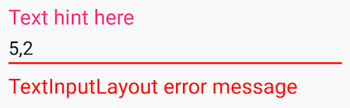
activity_layout.xml
<android.support.design.widget.TextInputLayout
    android:layout_width="match_parent"
    android:layout_height="wrap_content">

    <android.support.v7.widget.AppCompatEditText
        android:layout_width="match_parent"
        android:layout_height="wrap_content"
        android:hint="Text hint here"
        android:text="5,2" />

</android.support.design.widget.TextInputLayout>
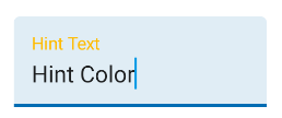
Focused:
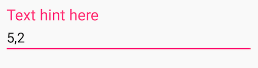
Without focus:
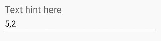
Error message:
Community
- 1
- 1
Douglas Nassif Roma Junior
- 2,070
- 2
- 27
- 50
-
9What should I do in order to also get pink color for "Without focus" example? – John Smith Feb 07 '17 at 02:15
-
28
Add this attribute in Edittext tag and enjoy:
android:backgroundTint="@color/colorWhite"
pm dubey
- 976
- 11
- 16
-
5effect: changes the line color on devices with API level 21 and above – Someone Somewhere Aug 23 '17 at 13:55
-
18
This Blog Post describes various styling aspects of EditText and AutoCompleteTextView wrapped by TextInputLayout.
For EditText and AppCompat lib 22.1.0+ you can set theme attribute with some theme related settings:
<style name="StyledTilEditTextTheme">
   <item name="android:imeOptions">actionNext</item>
   <item name="android:singleLine">true</item>
   <item name="colorControlNormal">@color/greyLight</item>
   <item name="colorControlActivated">@color/blue</item>
   <item name="android:textColorPrimary">@color/blue</item>
   <item name="android:textSize">@dimen/styledtil_edit_text_size</item>
</style>

<style name="StyledTilEditText">
    <item name="android:theme">@style/StyledTilEditTextTheme</item>
    <item name="android:paddingTop">4dp</item>
</style>
and apply them on EditText:
<EditText
    android:id="@+id/etEditText"
    style="@style/StyledTilEditText"
For AutoCompleteTextView things are more complicated because wrapping it in TextInputLayout and applying this theme breaks floating label behaviour.
You need to fix this in code:
private void setStyleForTextForAutoComplete(int color) {
    Drawable wrappedDrawable =     DrawableCompat.wrap(autoCompleteTextView.getBackground());
    DrawableCompat.setTint(wrappedDrawable, color);
    autoCompleteTextView.setBackgroundDrawable(wrappedDrawable);
}
and in Activity.onCreate:
setStyleForTextForAutoComplete(getResources().getColor(R.color.greyLight));
autoCompleteTextView.setOnFocusChangeListener((v, hasFocus) -> {
    if(hasFocus) {
        setStyleForTextForAutoComplete(getResources().getColor(R.color.blue));
    } else {
        if(autoCompleteTextView.getText().length() == 0) {
              setStyleForTextForAutoComplete(getResources().getColor(R.color.greyLight));
        }
    }
});
Vasily Kabunov
- 6,511
- 13
- 49
- 53
Patryk Lenza
- 191
- 1
- 5
10
If you want to change the bar/line color and the hint text color of the TextInputLayout (what the accent color normally is), then just create this style:
<style name="MyStyle">
    <item name="colorAccent">@color/your_color</item>
</style>
Then apply it to your TextInputLayout as a theme:
<android.support.design.widget.TextInputLayout
    ...
    app:theme="@style/MyStyle" />
This basically sets a theme (not style) to one view (as opposed to the whole activity).
Farbod Salamat-Zadeh
- 19,687
- 20
- 75
- 125
10
A TextinputLayout is not a view, but a Layout, as very nicely described by Dimitrios Tsigouris in his blog post here. Therefore, you don't need a Style, which is for Views only, but use a Theme. Following the blog post, I ended up with the following solution:
Start in your styles.xml with
<style name="TextInputLayoutAppearance" parent="Widget.Design.TextInputLayout">
        <!-- reference our hint & error styles -->
        <item name="android:textColor">@color/your_colour_here</item>
        <item name="android:textColorHint">@color/your_colour_here</item>
        <item name="colorControlNormal">@color/your_colour_here</item>
        <item name="colorControlActivated">@color/your_colour_here</item>
        <item name="colorControlHighlight">@color/your_colour_here</item>
</style>
And in your layout add
<com.google.android.material.textfield.TextInputLayout
                android:theme="@style/TextInputLayoutAppearance"
...
Paul Spiesberger
- 5,630
- 1
- 43
- 53
-
1Use Widget.MaterialComponents.TextInputLayout.OutlinedBox in parent – Sudip Sadhukhan Jan 16 '20 at 08:53
-
android:theme="@style/TextInputLayoutAppearance" this doesn't render view in xml layout in android studio but works perfectly fine in mobile – Aaron Ebinezer Mar 02 '23 at 05:25
6
<style name="Widget.Design.TextInputLayout" parent="android:Widget">
    <item name="hintTextAppearance">@style/TextAppearance.Design.Hint</item>
    <item name="errorTextAppearance">@style/TextAppearance.Design.Error</item>
</style>
You can override this style for layout
And also you can change inner EditText-item style too.
Fedor Kazakov
- 601
- 3
- 12
-
how to use this style ? is there any way to override all app's style at one place? – Hanzala Apr 24 '20 at 07:10
6
<style name="EditScreenTextInputLayoutStyle" parent="Theme.AppCompat.Light.NoActionBar">
    <item name="colorControlNormal">@color/actionBar_background</item>
    <item name="colorControlActivated">@color/actionBar_background</item>
    <item name="colorControlHighlight">@color/actionBar_background</item>
    <item name="colorAccent">@color/actionBar_background</item>
    <item name="android:textColorHint">@color/actionBar_background</item>
</style>
apply this style to TextInputLayout
Jared Rummler
- 37,824
- 19
- 133
- 148
Komal Nikhare
- 252
- 1
- 4
- 9
-
2just a quick note for applying the style to TextInputLayout: `android:theme="@style/EditScreenTextInputLayoutStyle"` – jackycflau May 29 '18 at 03:23
4
I used all of the above answers and none worked. This answer works for API 21+. Use app:hintTextColor attribute when text field is focused and app:textColorHint attribute when in other states. To change the bottmline color use this attribute app:boxStrokeColor as demonstrated below:
<com.google.android.material.textfield.TextInputLayout
            app:boxStrokeColor="@color/colorAccent"
            app:hintTextColor="@color/colorAccent"
            android:textColorHint="@android:color/darker_gray"

       <com.google.android.material.textfield.TextInputEditText
                android:layout_width="match_parent"
                android:layout_height="wrap_content" />
</com.google.android.material.textfield.TextInputLayout>
It works for AutoCompleteTextView as well. Hope it works for you:)
Donzaala
- 123
- 1
- 10
4
Change line color of TextInputLayout + TextInputEditText
colors.xml
<color name="mtrl_textinput_default_box_stroke_color" tools:override="true">@color/lineColor</color>
styles.xml
<style name="TextInputLayout" parent="Widget.MaterialComponents.TextInputLayout.FilledBox.Dense">
    <item name="boxStrokeColor">@color/lineColor</item>
    <item name="android:textColorHint">@color/hintColor</item>
    <item name="boxStrokeWidth">1dp</item>
    <item name="boxBackgroundColor">@color/backgroundColor</item>
</style>

<style name="TextInputEditText" parent="ThemeOverlay.MaterialComponents.TextInputEditText.FilledBox.Dense">
    <item name="android:textColor">@color/black</item>
</style>
layout.xml
<com.google.android.material.textfield.TextInputLayout
            style="@style/TextInputLayout"
            android:layout_height="wrap_content"
            android:layout_width="match_parent">

            <com.google.android.material.textfield.TextInputEditText
                style="@style/TextInputEditText"
                android:layout_width="match_parent"
                android:layout_height="wrap_content"
                android:inputType="text" />
</com.google.android.material.textfield.TextInputLayout>
norbDEV
- 4,795
- 2
- 37
- 28
3
Works for me. If you trying EditText with Label and trying change to underline color use this. Change to TextInputEditText instead EditText.
           <com.google.android.material.textfield.TextInputLayout
                android:id="@+id/editTextTextPersonName3"
                android:layout_width="0dp"
                android:layout_height="wrap_content"
                android:layout_marginStart="@dimen/_16sdp"
                android:layout_marginLeft="@dimen/_16sdp"
                android:layout_marginTop="@dimen/_16sdp"
                android:layout_marginEnd="@dimen/_8sdp"
                android:layout_marginRight="@dimen/_8sdp"
                android:textColorHint="@color/white"
                app:layout_constraintEnd_toStartOf="@+id/guideline3"
                app:layout_constraintStart_toStartOf="parent"
                app:layout_constraintTop_toTopOf="parent">

                <EditText
                    android:layout_width="match_parent"
                    android:layout_height="match_parent"
                    android:backgroundTint="@color/white"
                    android:hint="Lastname"
                    android:textSize="@dimen/_14sdp"
                    android:inputType="textPersonName"
                    android:textColor="@color/white"
                    android:textColorHint="@color/white" />
            </com.google.android.material.textfield.TextInputLayout>
Emre Şutuna
- 31
- 3
1
You can change the label color of TextInputLayout by using app:hintTextAppearance attribute in TextInputLayout.
<android.support.design.widget.TextInputLayout
    android:id="@+id/inputlayout"
    android:layout_width="match_parent"
    android:layout_height="wrap_content"
    app:hintTextAppearance="@style/TextAppearance.App.TextInputLayout">

    <EditText
        android:id="@+id/mail"
        android:layout_width="match_parent"
        android:layout_height="wrap_content"
        android:layout_marginTop="10dp"
        android:hint="@string/email"
        android:inputType="textEmailAddress"
        android:maxLines="1"
        android:paddingStart="5dp"
        android:singleLine="true"/>

</android.support.design.widget.TextInputLayout>
Style:
 <style name="TextAppearance.App.TextInputLayout"
 parent="@android:style/TextAppearance">
        <item name="android:textColor">@android:color/black</item>
        <item name="android:textSize">20sp</item>
    </style>
To change edittext underline color, you can use android:backgroundTint
<EditText
        android:layout_width="match_parent"
        android:layout_height="wrap_content"
        android:hint="Underline color change"
        android:backgroundTint="@android:color/holo_red_light" />
ahmad bajwa
- 966
- 2
- 10
- 30
1
Create style as mentioned below
<style name="text_input_layout_style">
        <item name="colorControlNormal">@color/primary</item>
        <item name="colorControlActivated">@color/primary</item>
        <item name="colorControlHighlight">@color/primary</item>
</style>
and apply it to your TextInputLayout as android:theme="@style/text_input_layout_style"
And definitely will work for you all.
Dharmesh Baldha
- 820
- 6
- 11
-
No solution worked for me because my app theme is Appcompat based, not Material one, this one helped me... Thanks, dude... – Willey Hute Jun 10 '22 at 11:16
0
I needed to change the bottom line color of a TextInputEditText inside a TextInputLayout and then the other answers didn't work out. I finally solved it by setting the colorOnSurface for the TextInputLayouts theme. I'll leave my code here in case it helps someone else.
XML:
<com.google.android.material.textfield.TextInputLayout
    android:layout_width="match_parent"
    android:layout_height="wrap_content"
    app:theme=""@style/TextInputLayoutStyle"">

    <com.google.android.material.textfield.TextInputEditText
        android:layout_width="match_parent"
        android:layout_height="wrap_content"/>

</com.google.android.material.te`tfield.TextInputLayout>
Style:
<style name="TextInputLayoutStyle">
    <item name="colorOnSurface">#0ff</item>
</style>
Jonathan Persgarden
- 260
- 4
- 9
0
XML
<com.google.android.material.textfield.TextInputLayout
        android:id="@+id/activity_profile_textInputLayout_mobile"
        style="@style/Widget.MaterialComponents.TextInputLayout.OutlinedBox"
        android:layout_width="match_parent"
        android:layout_height="wrap_content"
        android:layout_marginLeft="20dp"
        android:layout_marginTop="10dp"
        android:layout_marginRight="20dp"
        android:hint="Mobile Number"
        app:theme="@style/EditBoxColor">

        <com.google.android.material.textfield.TextInputEditText
            android:id="@+id/activity_profile_textInputEditText_mobile"
            android:layout_width="match_parent"
            android:layout_height="wrap_content"
            android:imeOptions="actionNext"
            android:inputType="number"
            android:maxLength="10"
            android:textSize="15sp" />
    </com.google.android.material.textfield.TextInputLayout>
Style
<style name="EditBoxColor" parent="ShapeAppearance.MaterialComponents.SmallComponent">
    <item name="colorPrimary">@color/colorPurple</item>
    <item name="colorPrimaryDark">@color/colorPurple3</item>
</style>
Ashwin H
- 695
- 7
- 24