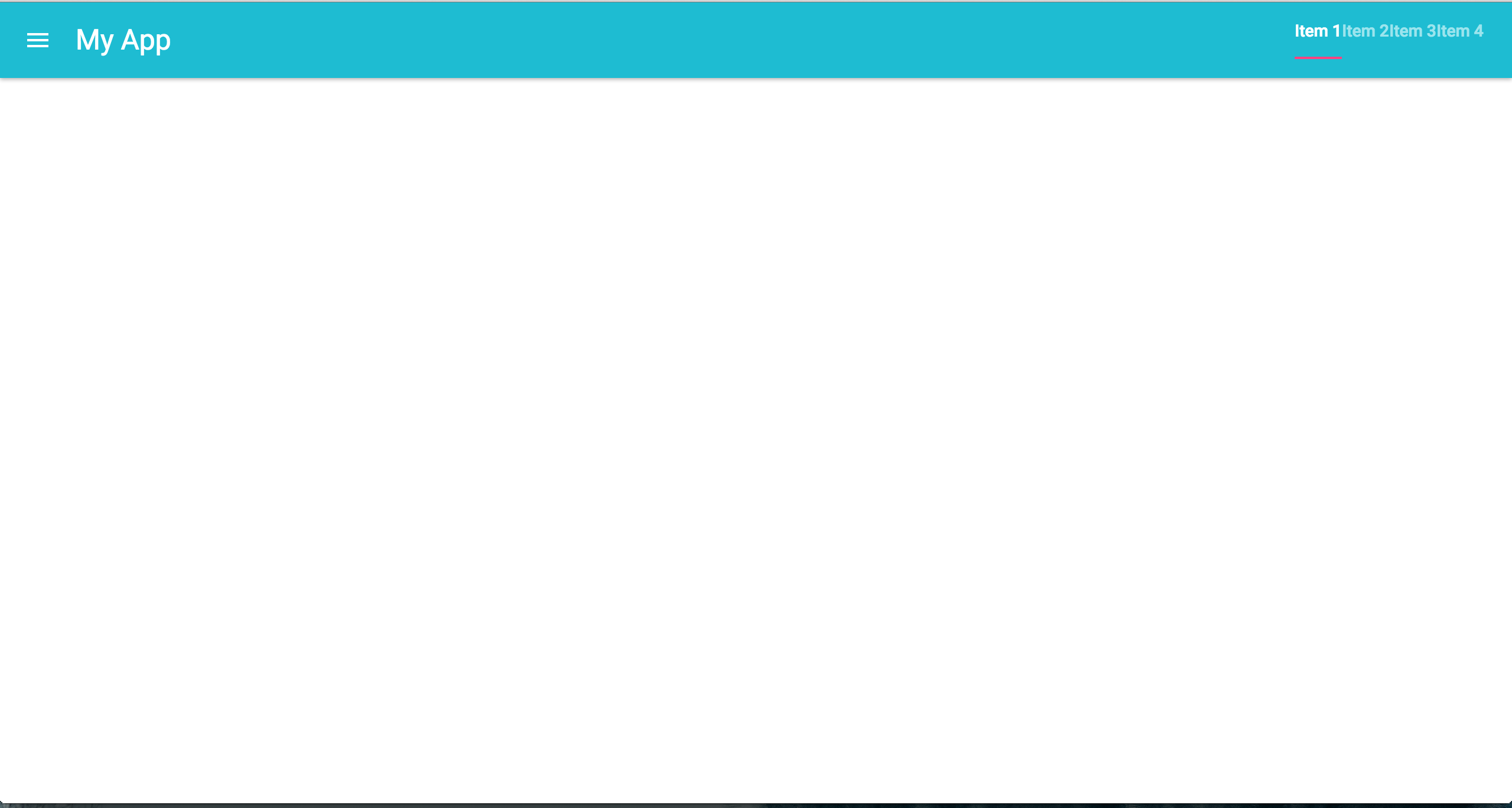
If you want to display multiple items horizontally in the AppBar, put them inside a Toolbar and it will display nicely. See this answer here to know the reason why.
If you want to push the navbar to the right side, add a Box with the flexGrow set to 1 before the Tabs. This will create an empty div element. It works because Toobar container uses flex layout.
<AppBar position="static">
  <Toolbar>
    <IconButton size="large" edge="start" color="inherit" sx={{ mr: 2 }}>
      <MenuIcon />
    </IconButton>
    <Box flexGrow={1} />
    <Tabs textColor="inherit">
      <Tab label="One" />
      <Tab label="Two" />
      <Tab label="Three" />
    </Tabs>
  </Toolbar>
</AppBar>
Full Example
export default function Demo() {
  const [value, setValue] = React.useState(0);
  const handleChange = (_, newValue) => setValue(newValue);

  return (
    <>
      <AppBar position="static">
        <Toolbar>
          <IconButton size="large" edge="start" color="inherit" sx={{ mr: 2 }}>
            <MenuIcon />
          </IconButton>
          <Typography
            variant="h6"
            noWrap
            component="div"
            sx={{ display: { xs: "none", sm: "block" } }}
          >
            MUI
          </Typography>
          <Box flexGrow={1} />
          <Tabs value={value} onChange={handleChange} textColor="inherit">
            <Tab label="One" />
            <Tab label="Two" />
            <Tab label="Three" />
          </Tabs>
        </Toolbar>
      </AppBar>
      <div index={value} onChangeIndex={setValue}>
        <TabPanel value={value} index={0}>
          Item One
        </TabPanel>
        <TabPanel value={value} index={1}>
          Item Two
        </TabPanel>
        <TabPanel value={value} index={2}>
          Item Three
        </TabPanel>
      </div>
    </>
  );
}
function TabPanel(props) {
  const { children, value, index, ...other } = props;

  return (
    <div role="tabpanel" hidden={value !== index} {...other}>
      {value === index && (
        <Box sx={{ p: 3 }}>
          <Typography>{children}</Typography>
        </Box>
      )}
    </div>
  );
}
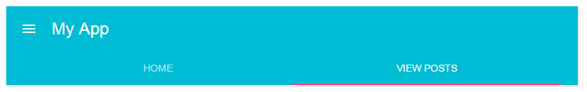
Live Demo
