72

The solutions I found to change the spinner dropdown icon where all:

1. create a custom drawable

<?xml version="1.0" encoding="utf-8"?>
<selector xmlns:android="http://schemas.android.com/apk/res/android">
    <item android:drawable="@drawable/vector_drawable_ic_dropdown_black" android:state_focused="true" android:state_pressed="false" />
    <item android:drawable="@drawable/vector_drawable_ic_dropdown_black" android:state_focused="true" android:state_pressed="true" />
    <item android:drawable="@drawable/vector_drawable_ic_dropdown_black" android:state_focused="false" android:state_pressed="true" />
    <item android:drawable="@drawable/vector_drawable_ic_dropdown_black" />
</selector>

2. Set the drawable as the spinner background:

<Spinner
    android:layout_width="match_parent"
    android:layout_height="wrap_content"
    android:layout_marginBottom="16dp"
    android:background="@drawable/custom_spinner_icon"
    android:gravity="center"
    android:paddingBottom="8dp"
    android:paddingTop="8dp"
    android:textColor="@color/textcolorprimary" />
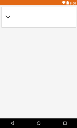
And the result is:

enter image description here

As you can see this is not an acceptable solution since the icon needs to be right aligned and not stretched.

What can I do to make the icon not stretch and align it right?

EDIT

Since there are no working solutions yet I guess I have to specify my question. This is how my Spinner looks using the standard theme:

<Spinner
    android:id="@+id/products_download_spinner_language"
    android:layout_width="match_parent"
    android:layout_height="wrap_content"
    android:layout_marginBottom="16dp"
    android:gravity="center"
    android:paddingBottom="8dp"
    android:paddingTop="8dp"
    android:textColor="@color/textcolorprimary"
    android:theme="@android:style/Theme.Holo.Light.DarkActionBar" />

enter image description here

And everything I want (it is really not much I guess) is changing the arrow. I don't want that arrow in the right bottom corner to be displayed, I want this arrow to be displayed vertically centered at the right:

enter image description here

And every solution which i tried until now:

Spinner Dropdown Arrow

How to set dropdown arrow in spinner?

simply weren't working. They had stretched icons or the bottom line was missing or something else went totally wrong. I just want another arrow.

Zain
  • 37,492
  • 7
  • 60
  • 84
Mulgard
  • 9,877
  • 34
  • 129
  • 232

12 Answers12

143

Try applying following style to your spinner using

style="@style/SpinnerTheme"

//Spinner Style:

<style name="SpinnerTheme" parent="android:Widget.Spinner">
    <item name="android:background">@drawable/bg_spinner</item>
</style>

//bg_spinner.xml Replace the arrow_down_gray with your arrow

<?xml version="1.0" encoding="utf-8"?>
<selector xmlns:android="http://schemas.android.com/apk/res/android">

    <item>

        <layer-list>

            <item>
                <shape>
                    <gradient android:angle="90" android:endColor="#ffffff" android:startColor="#ffffff" android:type="linear" />

                    <stroke android:width="0.33dp" android:color="#0fb1fa" />

                    <corners android:radius="0dp" />

                    <padding android:bottom="3dp" android:left="3dp" android:right="3dp" android:top="3dp" />
                </shape>
            </item>

            <item android:right="5dp">

                <bitmap android:gravity="center_vertical|right" android:src="@drawable/arrow_down_gray" />

            </item>

        </layer-list>

    </item>

</selector>
PEHLAJ
  • 9,980
  • 9
  • 41
  • 53
  • 1
    how to remove top right and left border? just need bottom border. – Mulgard May 26 '16 at 15:40
  • Do you know where arrow_down_gray is? I am looking for the file! Thanks – androidguy Mar 12 '17 at 05:22
  • 1
    This can be any arrow icon which you want to use. Anyway I have attached that as well, please see here http://oi64.tinypic.com/2jb3b88.jpg – PEHLAJ Mar 15 '17 at 06:41
  • 19
    What if @drawable/arrow_down_gray is vector? – Lester Apr 18 '18 at 08:18
  • 6
    @Lester I am unable to add vector there. Instead when I try directly using the vector as item, ``, it stretches on some devices still. Were you able to come up with a solution? – Shobhit Puri Sep 20 '18 at 23:46
  • It did not work with custom Spinner Adapter with a custom layout with image and text – Neri Oct 24 '18 at 11:00
  • how to add paddingEnd to the drawable? The drawable is stuck to the end of the spinner. I need to add some padding to the drawable – Tarun Kumar Dec 11 '18 at 06:35
  • @Lester paste the code of that vector drawable in the place of bitmap line – Himanshu Mori Feb 20 '19 at 10:23
  • 9
    @Lester Don't use the Bitmap tag inside of an item tag, use item attributes directly: `````` – milosmns Sep 18 '19 at 09:08
  • 3
    @milosmms, that will work for API>=23, and you can dont have to add android:width="24dp" android:height="24dp" in API>24, but for API<23, the arrow stretchs. Any body else have a solution using vector for api<23?. I try using the bitmap method, but it fails in API23 – nnyerges Nov 17 '19 at 14:14
41

Add theme to spinner

<Spinner style="@style/SpinnerTheme"
      android:layout_width="match_parent"
      android:layout_height="match_parent"/>

Add spinnerTheme to styles.xml

<style name="SpinnerTheme" parent="android:Widget.Spinner">
    <item name="android:background">@drawable/spinner_background</item>
</style>

Add New -> "Vector Asset" to drawable with e.g. "ic_keyboard_arrow_down_24dp"

Add spinner_background.xml to drawable

<?xml version="1.0" encoding="utf-8"?>
<selector xmlns:android="http://schemas.android.com/apk/res/android">
    <item>
        <layer-list>
            <item android:drawable="@drawable/ic_keyboard_arrow_down_24dp" android:gravity="center_vertical|right" android:right="5dp"/>
        </layer-list>
    </item>
</selector>
Moshood Awari
  • 500
  • 4
  • 5
20

For this you can use .9 Patch Image and just simply set it in to background.

android:background="@drawable/spin"

Here i'll give you .9patch image. try with this.

enter image description here enter image description here

Right click on image and click Save Image as

set image name like this : anyname.9.png and hit save.

Enjoy.. Happy Coading. :)

Ronak Selarka
  • 663
  • 1
  • 5
  • 13
  • Im using svg's. Much better than .9 Patch Image. – Mulgard May 24 '16 at 12:28
  • I think in this case a .9patch image is better than an svg. Using a 9patch you could stretch only a transparent pixel from the left border, and keep the rest of the image at the original size. I don't know if that's possible using svg, but I would definitely give a try to this answer. – Jofre Mateu May 26 '16 at 13:08
  • @Mulgard, you should take a look to the original implementation and the format of the icon used. If I'm not wrong, the default implementation uses a 9patch – Jofre Mateu May 27 '16 at 07:23
  • 1
    I think this is the best solution, without the need to play with the mysterious android theme – Sira Lam Nov 01 '18 at 06:29
10

We can manage it by hiding the icon as i did:

<FrameLayout
        android:layout_width="match_parent"
        android:layout_height="wrap_content">
    <Spinner android:id="@+id/fragment_filter_sp_users"
             android:layout_width="match_parent"
             android:background="@color/colorTransparent"
             android:layout_height="wrap_content"/>

    <ImageView
            android:layout_gravity="end|bottom"
            android:contentDescription="@null"
            android:layout_marginBottom="@dimen/_5sdp"
            android:layout_width="wrap_content"
            android:layout_height="wrap_content"
            android:src="@drawable/ic_arrow_bottom"
    />
</FrameLayout>
adiga
  • 34,372
  • 9
  • 61
  • 83
Sunil
  • 3,211
  • 3
  • 21
  • 21
4

You need to create custom background like this:

<?xml version="1.0" encoding="utf-8"?>
<selector xmlns:android="http://schemas.android.com/apk/res/android">

    <item>
        <layer-list>
            <item>
                <shape>
                    <gradient android:angle="90" android:endColor="#ffffff" android:startColor="#ffffff" android:type="linear"/>

                    <stroke android:width="1dp" android:color="#504a4b"/>

                    <corners android:radius="5dp"/>

                    <padding android:bottom="3dp" android:left="3dp" android:right="3dp" android:top="3dp"/>
                </shape>
            </item>
            <item>
                <bitmap android:gravity="bottom|right" android:src="@drawable/drop_down"/> // you can place your dropdown image
            </item>
        </layer-list>
    </item>

</selector>

Then create style for spinner like this:

<style name="spinner_style">
        <item name="android:background">@drawable/YOURCUSTOMBACKGROUND</item>
        <item name="android:layout_marginLeft">5dp</item>
        <item name="android:layout_marginRight">5dp</item>
        <item name="android:layout_marginBottom">5dp</item>
</style>

after that apply this style to your spinner

Mehta
  • 1,228
  • 1
  • 9
  • 27
4

Have you tried to define a custom background in xml? decreasing the Spinner background width which is doing your arrow look like that.

Define a layer-list with a rectangle background and your custom arrow icon:

    <?xml version="1.0" encoding="utf-8"?>
<layer-list xmlns:android="http://schemas.android.com/apk/res/android">
    <item>
        <shape android:shape="rectangle">
            <solid android:color="@color/color_white" />
            <corners android:radius="2.5dp" />
        </shape>
    </item>
    <item android:right="64dp">
         <bitmap android:gravity="right|center_vertical"  
             android:src="@drawable/custom_spinner_icon">
         </bitmap>
    </item>
</layer-list>
Rawa
  • 13,357
  • 6
  • 39
  • 55
Francisco Durdin Garcia
  • 12,540
  • 9
  • 53
  • 95
3

dummy.xml(remember image size should be less)

<?xml version="1.0" encoding="utf-8"?>
    <selector xmlns:android="http://schemas.android.com/apk/res/android">
        <item>
            <layer-list android:opacity="transparent">
                <item android:width="60dp" android:gravity="left" android:start="20dp">
                    <bitmap  android:src="@drawable/down_button_dummy_dummy" android:gravity="left"/>
                </item>
            </layer-list>
        </item>
    </selector>

layout file snippet be like

<android.support.v7.widget.CardView
        android:layout_width="match_parent"
        android:layout_height="wrap_content"
        app:cardUseCompatPadding="true"
        app:cardElevation="5dp"
        >
     <Spinner
        android:layout_width="match_parent"
        android:layout_height="100dp"
        android:background="@drawable/dummy">

     </Spinner>
    </android.support.v7.widget.CardView>

click to see result layout image

2

Without Using ANY Drop down Using your Drop Down ICON

<?xml version="1.0" encoding="utf-8"?>
<selector xmlns:android="http://schemas.android.com/apk/res/android">

<item>
    <layer-list>
        <item>
            <shape>
               <gradient android:angle="90" android:endColor="#ffffff" android:startColor="#ffffff" android:type="linear" /><!--For gradient background-->

                <stroke android:width="1dp" android:color="#FFF" /><!--For Border background-->

                <corners android:radius="0dp" /><!--For background corner-->

                <padding android:bottom="3dp" android:left="3dp" android:right="6dp" android:top="3dp" /><!--For padding for all sides-->
            </shape>
        </item>
        <item>
            <bitmap android:gravity="center|right" android:src="@drawable/ic_down_arrow" /> // Replace with your Icon

        </item>
    </layer-list>
</item>

PEHLAJ
  • 9,980
  • 9
  • 41
  • 53
2

I have managed to do the following:

enter image description here

Create this drawable file with this name radio_button_background_drawable

<selector xmlns:android="http://schemas.android.com/apk/res/android">
    <item>
        <layer-list>
            <item android:drawable="@drawable/vector_down_arrow" android:gravity="end" android:right="5dp" />
        </layer-list>
    </item>
</selector>

Add it to the spinner background:

        <Spinner
            android:id="@+id/id_type_SP"
            android:layout_width="match_parent"
            android:layout_height="wrap_content"
            android:background="@drawable/radio_button_background_drawable"
            android:inputType="number"
            tools:ignore="MissingConstraints" />
هيثم
  • 791
  • 8
  • 11
1

There is a trick to set the spinner background to a transparent color to hide the default spinner arrow:

<Spinner
    ....
    android:background="@android:color/transparent"/>

Then create a custom spinner resource item (for the closed state); set your arrow drawable to the android:drawableEnd TextView:

spinner_item.xml

<?xml version="1.0" encoding="utf-8"?>
<CheckedTextView xmlns:android="http://schemas.android.com/apk/res/android"
    xmlns:app="http://schemas.android.com/apk/res-auto"
    android:id="@android:id/text1"
    style="?android:attr/spinnerDropDownItemStyle"
    android:layout_width="match_parent"
    android:layout_height="wrap_content"
    android:paddingVertical="4dp"
    app:drawableEndCompat="@drawable/chevron_down"
    app:drawableRightCompat="@drawable/chevron_down"
    android:ellipsize="marquee"
    android:singleLine="true"/>

Set that to the adapter:

ArrayAdapter<String> spinnerAdapter = new ArrayAdapter<>(context,
         R.layout.spinner_item, myItems);
Zain
  • 37,492
  • 7
  • 60
  • 84
1

If you want change dropdown icon with any vector drawable you can try this.

You should define spinnerStyle and android:spinnerItemStyle in your (styles.xml or themes.xml).

<style name="AppTheme" parent="Theme.MaterialComponents.Light">
    ...
    <item name="spinnerStyle">@style/AppTheme.Spinner</item>
    <item name="android:spinnerItemStyle">@style/AppTheme.Spinner.Item</item>
    ...
</style>

<style name="AppTheme.Spinner" parent="Widget.AppCompat.Spinner">
    <item name="android:background">@android:color/transparent</item>
    <item name="android:gravity">start</item>
</style>

<style name="AppTheme.Spinner.Item" parent="Widget.AppCompat.TextView.SpinnerItem">
    <item name="drawableRightCompat">@drawable/baseline_keyboard_arrow_down_24</item>
</style>

That's all, now you can use Spinner any layout.

<Spinner
    android:layout_width="wrap_content"
    android:layout_height="wrap_content"
    android:entries="@array/exampleArray" />
0

I have had a lot of difficulty with this as I have a custom spinner, if I setBackground then the Drawable would stretch. My solution to this was to add a drawable to the right of the Spinner TextView. Heres a code snippet from my Custom Spinner. The trick is to Override getView and customize the Textview as you wish.

public class NoTextSpinnerArrayAdapter extends ArrayAdapter<String> {

    private String text = "0";

    public NoTextSpinnerArrayAdapter(Context context, int textViewResourceId, List<String> objects) {
        super(context, textViewResourceId, objects);
    }

    public void updateText(String text){
        this.text = text;
        notifyDataSetChanged();
    }

    public String getText(){
        return text;
    }

    @NonNull
    public View getView(int position, View convertView, @NonNull ViewGroup parent) {
        View view = super.getView(position, convertView, parent);
        TextView textView = view.findViewById(android.R.id.text1);
        textView.setCompoundDrawablePadding(16);
        textView.setCompoundDrawablesWithIntrinsicBounds(0, 0, R.drawable.ic_menu_white_24dp, 0);

        textView.setGravity(Gravity.END);
        textView.setText(text);
        return view;
    }
}

You also need to set the Spinner background to transparent:

<lifeunlocked.valueinvestingcheatsheet.views.SelectAgainSpinner
            android:id="@+id/saved_tickers_spinner"
            android:background="@android:color/transparent"
            android:layout_width="60dp"
            android:layout_height="match_parent"
            tools:layout_editor_absoluteX="248dp"
            tools:layout_editor_absoluteY="16dp" />

and my custom spinner if you want it....

public class SelectAgainSpinner extends android.support.v7.widget.AppCompatSpinner {
    public SelectAgainSpinner(Context context) {
        super(context);
    }

    public SelectAgainSpinner(Context context, AttributeSet attrs) {
        super(context, attrs);
    }

    public SelectAgainSpinner(Context context, AttributeSet attrs, int defStyle) {
        super(context, attrs, defStyle);
    }

    @Override
    public void setPopupBackgroundDrawable(Drawable background) {
        super.setPopupBackgroundDrawable(background);
    }

    @Override
    public void setSelection(int position, boolean animate) {
        boolean sameSelected = position == getSelectedItemPosition();
        super.setSelection(position, animate);
        if (sameSelected) {
            // Spinner does not call the OnItemSelectedListener if the same item is selected, so do it manually now
            if (getOnItemSelectedListener() != null) {
                getOnItemSelectedListener().onItemSelected(this, getSelectedView(), position, getSelectedItemId());
            }
        }
    }

    @Override
    public void setSelection(int position) {
        boolean sameSelected = position == getSelectedItemPosition();
        super.setSelection(position);
        if (sameSelected) {
            // Spinner does not call the OnItemSelectedListener if the same item is selected, so do it manually now
            if (getOnItemSelectedListener() != null) {
                getOnItemSelectedListener().onItemSelected(this, getSelectedView(), position, getSelectedItemId());
            }
        }
    }
}