2

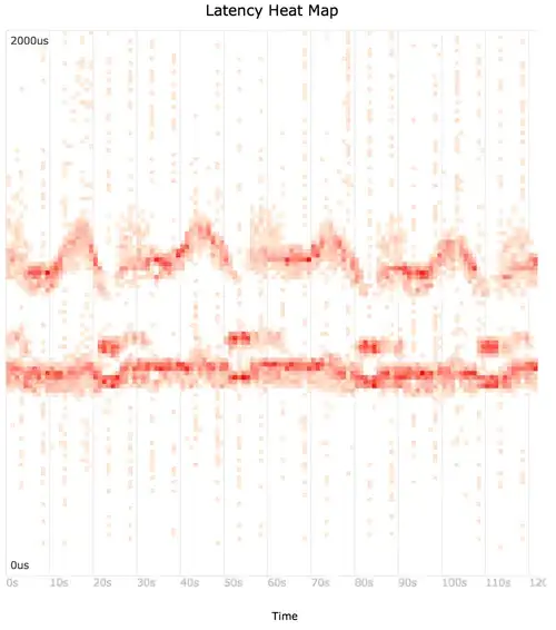
I have time series latency data processed by python and am trying to generate a latency heat map as described in Visualizing System Latency. Other examples include epochjs and Circonus. These are sometimes also called a timeseries heatmap.

enter image description here

They are a natural way to visualize the entire distribution of latency values over time instead of just the mean, 95th percentile or other summary statistic. I've looked at the galleries for pandas, bokeh, matplotlib, and seaborn without finding an example.
cburroughs
  • 21
  • 3

1 Answers1

0

I don't think there is an out-of-the-box way to do those plots, but I think it's not too difficult.

If I understand correctly, you have a bunch of latencies values over time. What you want to do is bin those values in a certain ∆t, and plot the distribution of the latencies for each ∆t. Is that it?

Check out that answer that I wrote for another question that is essentially the same problem, and which might point you in the right direction. In your case, the phase axis, would be the time, and the bins the histogram of the latencies at each point in time

https://stackoverflow.com/a/37922077/1356000

Community
  • 1
  • 1
Diziet Asahi
  • 38,379
  • 7
  • 60
  • 75