59

Look at the image:

enter image description here

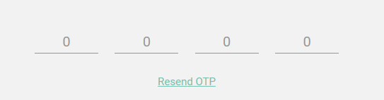
I want design something like in the image, where a 4 digit one time password (OTP) is to be entered by user. Right now I have achieved this by 4 separate inputs and then combining values in javascript:

<input type="text" class="form-control" placeholder="0" maxlength="1"  />
<input type="text" class="form-control" placeholder="0" maxlength="1" />

I am not sure if this is correct approach. I think there must be some styling options by which one input textbox would appear as partitioned one like in the image. Is it possible using bootstrap? How to style one input control to be appeared as partitioned field of inputs?

Karan Desai
  • 3,012
  • 5
  • 32
  • 66
  • It will be helpful for you http://digitalbush.com/projects/masked-input-plugin/ – Leo the lion Jan 17 '17 at 13:43
  • 2
    Maybe you can try css "letter-spacing" property to increase spacing in your input field text. Plus you can "tune" the bottem border dash style to fit the spacing you have. The following link will probably help you to adjust the width of dashes. http://stackoverflow.com/questions/6250394/how-to-increase-space-between-dotted-border-dots – Ufuk Onder Jan 17 '17 at 14:14

8 Answers8

55

You don't have to keep four separate fields.

First, you should adjust the character spacing, and then adjust the border style of bottom.

#partitioned {
  padding-left: 15px;
  letter-spacing: 42px;
  border: 0;
  background-image: linear-gradient(to left, black 70%, rgba(255, 255, 255, 0) 0%);
  background-position: bottom;
  background-size: 50px 1px;
  background-repeat: repeat-x;
  background-position-x: 35px;
  width: 220px;
  outline : none;
}
<input id="partitioned" type="text" maxlength="4" />

--EDIT to fix 5 underlines for 4 character ugliness--

var obj = document.getElementById('partitioned');
obj.addEventListener('keydown', stopCarret); 
obj.addEventListener('keyup', stopCarret); 

function stopCarret() {
    if (obj.value.length > 3){
        setCaretPosition(obj, 3);
    }
}

function setCaretPosition(elem, caretPos) {
    if(elem != null) {
        if(elem.createTextRange) {
            var range = elem.createTextRange();
            range.move('character', caretPos);
            range.select();
        }
        else {
            if(elem.selectionStart) {
                elem.focus();
                elem.setSelectionRange(caretPos, caretPos);
            }
            else
                elem.focus();
        }
    }
}
#partitioned {
  padding-left: 15px;
  letter-spacing: 42px;
  border: 0;
  background-image: linear-gradient(to left, black 70%, rgba(255, 255, 255, 0) 0%);
  background-position: bottom;
  background-size: 50px 1px;
  background-repeat: repeat-x;
  background-position-x: 35px;
  width: 220px;
  min-width: 220px;
}

#divInner{
  left: 0;
  position: sticky;
}

#divOuter{
  width: 190px; 
  overflow: hidden;
}
<div id="divOuter">
    <div id="divInner">
        <input id="partitioned" type="text" maxlength="4" />
    </div>
</div>

I think this can be a starting point.

Hope this will help...

splattne
  • 102,760
  • 52
  • 202
  • 249
Ufuk Onder
  • 786
  • 7
  • 9
  • 2
    i am facing an issue with the alignment of the character if we does't give max length 4 the after entering few digits the number is goes right side it is not aligning center of the dash of the input field – Mohan Gopi Jan 22 '18 at 07:41
  • 1
    yes you are right, and it seems this is the limitation :( and as a side note, there is actually 5 partition line. To this this uglyness, you can place the input field in a div, and that div inside another... the inner div must be sticky and the outer div must hide overflows... – Ufuk Onder Jan 23 '18 at 16:33
  • @UfukOnder can you help me for text length 6? – LOKESH Sep 13 '19 at 06:54
  • And what about the credit card number or date field? – Shukur Sharofiddinov Aug 15 '20 at 10:13
  • 2
    want to remove the blue rectangle border when clicked? you can add `outline:none` as a css rule to the `#partitioned` styles – Sami Birnbaum Dec 17 '20 at 11:25
48

I know this question is old. I stumbled upon this when I was trying to achieve the same for my project.

I couldn't find what I needed. So I made one myself with the ideas from here

You can use this with any number of characters and needs no change in javascript as long as all the input fields are inside a div with id="otp".


Here is a preview:

enter image description here


Take a look at the code here

function OTPInput() {
  const inputs = document.querySelectorAll('#otp > *[id]');
  for (let i = 0; i < inputs.length; i++) {
    inputs[i].addEventListener('keydown', function(event) {
      if (event.key === "Backspace") {
        inputs[i].value = '';
        if (i !== 0)
          inputs[i - 1].focus();
      } else {
        if (i === inputs.length - 1 && inputs[i].value !== '') {
          return true;
        } else if (event.keyCode > 47 && event.keyCode < 58) {
          inputs[i].value = event.key;
          if (i !== inputs.length - 1)
            inputs[i + 1].focus();
          event.preventDefault();
        } else if (event.keyCode > 64 && event.keyCode < 91) {
          inputs[i].value = String.fromCharCode(event.keyCode);
          if (i !== inputs.length - 1)
            inputs[i + 1].focus();
          event.preventDefault();
        }
      }
    });
  }
}
OTPInput();
@import url('https://unpkg.com/tailwindcss@^1.0/dist/tailwind.min.css');
.form-control {
  -webkit-transition: none;
  transition: none;
  width: 32px;
  height: 32px;
  text-align: center
}

.form-control:focus {
  color: #3F4254;
  background-color: #ffffff;
  border-color: #884377;
  outline: 0;
}

.form-control.form-control-solid {
  background-color: #F3F6F9;
  border-color: #F3F6F9;
  color: #3F4254;
  transition: color 0.15s ease, background-color 0.15s ease, border-color 0.15s ease, box-shadow 0.15s ease;
}

.form-control.form-control-solid:active,
.form-control.form-control-solid.active,
.form-control.form-control-solid:focus,
.form-control.form-control-solid.focus {
  background-color: #EBEDF3;
  border-color: #EBEDF3;
  color: #3F4254;
  transition: color 0.15s ease, background-color 0.15s ease, border-color 0.15s ease, box-shadow 0.15s ease;
}
<div class="mb-6 text-center">
  <div id="otp" class="flex justify-center">
    <input class="m-2 text-center form-control form-control-solid rounded focus:border-blue-400 focus:shadow-outline" type="text" id="first" maxlength="1" />
    <input class="m-2 text-center form-control form-control-solid rounded focus:border-blue-400 focus:shadow-outline" type="text" id="second" maxlength="1" />
    <input class="m-2 text-center form-control form-control-solid rounded focus:border-blue-400 focus:shadow-outline" type="text" id="third" maxlength="1" />
    <input class="m-2 text-center form-control form-control-solid rounded focus:border-blue-400 focus:shadow-outline" type="text" id="fourth" maxlength="1" />
    <input class="m-2 text-center form-control form-control-solid rounded focus:border-blue-400 focus:shadow-outline" type="text" id="fifth" maxlength="1" />
    <input class="m-2 text-center form-control form-control-solid rounded focus:border-blue-400 focus:shadow-outline" type="text" id="sixth" maxlength="1" />
  </div>
</div>
Midhun Monachan
  • 588
  • 4
  • 12
  • @mihun Can you explain how to add only numbers in the input fields? . OTP screens need only numbers. – Jomal Johny Feb 17 '21 at 07:06
  • this is how it should be done. The rest of the answers are just not in a good way. thanks for the function snippet :D – minigeek Oct 27 '21 at 09:11
  • 2
    I found that when backspacing on the last input field it actually clears the last input as well as the second to last. Easy fix is to just check for last input and handle it differently `if (i == inputs.length - 1)` in the case of a backspace – Isaac Vidrine Dec 16 '21 at 21:46
  • Love this solution! Just a thought, how would you handle the user pasting a code? I think from a UX perspective, the majority of people would paste their 2FA code in, or even just click the new "code from message" button on their phone when your input has the `autocomplete="one-time-code"` attribute and they receive their code via SMS – S_R Feb 03 '22 at 09:21
  • 2
    @S_R pasting isn't an issue as there is an on-paste event you can listen to and just manually set the values. But i do wonder about the autocomplete="one-time-code" and if there is a way to listen to that event or handle it with multiple inputs like here – lsdmt Feb 15 '22 at 20:31
18

This works for me without any extra javascript code.

#partitioned {
  padding-left: 15px;
  letter-spacing: 42px;
  border: 0;
  background-image: linear-gradient(to left, black 70%, rgba(255, 255, 255, 0) 0%);
  background-position: bottom;
  background-size: 50px 1px;
  background-repeat: repeat-x;
  background-position-x: 35px;
  width: 220px;
  min-width: 220px;
}

#divInner{
  left: 0;
  position: sticky;
}

#divOuter{
  width: 190px; 
  overflow: hidden;
}
<div id="divOuter">
  <div id="divInner">
<input id="partitioned" type="text" maxlength="4" oninput="this.value = this.value.replace(/[^0-9.]/g, '').replace(/(\..*)\./g, '$1');"  onKeyPress="if(this.value.length==4) return false;"/>
  </div>
</div>
Tanuj K
  • 181
  • 1
  • 3
  • its working and i need to know what to chnage to make it a 6 digit input field? – Mr Zid Mar 25 '20 at 10:39
  • 3
    @MrZid to make it 6 digit input field you have to make the following changes. 1. Change the min-width and width of #partitioned to 305px in CSS 2. Change the width of #divOuter to 290px in CSS 3. and change maxlength = "6" and onKeyPress="if(this.value.length==6) return false;" in HTML – Tanuj K Apr 02 '20 at 07:58
  • its accepting alphabets also... should accept only numbers because its an otp – user1735921 Jun 14 '20 at 23:54
  • 3
    want to remove the blue rectangle border when clicked? you can add `outline:none` as a css rule to the `#partitioned` styles – Sami Birnbaum Dec 17 '20 at 11:25
  • Amazing solution without javascript. And comment of @TanujK for 6-digit otp is also commendable... – Ishpreet Aug 11 '21 at 08:02
13

Hope this solution helps you. You can remove onfocus event from input elements if you want.

<body>
  <head>
    <style>
      input[type=number] {
          height: 45px;
          width: 45px;
          font-size: 25px;
          text-align: center;
          border: 1px solid #000000;
      }
      input[type=number]::-webkit-inner-spin-button,
      input[type=number]::-webkit-outer-spin-button {
        -webkit-appearance: none;
        margin: 0;
      }
    </style>
    <script>
      function getCodeBoxElement(index) {
        return document.getElementById('codeBox' + index);
      }
      function onKeyUpEvent(index, event) {
        const eventCode = event.which || event.keyCode;
        if (getCodeBoxElement(index).value.length === 1) {
          if (index !== 4) {
            getCodeBoxElement(index+ 1).focus();
          } else {
            getCodeBoxElement(index).blur();
            // Submit code
            console.log('submit code ');
          }
        }
        if (eventCode === 8 && index !== 1) {
          getCodeBoxElement(index - 1).focus();
        }
      }
      function onFocusEvent(index) {
        for (item = 1; item < index; item++) {
          const currentElement = getCodeBoxElement(item);
          if (!currentElement.value) {
              currentElement.focus();
              break;
          }
        }
      }
    </script>
  </head>
  <body>
    <form>
        <input id="codeBox1" type="number" maxlength="1" onkeyup="onKeyUpEvent(1, event)" onfocus="onFocusEvent(1)"/>
        <input id="codeBox2" type="number" maxlength="1" onkeyup="onKeyUpEvent(2, event)" onfocus="onFocusEvent(2)"/>
        <input id="codeBox3" type="number" maxlength="1" onkeyup="onKeyUpEvent(3, event)" onfocus="onFocusEvent(3)"/>
        <input id="codeBox4" type="number" maxlength="1" onkeyup="onKeyUpEvent(4, event)" onfocus="onFocusEvent(4)"/>
    </form>
  </body>
</body>
Jagraj Singh
  • 404
  • 5
  • 6
3

I would just keep this 4 separate fields approach, and add the same event handler to all of them, which will:

  1. Check whether the input is valid (in the character class, you're willing to accept)
  2. Check which field you are at, and then move the focus to the next field, or the ok button.

You can even write a little separate JS for that, and re-use it.

Dan
  • 630
  • 5
  • 8
2

Just changed Midhun Monachan's snippet to add copy-paste feature.

document.addEventListener("DOMContentLoaded", function(event) {
   
    function OTPInput() {
        const editor = document.getElementById('first');
        editor.onpaste = pasteOTP;

        const inputs = document.querySelectorAll('#otp > *[id]');
        for (let i = 0; i < inputs.length; i++) { 
            inputs[i].addEventListener('input', function(event) { 
                if(!event.target.value || event.target.value == '' ){
                    if(event.target.previousSibling.previousSibling){
                        event.target.previousSibling.previousSibling.focus();    
                    }
                
                }else{ 
                    if(event.target.nextSibling.nextSibling){
                        event.target.nextSibling.nextSibling.focus();
                    }
                }               
            });             
        } 
    } 
    OTPInput(); 
});

function pasteOTP(event){
    event.preventDefault();
    let elm = event.target;
    let pasteVal = event.clipboardData.getData('text').split("");
    if(pasteVal.length > 0){
        while(elm){
            elm.value = pasteVal.shift();
            elm = elm.nextSibling.nextSibling;
        }
    }
}
input {
text-align: center!important;
    display: block;
    width: 100%;
    height: calc(1.5em + 0.75rem + 2px);
    padding: 0.375rem 0.75rem;
    font-size: 1rem;
    font-weight: 400;
    line-height: 1.5;
    color: #495057;
    background-color: #fff;
    background-clip: padding-box;
    border: 1px solid #ced4da;
    border-radius: 0.25rem;
    transition: border-color 0.15s ease-in-out, box-shadow 0.15s ease-in-out;
        border-radius: 0.25rem !important;
            margin: 0.5rem !important;
                overflow: visible;
                word-wrap: break-word;
}
<script src="https://cdnjs.cloudflare.com/ajax/libs/jquery/3.3.1/jquery.min.js"></script>
<link rel="stylesheet" href="https://cdnjs.cloudflare.com/ajax/libs/twitter-bootstrap/4.6.1/css/bootstrap-grid.min.css" integrity="sha512-Xj2sd25G+JgJYwo0cvlGWXoUekbLg5WvW+VbItCMdXrDoZRWcS/d40ieFHu77vP0dF5PK+cX6TIp+DsPfZomhw==" crossorigin="anonymous" referrerpolicy="no-referrer" />
<form id="otpForm" >
              <div class="container height-100 d-flex justify-content-center align-items-center">
                  <div class="position-relative">
                      <div class="card p-2 text-center">
                          
                          <div id="otp" class="inputs d-flex flex-row justify-content-center mt-2"> 
                            <input class="m-2 text-center form-control rounded" type="text" id="first" maxlength="1" /> 
                            <input class="m-2 text-center form-control rounded" type="text" id="second" maxlength="1" /> 
                            <input class="m-2 text-center form-control rounded" type="text" id="third" maxlength="1" /> 
                            <input class="m-2 text-center form-control rounded" type="text" id="fourth" maxlength="1" /> 
                            <input class="m-2 text-center form-control rounded" type="text" id="fifth" maxlength="1" /> 
                            <input class="m-2 text-center form-control rounded" type="text" id="sixth" maxlength="1" /> 
                          </div>
                         
                      </div>                    
                  </div>
              </div>
            </form>
Jinul
  • 39
  • 4
0

You can use the below directive if using AngularJS

In your HTML add

<div otp-input-directive options="otpInput"></div>

In your controller add

$scope.otpInput={
        size:6,
        type:"text",
        onDone: function(value){
            console.log(value);
        },
        onChange: function(value){
            console.log(value);
        }
    };

Plunker link

UI component look and feel

https://github.com/amstel91/otp-input-directive

Amstel D'Almeida
  • 630
  • 6
  • 13
0
If your using input type number, then use below code, It's Working


#otpOuterBlock{
  width: 190px; 
  overflow: hidden;
}
#otpInnerBlock{
  left: 0;
  position: sticky;
}

#otpVerifyText{
  padding-left: 15px;
  letter-spacing: 42px;
  border: 0;
  background-image: linear-gradient(to left, black 70%, rgba(255, 255, 255, 0) 0%);
  background-position: bottom;
  background-size: 50px 1px;
  background-repeat: repeat-x;
  background-position-x: 35px;
  width: 220px;
  min-width: 220px;
}

input::-webkit-outer-spin-button,
input::-webkit-inner-spin-button {
    -webkit-appearance: none;
    margin: 0;
}


input[type=number] {
    -moz-appearance: textfield;
}


<div id="otpOuterBlock">
    <div id="otpInnerBlock">
        <input id="otpVerifyText" type="number" maxlength="4" />
    </div>
</div>
  • 1
    Your answer could be improved with additional supporting information. Please [edit] to add further details, such as citations or documentation, so that others can confirm that your answer is correct. You can find more information on how to write good answers [in the help center](/help/how-to-answer). – Community Mar 04 '22 at 10:25