Wanted: a CSS only solution to enable MULTIPLE equal height grid "sections" on a per row basis, that is also responsive.
Note: this is a follow-up question to this question which has only a single "equal height" section per item - which can be achieved through flexbox
The below diagram should help explain the requirement:
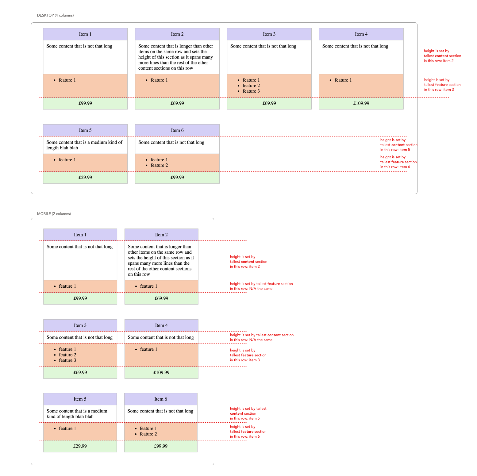
The "item grid" should be responsive - in that it can show a different number of cards per row based on viewport width (4 on desktop, 2 on mobile). Within a given row, the equivalent "content" and "feature" sections should have the same height.
In the below HTML & CSS - the item cards are split into the rows that we need (at the two example break points desktop & mobile) but the content section heights are variable:
.items {
  max-width: 1200px;
}

.item {
  width: 25%;
  box-sizing: border-box;
  display: inline-block;
  vertical-align: top;
  padding: 0 12px;
  margin: 24px -4px 24px 0;
}

@media (max-width: 600px) {
  .item {
    width: 50%;
  }
}

.item__heading {
  background-color: #d4d0f5;
  padding: 10px;
  text-align: center;
  border: 1px solid #bbbbbb;
}

.item__content {
  padding: 10px;
  border-left: 1px solid #bbbbbb;
  border-right: 1px solid #bbbbbb;
}

.item__features {
  padding: 10px;
  border-top: 1px solid #bbbbbb;
  border-left: 1px solid #bbbbbb;
  border-right: 1px solid #bbbbbb;
  background-color: #f7cbb1;
}

.item__features ul {
  margin: 0px;
}

.item__price {
  background-color: #e0f6d9;
  padding: 10px;
  text-align: center;
  border: 1px solid #bbbbbb;
}
<div class="items">
<div class="item">
<div class="item__heading">
Item 1
</div>
<div class="item__content">
Some content that is not that long
</div>
<div class="item__features">
<ul>
<li>feature 1</li>
</ul>
</div>
<div class="item__price">
£99.99
</div>
</div>
<div class="item">
<div class="item__heading">
Item 2
</div>
<div class="item__content">
Some content that is longer than other items on the same row and sets the height of this section as it spans many more lines than the rest of the other content sections on this row
</div>
<div class="item__features">
<ul>
<li>feature 1</li>
</ul>
</div>
<div class="item__price">
£69.99
</div>
</div>
<div class="item">
<div class="item__heading">
Item 3
</div>
<div class="item__content">
Some content that is not that long
</div>
<div class="item__features">
<ul>
<li>feature 1</li> <li>feature 2</li>
<li>feature 3</li>
</ul>
</div>
<div class="item__price">
£69.99
</div>
</div>
<div class="item">
<div class="item__heading">
Item 4
</div>
<div class="item__content">
Some content that is not that long
</div>
<div class="item__features">
<ul>
<li>feature 1</li>
</ul>
</div>
<div class="item__price">
£109.99
</div>
</div>
<div class="item">
<div class="item__heading">
Item 5
</div>
<div class="item__content">
Some content that is a medium kind of length blah blah
</div>
<div class="item__features">
<ul>
<li>feature 1</li>
</ul>
</div>
<div class="item__price">
£29.99
</div>
</div>
<div class="item">
<div class="item__heading">
Item 6
</div>
<div class="item__content">
Some content that is not that long
</div>
<div class="item__features">
<ul>
<li>feature 1</li>
<li>feature 2</li>
</ul>
</div>
<div class="item__price">
£99.99
</div>
</div>
</div>I created the following codepen as a JavaScript based solution that achieves the desired outcome - but I am hoping to replace this with just a CSS solution if possible: http://codepen.io/rusta/pen/xdmdxm
Limitations
- The number of items to be displayed in the grid list can be any number from 1-n
- The size of the "content" and "feature" sections to be displayed will be genuinely variable (so picking a "sensible" min-height is not an option)
Flexbox based solutions seem to be un-able to cope with the fact that the items have more than one section that needs to be aligned
I was hoping that the new CSS Grid system would help achieve the above, but I have made several attempts at this with no luck, so am opening it up the community to see if I am just missing something
Further note: I say a CSS only solution, by which I mean a non-JS solution. If the HTML blocks need to change (order/nesting/class names) to support a non-JS solution that's a viable option